Cannes Lions
AIRLINE
LANDOR BEIJING, Beijing / GARUDA INDONESIA / 2010

Overview
Entries
Credits
OVERVIEW
Description
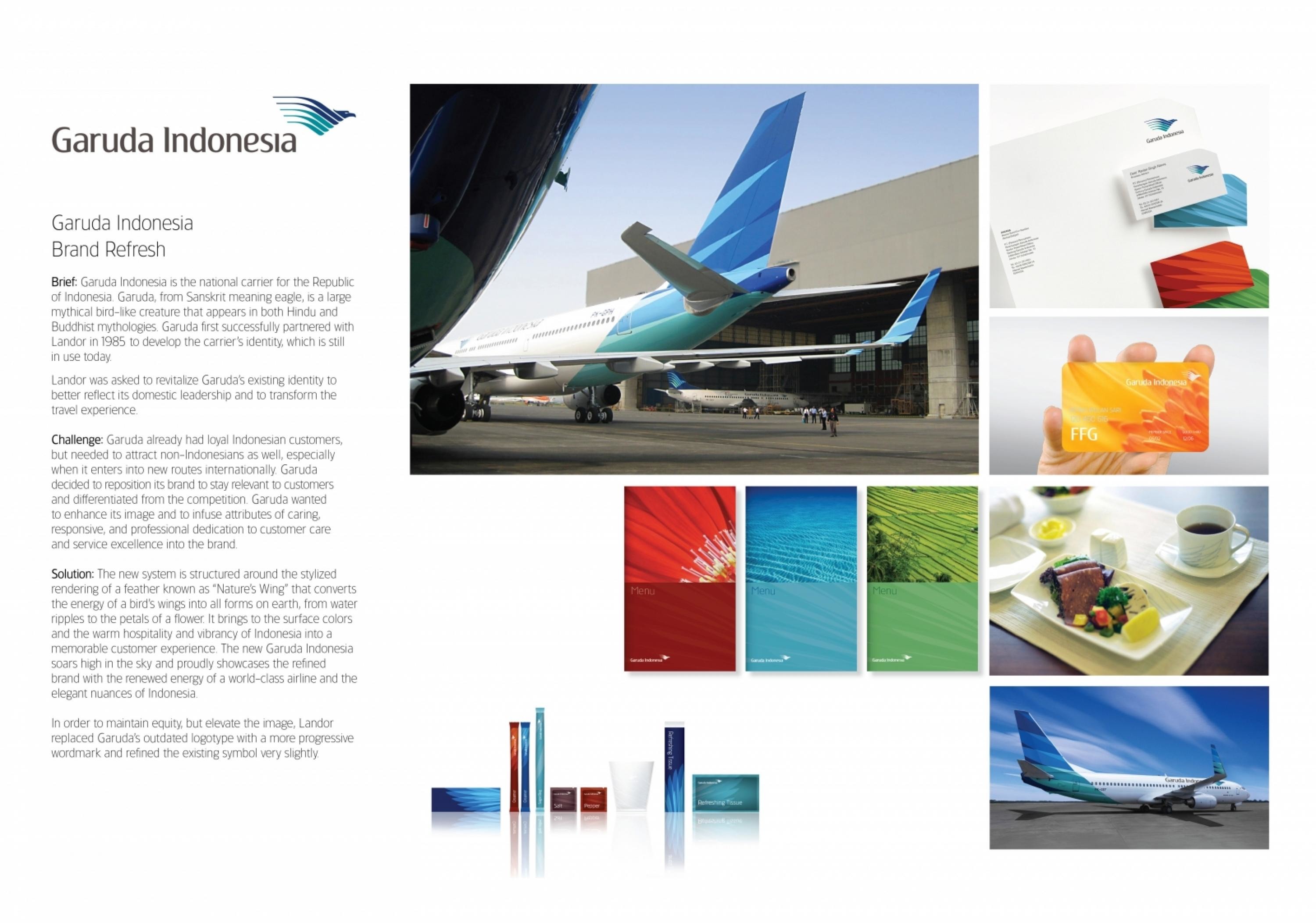
First some background: Garuda Indonesia is the national carrier for the Republic of Indonesia. Garuda, from Sanskrit meaning eagle, is a large mythical bird-like creature that appears in both Hindu and Buddhist mythologies. Garuda first successfully partnered with us in 1985 to develop the carrier’s identity, which is still in use today.Because Garuda was facing increasing pressure from regional competition, we were asked to revitalize Garuda’s existing identity to better reflect its domestic leadership and to transform the travel experience.
Execution
The new system is structured around the stylised rendering of a feather known as 'Nature’s Wing' that converts the energy of a bird’s wings into all forms on earth, from water ripples to the petals of a flower.It brings to the surface colours and the warm hospitality and vibrancy of Indonesia into a memorable customer experience. The new Garuda Indonesia soars high in the sky and proudly showcases the refined brand with the renewed energy of a world-class airline and the elegant nuances of Indonesia.In order to maintain equity, but elevate the image, we replaced Garuda’s outdated logotype with a more progressive wordmark and refined the existing symbol very slightly.
Outcome
Since Garuda's brand refresh launch, the company has experienced a true lift in spirit brought on by 'Nature's Wing'; The new livery has received enthusiastic acclaim from loyal customers and new audiences, especially as Garuda begins more and more flights to Europe. It's clear that they are now presenting a more international image.
Similar Campaigns
7 items


