Cannes Lions
BAKERY
DDB CANADA/VANCOUVER, Vancouver / SILVER HILLS BAKERY / 2009
Awards:
Overview
Entries
Credits
OVERVIEW
Description
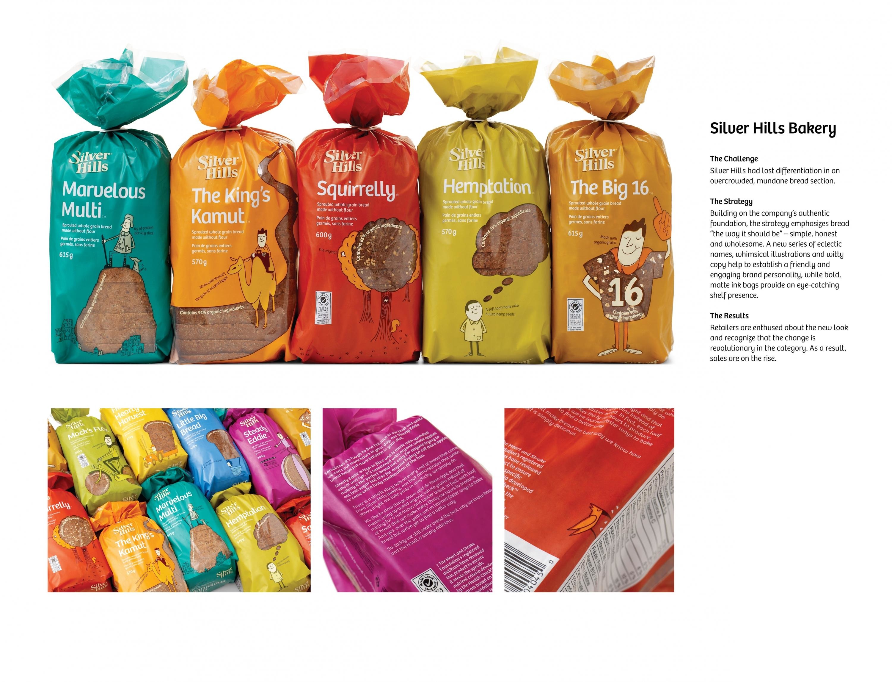
Silver Hills Bakery wanted to increase sales of its sprouted whole grain breads. Seeking to raise its profile in the bread aisle and expand its market penetration, the company sought a package that would appeal to a broader audience but not exclude or confuse their existing health-food customers. An authentic and humble company, Silver Hills wanted a package that expressed who the company is, what it stands for, how its product is different and why consumers should buy it.
Execution
Building off of the company’s foundation as a provider of simple, healthy products, the brand strategy focused on the idea that Silver Hills makes bread “the way it should be” – simple, honest and wholesome.
Consumers’ affinity for the company’s “Squirrelly” bread inspired the development of a series of eclectic names for each of Silver Hills’ eight other products. These names inspired personalities for each of the products, depicted through everyday whimsical illustrations purposely incorporating the product through a clear window. The witty tone of the copy builds the brand character. To further break through the product category, floods of bold, matte ink colours were used on biodegradable bags.
Outcome
Retailers are enthused about the new look and recognize that the change is revolutionary in the category. Consumer feedback has been very positive and the new packaging has been featured in many trade publications including Strategy Magazine, The Globe and Mail, Packaging Digest and Canadian Packaging. Although only in market for two weeks at the time of entry, Silver Hills has already seen a slight rise in sales.