Cannes Lions
Black and Red
SHISEIDO CO., LTD., Tokyo / SHISEIDO CO. / 2019
Overview
Entries
Credits
Overview
Background
SHISEIDO is a Japanese cosmetics brand that sells its products in more than 90 countries worldwide. In September 2017, it fully revamped its makeup line and launched over 100 products. These posters were displayed at SHISEIDO's headquarters as well as product launch events. The client asked us to produce visuals that express the product concept of “Modern Japan” and, furthermore, to create a unique brand image that distinguishes the brand from its western competitors.
Idea
A consumer survey shows that ads of cosmetics brands using general product visuals all appear similar to consumers. Given this result and the fact that Shiseido is a company of Japanese origin, we thought that Shiseido could distinguish itself from Western cosmetic companies by appealing to women in their 20s and 30s around the world through “Japaneseness.” Furthermore, we thought that the “Japaneseness” should be expressed as “Modern Japan,” not as classical elements such as sushi and kabuki. We believed the Japanese cosmetics company Shiseido needs this approach for its own branding.
We intentionally limited the palette to just two colors to express minimalism, aiming to portray a traditionally Japanese style and achieve a design different from that of Western cosmetic companies.
Execution
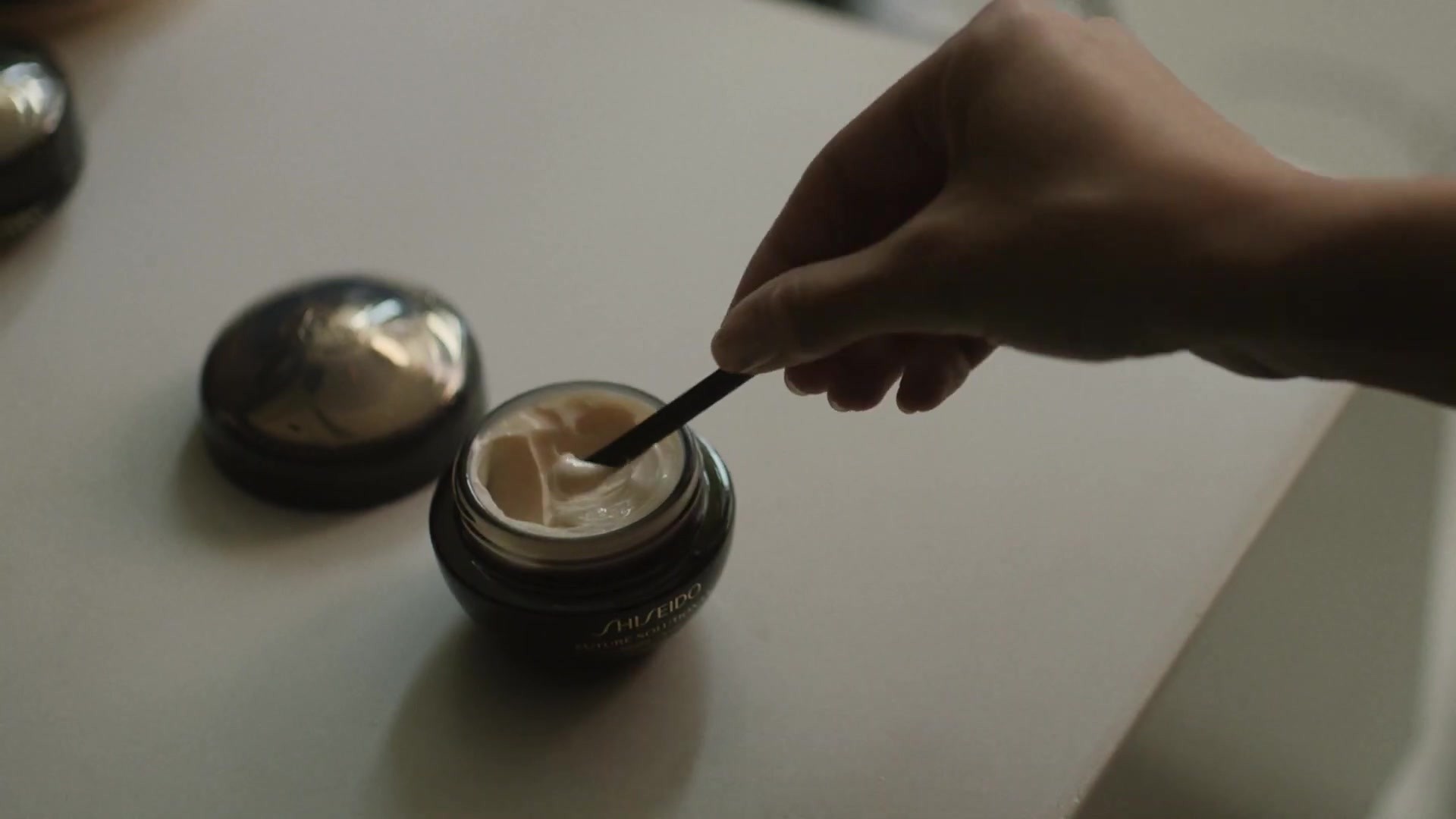
The packaging design incorporates a traditional Japanese color scheme, black and red. To make the posters more striking, we changed the color of the bright part of the photographs to red so that only black and red are used in them.
The black is jet black, the deep glossy color of Japanese black lacquer, while the red is the vivid deep scarlet of a traditional Japanese red dye that has been used for more than 200 years. We were inspired by Japan’s traditional use of colors for this creative solution.
We paid particular attention to the way the products were arranged. The photographs were taken as simple shots of the products laid on a glass table and are not composite photography. We just rotated the photographs to create bewildering images as if the products were floating. We expressed the Japanese design minimally with a very simple approach.
Outcome
These visuals were displayed as posters at Shiseido's headquarters and facilities, cosmetics stores, beauty counters in department stores, and at SHISEIDO beauty events between August 2018 and April 2019. They were also used for advertising in magazines and were released on the SHISEIDO website as well as on Instagram, Facebook, and LinkedIn accounts. A follow-up survey on this ad found that many consumers thought the visuals were unique and innovative, with qualities typical of Japanese brands. The brand image scores improved considerably. The sales grew by 126%, significantly exceeding the original sales target.
The innovative and impactful images of the visuals and our attention to detail have successfully differentiated the brand from its western competitors, contributing greatly to the sales of the products.
Similar Campaigns
12 items