Cannes Lions
Blue Moon Packaging Redesign
MOLSON COORS BEVERAGE COMPANY, Chicago / BLUE MOON BREWING COMPANY / 2024
Overview
Entries
Credits
Overview
Background
The brief for the redesign highlighted that Blue Moon needed to rebuild its brand to resonate with modern drinkers, particularly as its core audience skewed older. Plus, consumers wanted new offerings, and while they delivered this via its sub-brands, the result lacked cohesion.
Overall, brand recognition remained strong, but to drive relevancy and position Blue Moon for its next phase of growth, it needed to develop a new visual identity system that unified the packaging for its family of brands that extended across all consumer touchpoints. With a more consistent design architecture, they hoped to fortify the branding by highlighting its craft credentials, resulting in a stronger impact on shelf and display.
To do this, we needed to illuminate what was possible for the brand, starting with the experience of Blue Moon. Because when you see a Belgian White pour in the wild, you readily observe that it practically glows.
Idea
Blue Moon believes that life should be lived in full color. That's why they revamped their brand purpose, existing to awaken the "brightness in the everyday."
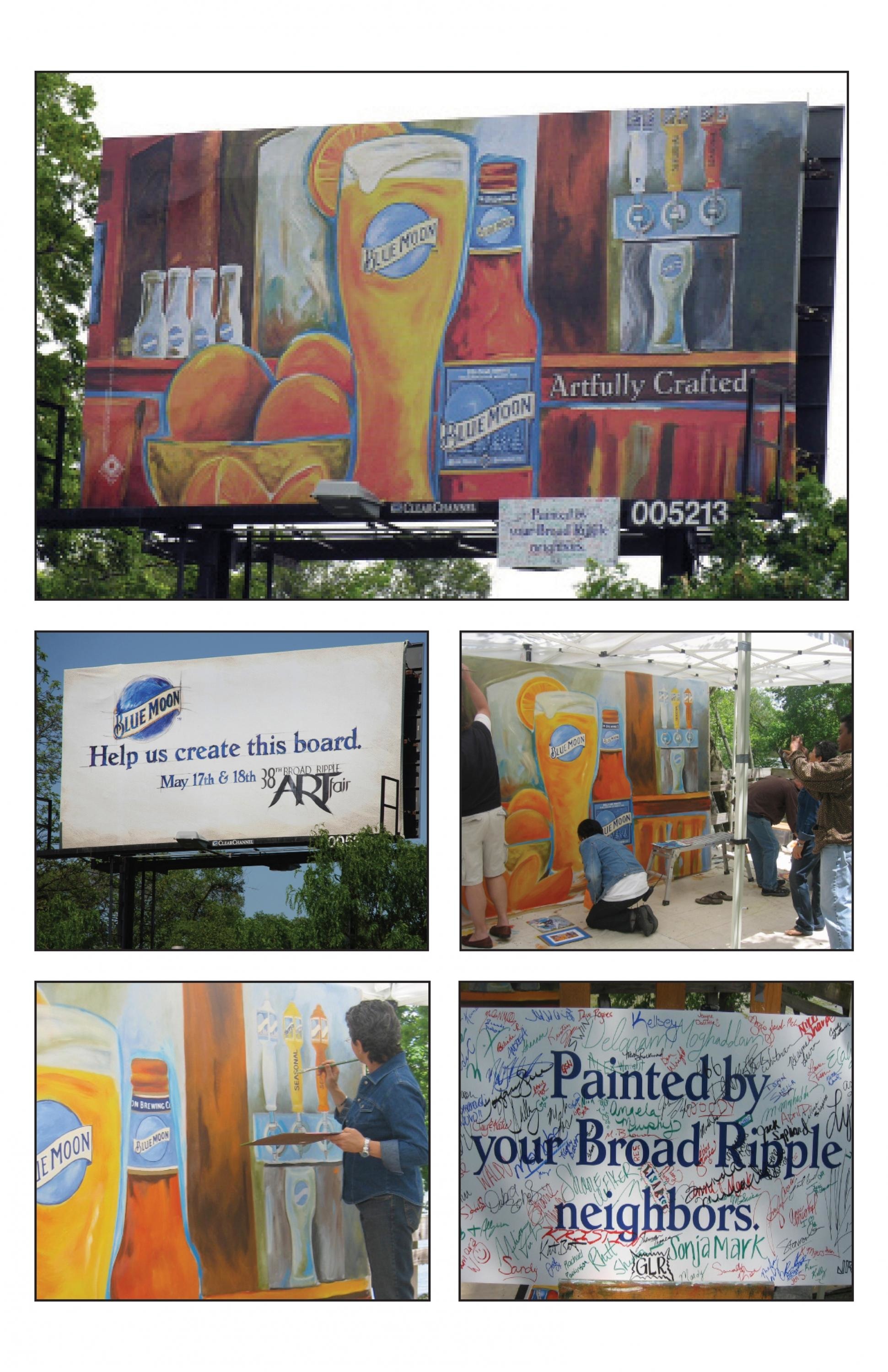
On pack, we wanted to celebrate Blue Moon's unique individuality and proposition—a joyful break from monotony. Just the act of adding an orange wheel to your beer not only creates a memorable moment for folks new to the brand, but also adds a level of care and intentionality that's authentic to the world of craft beer. Plus, the signature glass and orange garnish reinforce the brand's iconic ritual.
But that also means the new packaging must be just as full of life. Modern drinkers want more low-alc or NA options, but that doesn't mean the experience should be watered down as well. They want a beverage that makes life more interesting and enjoyable. Something that makes it feel like a special occasion.
Execution
Our redesign resulted in a unified vision that provides a clear connective tissue to the brand world. It was also critical to celebrate the brand's crafty nature and ensure drinks didn't resemble new flavors.
The logo is bolder and more prominent on the pack. It uses rich colors (Mango Wheat literally receives a very orange glow-up), clear product callouts, and a refreshed tone of voice that speaks to its heritage and Colorado provenance.
Better still, you can no longer mistake Blue Moon Light for a seltzer. Whites have been replaced with a lighter (but brighter) blue, and we placed more emphasis on Blue Moon's branding. Because the orange round is one of the brand's most notable attributes, we cleverly used just the peel for the Light offering. That same flavor appeal carries over to the rest of the brand with its distinctive serving suggestion, driving curiosity and consumer delight.
Outcome
From research testing to shelf, the redesign succeeded on all fronts with a more contemporary, eye-catching, and identifiable brand world. Better yet, people genuinely liked the refresh and thought it was a sizable improvement over the previous design.
That research also translated to the shelf. Blue Moon Light's transformation may even be the real hero of this design story, as its velocity yielded +10.4% over the L4W.
Overall, Blue Moon found improved sales trends for all the new packaging as it entered the market. Down sales from the prior year on Belgian White saw a 4-point increase. Meanwhile, Mango Wheat velocity rose +11.3% over the L4W.
Additionally, since launching last December, Blue Moon Non-Alcoholic has already become the #3-selling Craft NA brand. Considering how this emerging market is starting to unfold (and it's only been on the shelf for five months), that's massive.