Cannes Lions
Brand Identity Development for Moneta
MONETA, Salt Lake City / MONETA / 2020


Overview
Entries
Credits
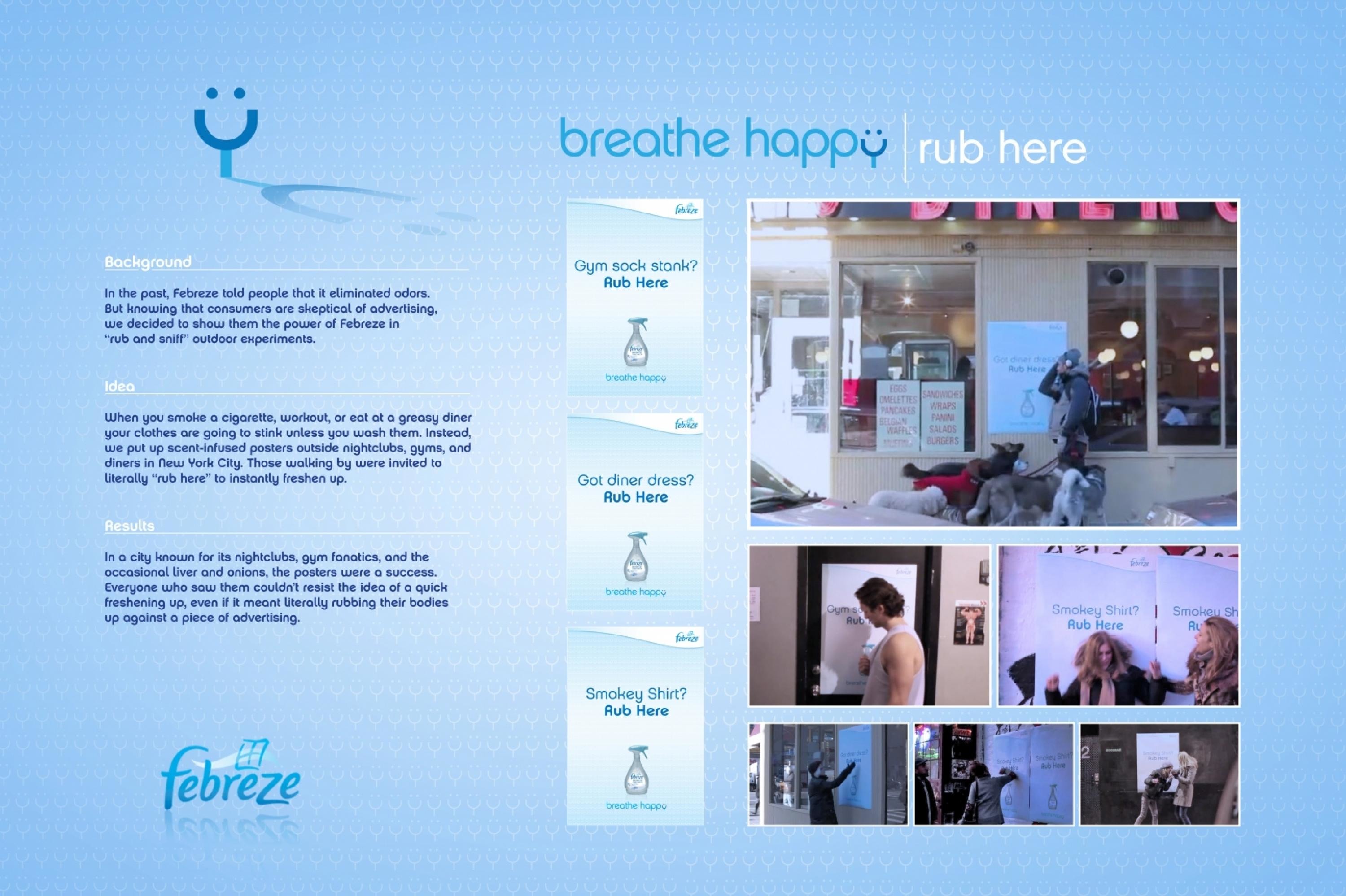
OVERVIEW
Background
Situation: Moneta is software entirely developed from the ground. Because of the startup nature of the brand, its identity needed to be developed from the ground up also.
Brief: After developing the software engine, we were hired to design a flexible identity system that was dynamic and technically inclusive. We made it our purpose to highlight the technologies used by Moneta in the brand mark.
Objectives:
- Inclusive Design
- Dynamic Behavior
- Transmit Brand’s Essence
- Unique Brand Experience
- Immediately Recognized Symbol
Budget: $30,000
Project scale and volume: Moneta is enterprise software that today serves over 80 million users. Consequently, the branding needed to present the organization at a similar level.
Idea
Brand relevance: Brandmark dynamically shows the various technologies used by Moneta by looping the behavior illustration of each technology within the boundaries of the letter M. The design gracefully overcame the challenge of balancing the brand’s geolocation characteristics and data type visuals. Moneta’s brand identity now clearly leads its highly technical audience to the world’s most dynamic Geopositioning technology. But we did not stop there, we also created a website including a series of illustrative videos to show the dynamism and the behavior of the brand, expanding the brand identity system and creating a unique and memorable brand experience.
Target audience: Highly technical decision-makers within the organization in need of Geopositioning data for their employees and assets.
Execution
Design elements and their integration:
Line: Outlining and framing
- Shapes: Creating fluid organic and rigid abstract shapes with the brandmark
- Texture: To suggest what technology a shape is made of
- Colors: To create contrast and bring focus on the final users
Design touchpoints: Website, Social media, Ads, Brochures, and Business Collaterals.
Materials, style elements, design choices:
- Color: Black and white were selected as the main colors of the brand as we wanted to keep the focus of the user on the clients who are using the software.
-Typeface: Modern geometrical san serif font was used to imply the modern and technical behavior of the brand.
-Illustrations: Bluetooth, Geolocation, and Geofencing illustration were added to showcase the technology behind the brand.
Design development, process, and Approach: At the heart of the design, we built a bold M that was multifaceted as the technology itself.
Outcome
The design gracefully overcame the challenge of balancing the brand’s geolocation characteristics and data type visuals. Moneta’s brand identity now clearly leads its highly technical audience to the world’s most dynamic Geopositioning technology.
The brand identity system has instilled a sense of relevance and has sparked much interest through business development and business investment. Moneta continues to benefit from the surge of attention via the digital assets found on the website and social media, printed collaterals in public events, and media coverage. These are all because the identity system allows Moneta's communications team to deliver their message with limited resources efficiently.
Ultimately, the brand strategy has been used as a guide to explain the technology behind the product for less tech-savvy buyers.
Similar Campaigns
8 items