Cannes Lions
Brand Identity – Window into the World
LEO BURNETT CHICAGO / THE FIELD MUSEUM / 2019

Overview
Entries
Credits
Overview
Background
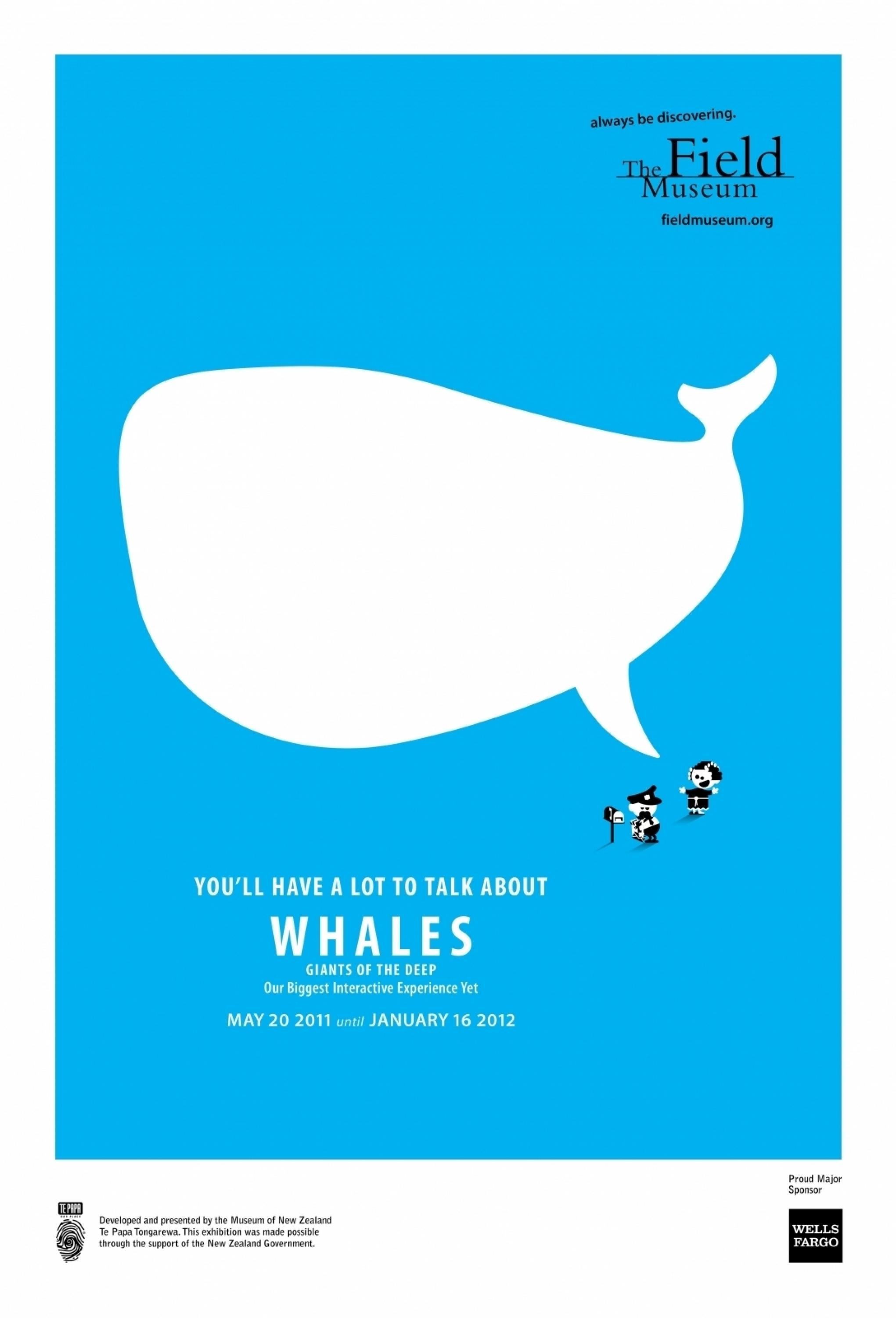
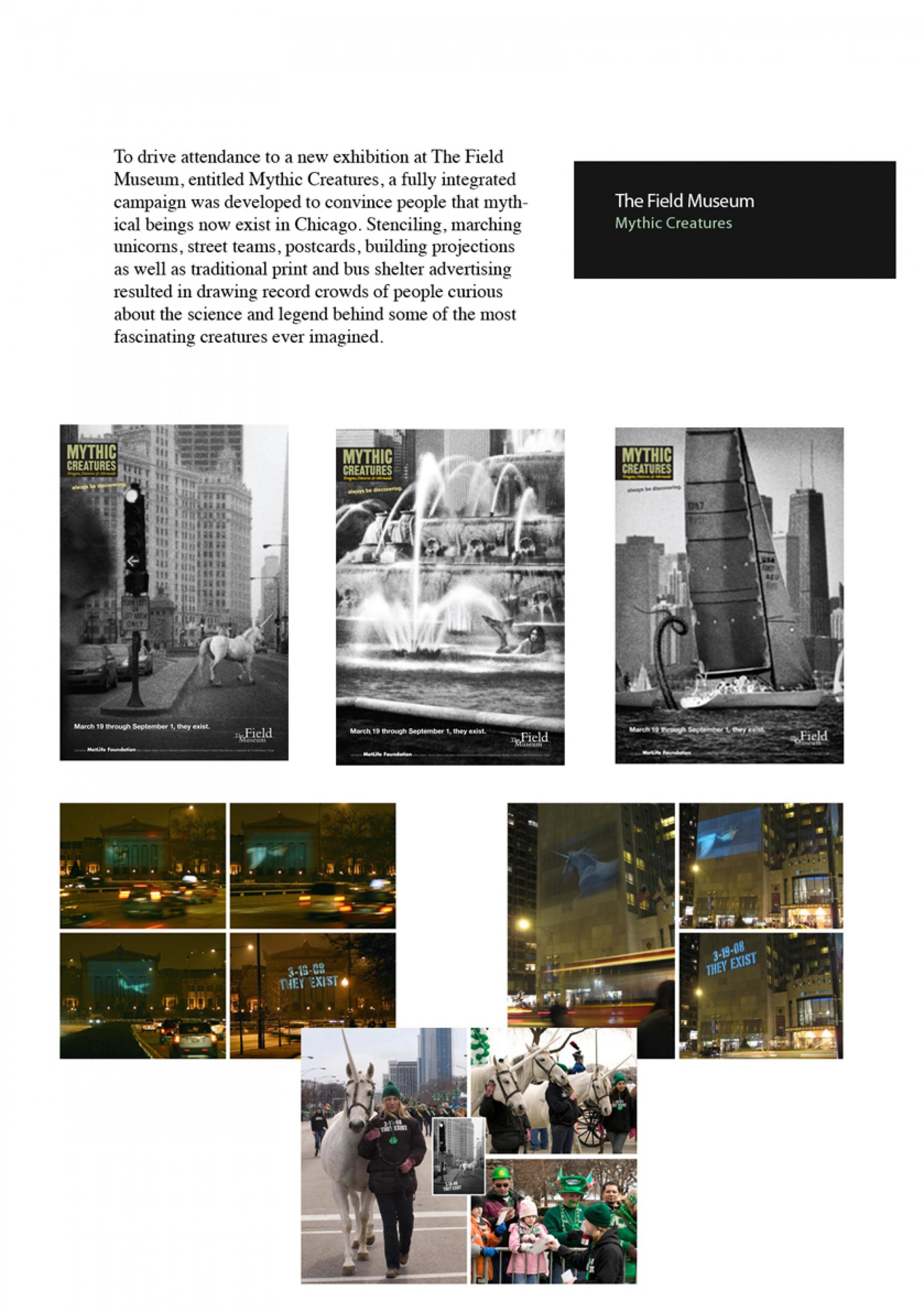
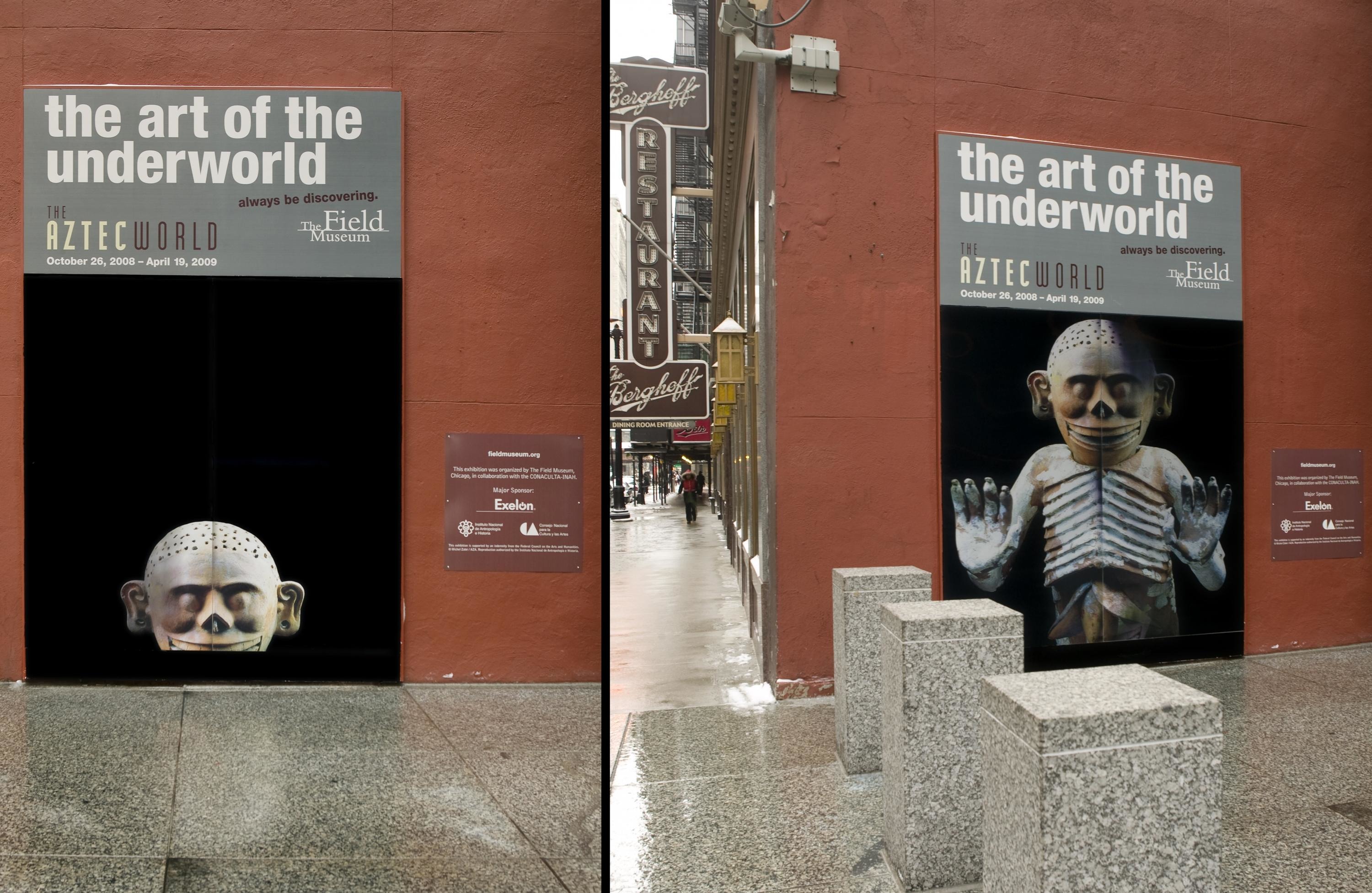
The Field Museum rebrand comes at the Museum’s 125th anniversary. At a time when people understand the importance of science, the museum knew it needed to change. Our brief was to reposition and rebrand the Field Museum as a forward-thinking scientific leader. Most felt the museum was boring, irrelevant and never changed. They were unaware of the museum’s scientific breakthroughs and that it housed and over 40 million artifacts and specimens that were used daily. The attendance was also down. Our team needed to get more people interested in scientific discovery. We had around $125,000, for media, marketing materials, signage, and website updates. Since we focused on the greater Chicago area, we phased the brand launch into specific exhibit marketing. At one point, there were four different exhibits posted. Since all of the work fell under one brand system, it was easier for the museum to launch in full force.
Idea
This new brand armed the Field Museum with a bold face to confront an unfortunate shift in our nation’s thinking. The very thing the museum stood for started to appear in the news. A cultural assault on science and fact took shape. In this era, science is important to everybody, not just the activist. The design was inspired by the important work the museum does. Imagine a footprint of a T-Rex left fossilized in soil for 66 million years, or the imprint of a meteoroid crash landed on Earth after a long journey across the Milky Way Galaxy. Anything but quiet, the boldness of this new design represents the seismic and lasting impact the Field Museum has on the community, city and the world. Our target audience included curious residents of all ages and backgrounds from of the Chicago metropolitan area, visiting tourists, lovers of science, and the scientific community.
Execution
The new logo includes two squares: the small square represents the fraction of the museum’s collection on display, while the large square, the logo itself, represents the museum’s collection as a whole. The wordmark is formally arranged much like a square grid used to divide an archaeological excavation site. The letterforms are purposely active, energetically arranged and bold. Our color is blue, like the planet we all share. Since the brand was redone end-to-end, we kept our design system simple: a few hard-working typefaces mixed with a minimal color palette. Photography is sourced directly from staff scientists in the field. The system is built to be playful, work on a grid and easy to use. The result feels familiar set within Chicago’s eclectic, gridded skyline. The brand works equally well on both a small, paper entry ticket as it does on the front of the immense neoclassical façade.
Outcome
Since its launch in Spring 2018, the Field Museum became more than a museum. Focusing on science and the future gave a new group of people something to relate to. Over 7000 people joined the museum to Speak Up for Science on Earth Day. The museum received more mentions in the news for work their scientific work, like helping designate a new national park in the Peruvian rainforest. Every touch point of the brand, including its great entry hall, has been totally redesigned and feels vibrant and alive. As a result, the museum received funding to introduce a new dinosaur to Chicago. Maximo, a titanosaur, the world’s biggest dinosaur now sits in the Stanley Field Hall. In a moment that most museum’s look back on its milestone 125-year anniversary, The Field Museum has celebrated by moving forward.
Similar Campaigns
12 items