Cannes Lions
Bundesliga Brand Refresh
MUTABOR DESIGN, Hamburg / DFL DEUTSCHE FUBALL LIGA GMBH / 2017
Overview
Entries
Credits
OVERVIEW
Description
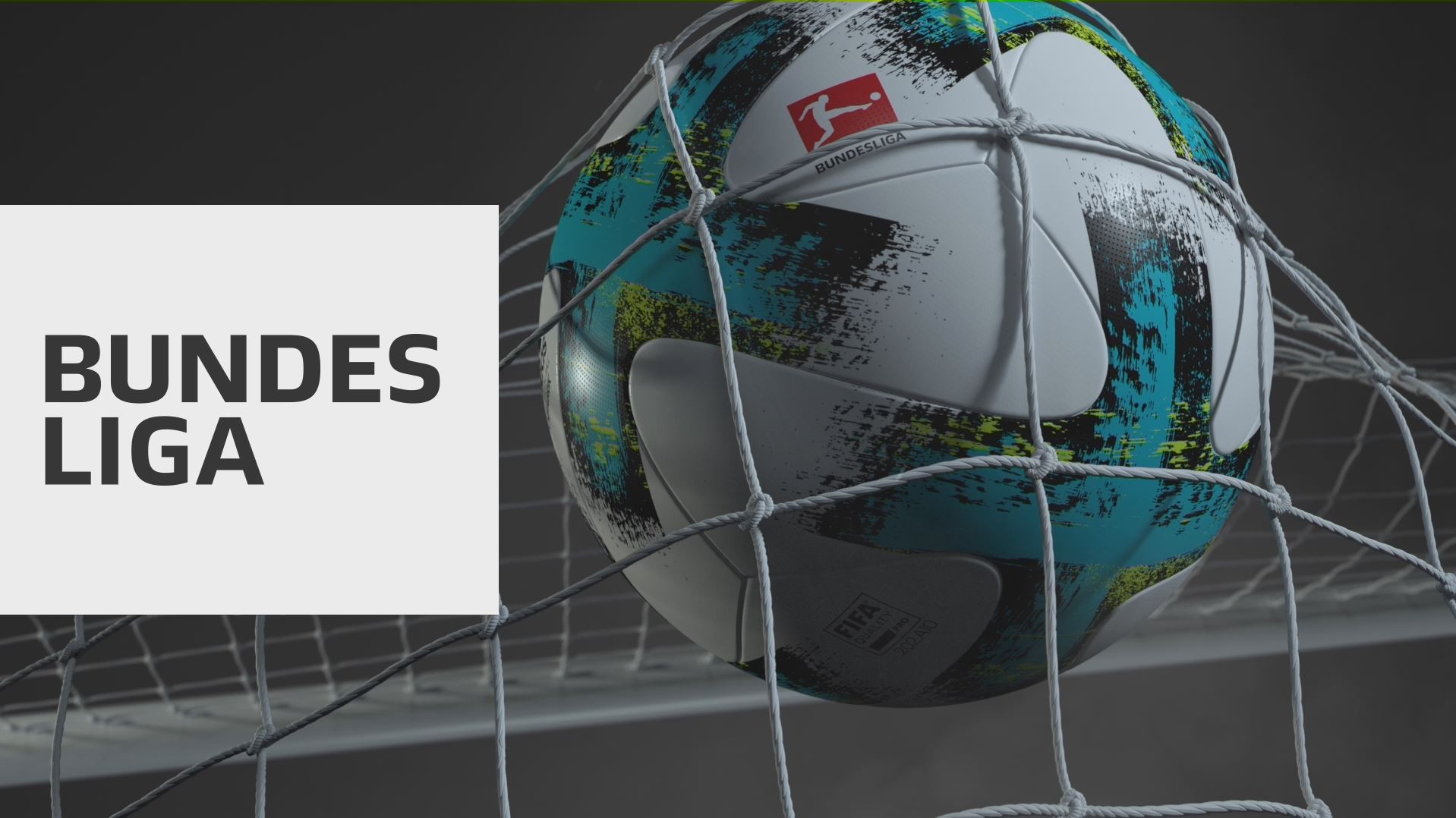
To meet these requirements, the Bundesliga does not feature a national symbol or a ball in its logo. Instead, the player is put at the center. Because that’s what football is all about: players, athletes, humans.
Execution
The dynamic figure is focused on the ball and successfully playing. The logo is fit for digital use and it can be animated. Its primary color is red, but it can be adapted to the colours of the different clubs to make its use even more popular for them. The logo is framed by a simple, digital and modular corporate design with a new script and a whole graphic set, directly derived from parts of the player. It can be animated for any digital use, it can easily be adapted to the very different sizes necessary since digitization and still it always stays the same: a dynamic player.
Outcome
The logo with the player instead of a coat of arms distinguishes the Bundesliga from the competition like other football leagues. Because of its iconic simplicity it can now be implemented in a much more flexible way: by the clubs, digitally, internationally. That makes the Bundesliga as a brand outside of „Football-Germany“ much more visible. The new logo was revealed to the press in January 2017. The new design was distributed to all clubs and partners in May 2017. It will be featured on air from season 2017/18.
Similar Campaigns
6 items