Eurobest
Bushe
SUPREMATIKA, Moscow / BUSHE / 2019
Awards:

Overview
Entries
Credits
OVERVIEW
Background
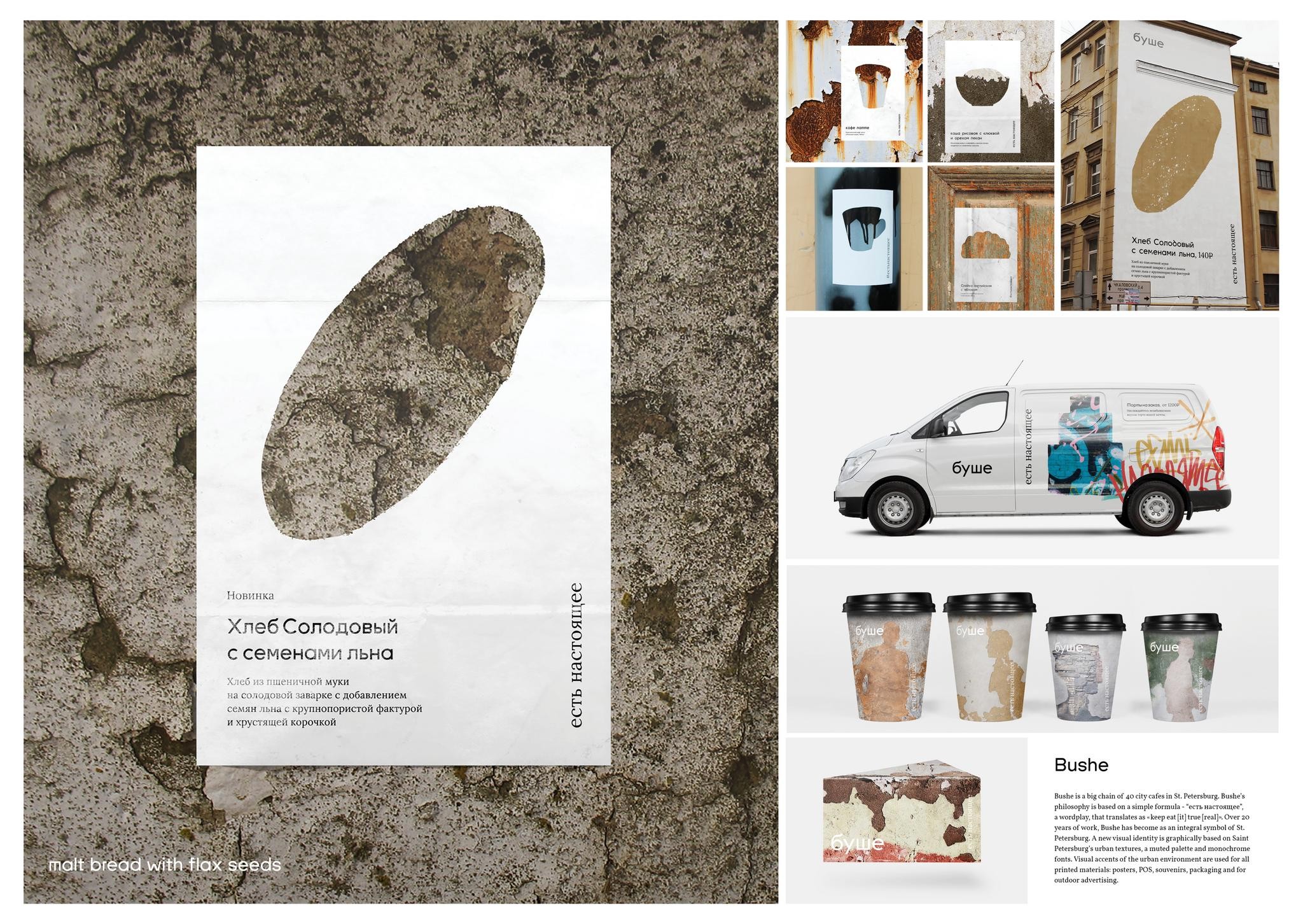
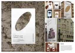
Bushe is a big chain of 40 city cafes in St. Petersburg. Over 20 years of work, Bushe has become an integral symbol of St. Petersburg with city's a special urban range, people with their stories, the architecture and the weather.
Idea
Bushe's philosophy is based on a simple wordplay formula - “???? ?????????”, translates as "keep eat [it] true [real]". It focuses on the content, and not on the external gloss.
Execution
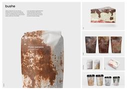
Based on this philosophy, a laconic identity was based on urban textures, a muted palette and grotesque font. Visual accents of the urban environment are used for all printed materials - posters, business cards, souvenirs, packaging and for outdoor advertising.
Outcome
The new visual Identity graphically continues the company's philosophy. So the design not only about cafes. It is about city.
Similar Campaigns
5 items