Dubai Lynx
Careem Brand Refresh
CAREEM, Dubai / CAREEM / 2024
Awards:

Overview
Entries
Credits
OVERVIEW
Background
After spending 10 years building people’s trust in the leading local ride-hailing app, brand has evolved from strictly offering the mobility of people to offering the mobility of all things, with an ambition to become the region’s first Everything App. With a deeply rooted heritage in ride-hailing, we were presented with a significant obstacle: people see us as a rides app, only.
The brief was to change people’s perception and sell them on our multi-service app.The objective was not just to spread awareness, but also build trust in an evolved Careem brand that offers a range of services.
An enormous project, spanning over 12 months, redesigning every single touchpoint, from online to offline, in-app and product, internally & externally across 11 markets, with a budget of $3million.
Idea
To shift customer perception from being a ride-hail to an Everything App, we needed to evolve our brand itself.
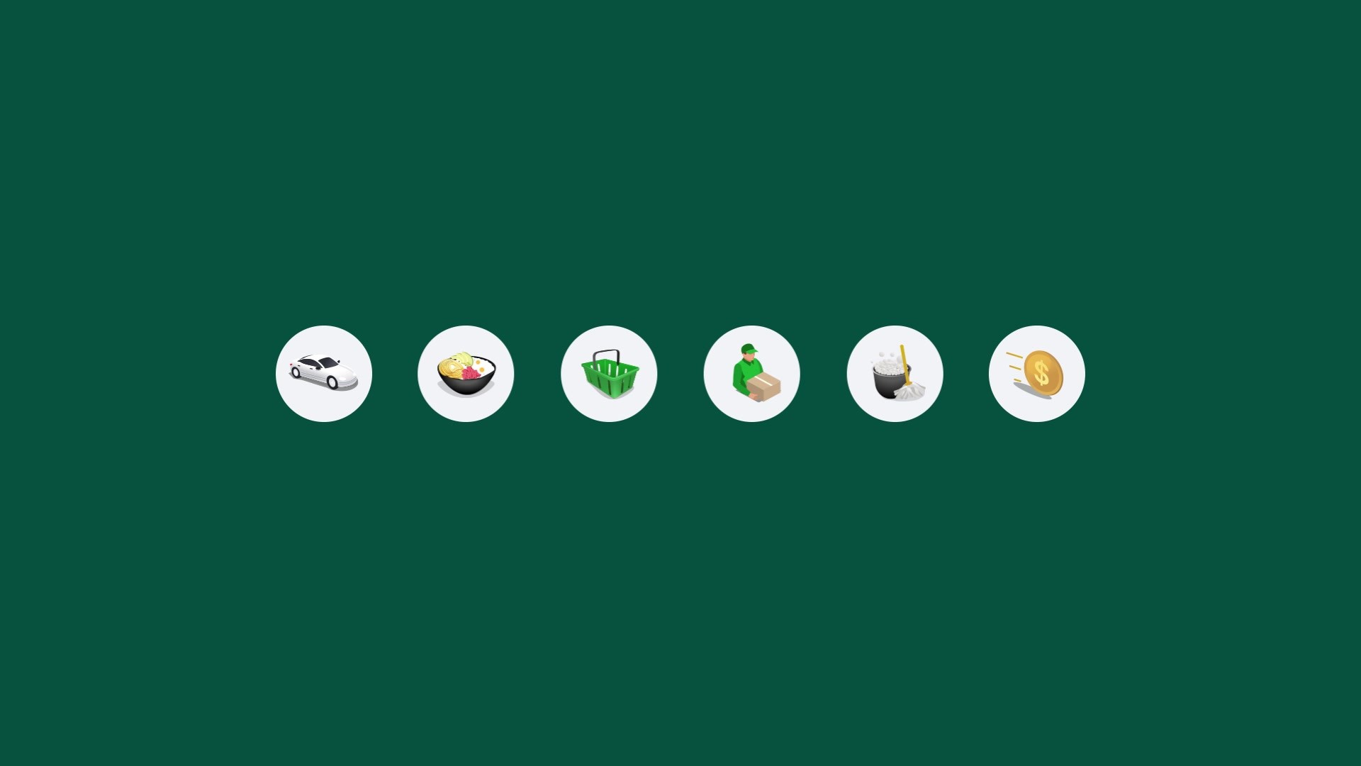
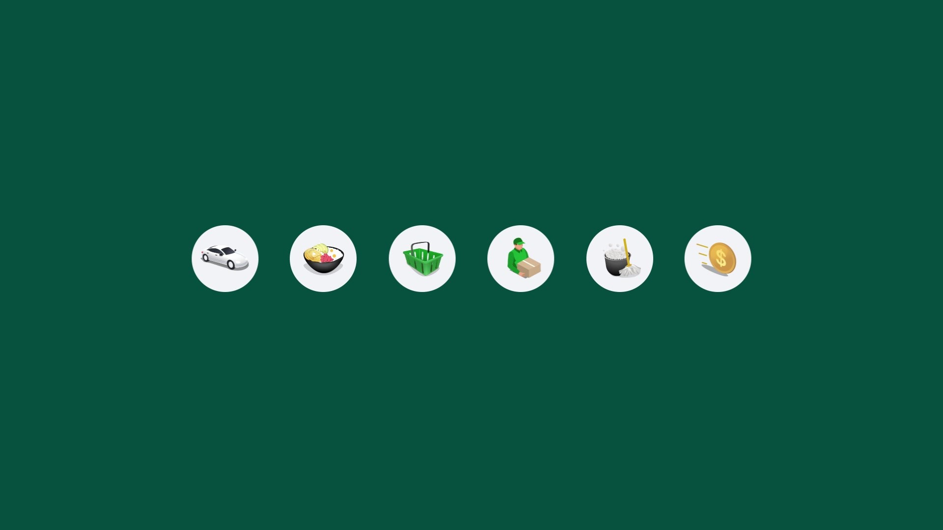
The idea started with the creation of a new brand architecture that splits our offerings into 4 categories (Go, Eat, Get, Pay) and supports the growing list of everyday services. With an incredibly wide target audience, this brand architecture allows all kinds of customers to easily and intuitively navigate the app.
Proud of the app we’ve spent years building, we realized our refreshed brand needed to retain iconic elements but reinvent itself to be more modern and current, reflecting contemporary design philosophies, advancements in tech, capturing who we are and standing out from the rest of the market. After all, the shift to an Everything App meant our competition wasn’t just ride-hailing services, but now included everything from food & grocery delivery services, financial solutions and entertainment services.
Execution
The whole 12-month process meticulously crafting every element started with the first decision- retaining and refining iconic elements, our logo and wordmark. Next, we created a brand architecture with 4 service categories, housing 20+ sub-brands. We then built the foundation of our design system: shapes inspired by everyday actions (shopping, paying, moving) with the power to change, move, expand to form endless visual possibilities, such as patterns and masks. Our new icons were formed from these shapes.
We introduced a new vivid colour palette with primary and secondary colours, all designed for screen first. A new art direction to represent our diverse audience and present clean compositions. We didn’t stop there: we changed our tone of voice and created sonic and audio branding tailored to our key markets.
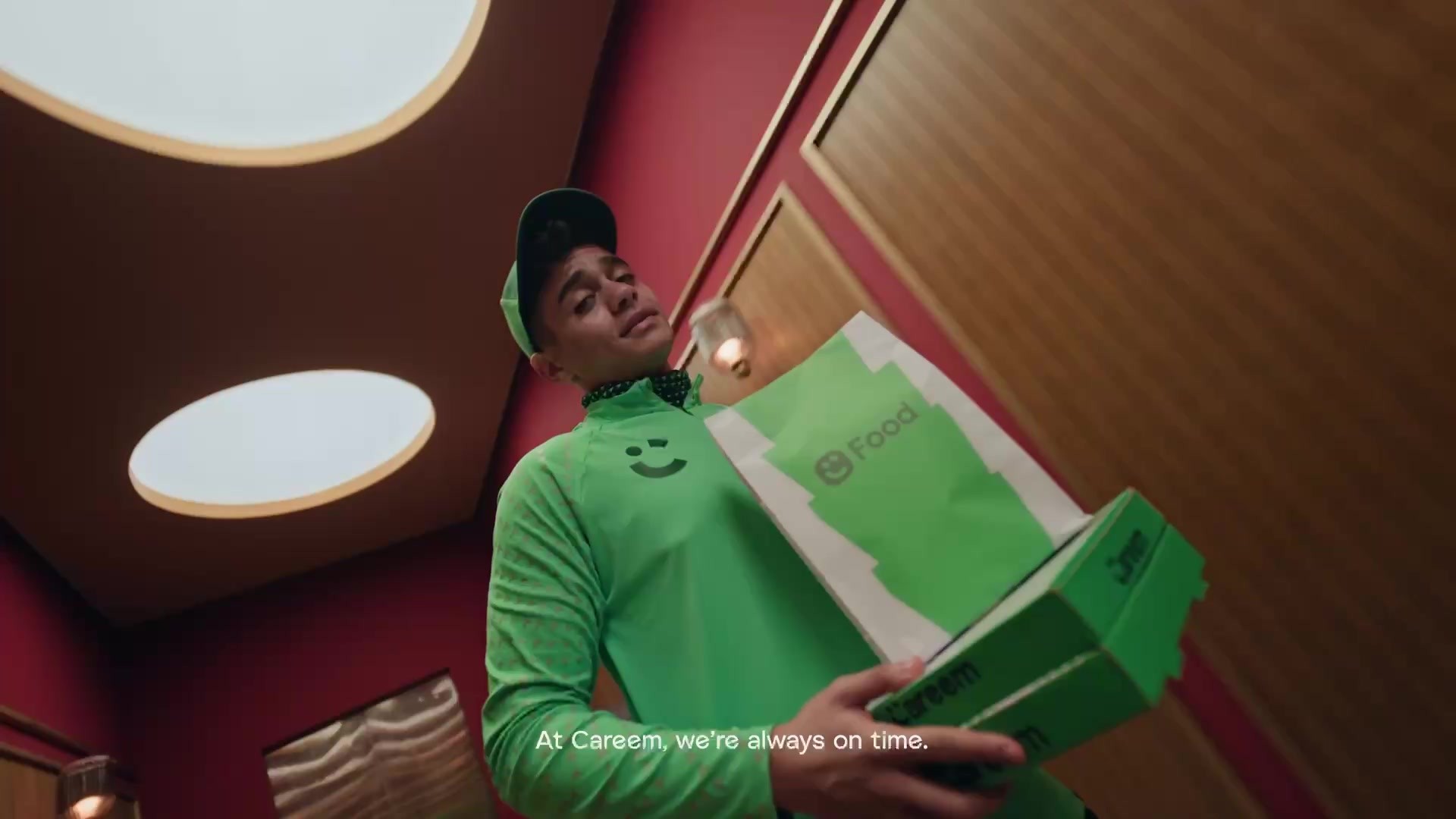
An entirely new design system- the complete brand overhaul included uniforms, offices, delivery bikes, welcome kits, product, in-app touchpoints, and more.
Outcome
The rebrand project’s success was enormous and exceeded our KPIs.
With a mission to change perception from a ride-hailing app to a multi-service app, we achieved a 70% increase in understanding that Careem offers multiple services in one place.
But perception was just the start. We saw incredible results across specific hero services such as food, where awareness of our Food delivery service doubled, resulting in a 46.7% increase in orders,
Another service that saw an even greater uplift was Groceries with a whopping increase of 109% in orders. The rebrand successfully drove a significant change in customer behaviour,, turning them from ride-hailing users only to multi-service users, resulting in an increase in the number of multi-service users by 2.5x. Lastly, subscribers to Careem Plus, our subscription program that unlocks value across all services, rose by 130%
Similar Campaigns
6 items


