Cannes Lions
CHEESE SNACK
TEAM CRÉATIF DESIGN, Sao Paulo / POLENGHI / 2010
Overview
Entries
Credits
Overview
Description
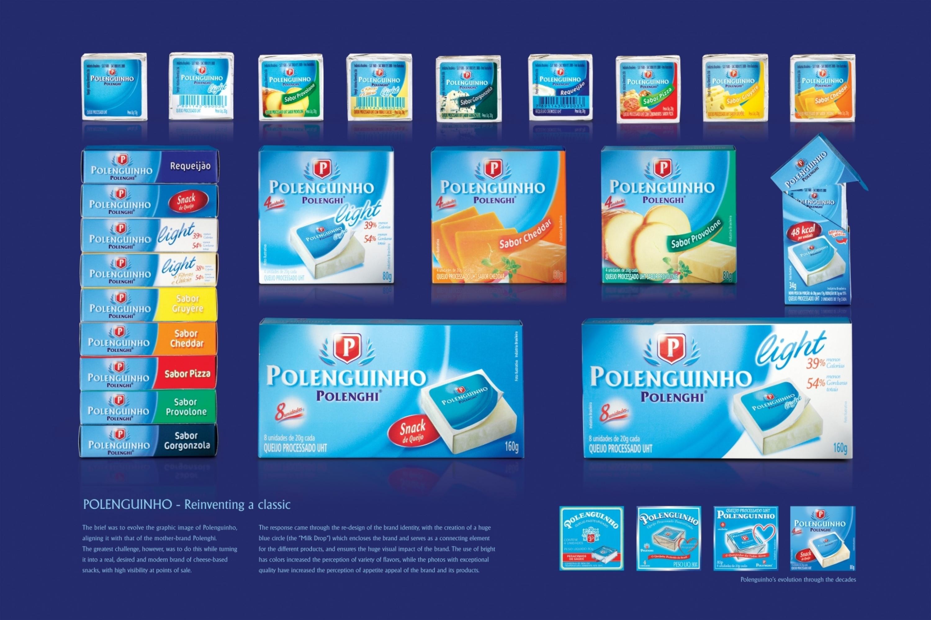
Over its 57 years of life, Polenguinho has built a high recall and a strong affective bond with consumers. However, in the past few years, it wasn’t able to evolve graphically or establish a kinship with the mother-brand Polenghi. In addition, its line extensions (flavors) had low awareness and appetite appeal. Therefore, the objective of the brief was to evolve the graphic image of Polenguinho, bringing it closer to the mother-brand and turning it into a real, desired and modern brand of cheese-based snacks.
Execution
The identity of the Polenguinho brand was re-designed together with that of the mother-brand Polenghi in order to strengthen the bonds between them. The huge blue circle (the 'Milk Drop'that encloses the brand serves as a connecting element for the different products and ensures the huge visual impact of the brand.
As a counterpoint for the powerful blue color branding, a more impactful and consistent use of colors helped increase the perception of variety of flavors and versions. Finally, the use of photographs of exceptional quality increased the perception of appetite appeal of the brand and its products.
Outcome
Introduced to the market in May 2009, the new visual identity helped the brand achieve, in 2009, its greatest sales volume of its history. This happened during a year of crisis, when the market as a whole shrank. In addition, the unaided recall of the brand increased 40%.
Similar Campaigns
7 items


