Cannes Lions
EYE CARE
TBWA\INDIA, Gurgaon / BONTON / 2008

1 of 0 items
Overview
Entries
Credits
OVERVIEW
Description
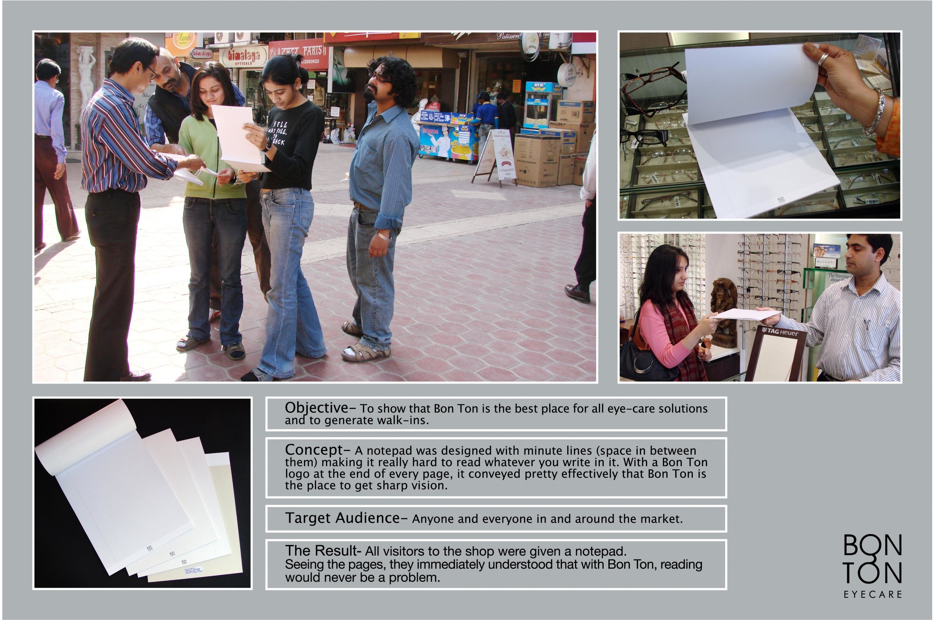
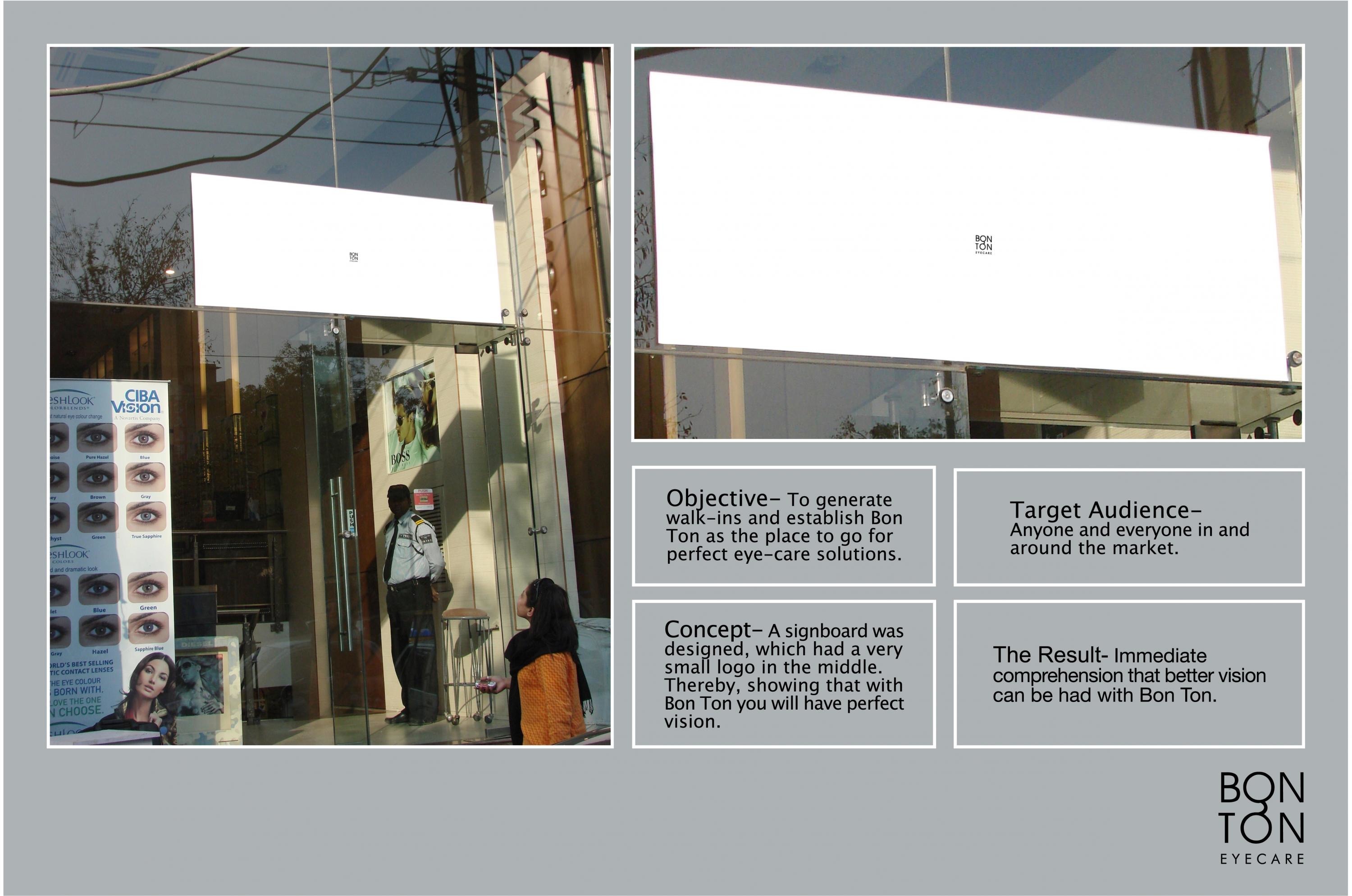
To show that Bon Ton is the best place for all eye-care solutions and to generate walk-ins.
Execution
A notepad was designed with minute lines (space in between them) making it really hard to read whatever you write in it. With a Bon Ton logo at the end of every page, it conveyed pretty effectively that Bon Ton is the place to get sharp vision.
Outcome
Anyone and everyone in and around the market & all visitors to the shop were given a notepad. Seeing the pages, they immediately understood that with Bon Ton, reading would never be a problem.
Similar Campaigns
9 items


