Cannes Lions
FRESTA MAGAZINE
NONO BRANDS DESIGN GRAFICO E DE SERVICOS , Belo Horizonte / ISRAEL KISLANSKY / 2011
Overview
Entries
Credits
OVERVIEW
Description
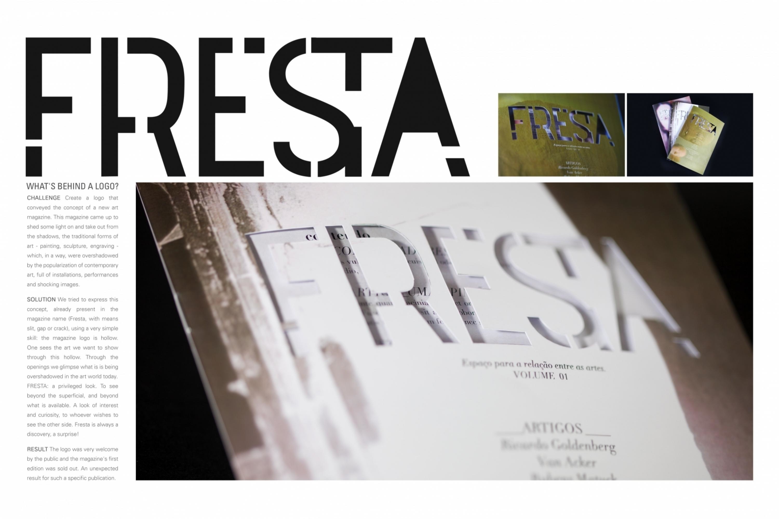
To create a logo that conveys the concept of a new art magazine.
Execution
We tried to express this concept, already present in the magazine name (Fresta, with means slit, gap or crack), using a very simple skill: the magazine logo is hollow. One sees the art we want to show through this hollow. Through the openings we glimpse what is is being overshadowed in the art world today.Fresta: a privileged look. To see beyond the superficial, and beyond what is available. A look of interest and curiosity, to whoever wishes to see the other side. Fresta is always a discovery, a surprise!
Outcome
Result - The logo was very much welcomed by the public and the magazine's first edition was sold out. An unexpected result for such a specific publication.