Cannes Lions
Impossible
JONES KNOWLES RITCHIE, London / IMPOSSIBLE / 2024

Overview
Entries
Credits
OVERVIEW
Background
Impossible Foods was founded in 2011 with a simple but audacious ambition: displace animal agriculture by convincing meat lovers to eat less meat; in the process, save the world. To achieve this, two things needed to be true: they needed a product that looked, smelled, and tasted like animal meat, and they needed to target meat eaters as well as vegetarians.
This was also a far bigger business opportunity—the US plant-based meat market is worth $2.5 billion, but the US animal meat market $132 billion ($1.4 trillion worldwide). Impossible knew what it needed to do—yet its brand was inconsistent, generic, and not delicious. It borrowed codes from plant-based categories, sometimes even from tech, and its messages on climate change were more off-putting than motivating. The brand needed a new strategy and identity system that was cohesive, distinctive, and invited meat lovers in on their terms.
Idea
To reach its mission, we needed to prove to meat lovers that the impossible was possible. Impossible’s meat cooks, smells, tastes, and even bleeds like real meat. In fact, it IS real meat—it just happens to be meat from plants.
This meant turning Impossible into a meat brand, and showing meat lovers that eating Impossible doesn’t mean sacrificing taste, health, or the culture of meat they love. We developed a new strategy, architecture, and identity that was “meatacular”, audacious, inventive and enticing. We ditched the green cues of the plant-based category so we could be meatier than ever, behaving at every touchpoint in a way that invited meat lovers to taste what the future of meat could be. Impossible isn’t here to make you sacrifice meat. It’s here to make it better.
Strategy
We conducted extensive qualitative and quantitative research to really understand what would drive switching behavior for meat-eaters.
Regardless of their views on sustainability, we found that meat eaters everywhere had something in common: they were not prepared to sacrifice the taste of animal meat, nor the culture of meat that surrounded it. This insight drove our overarching brand strategy of showing meat lovers that the impossible was possible—that Impossible’s meat IS meat—it just happens to be meat from plants.
We also worked to understand the drop-off points along the purchase funnel, from the first moment someone considers eating less meat all the way to becoming a brand advocate. This led to Impossible being its meatiest and most rooted in meat-culture at the beginning of the funnel, and saving sustainability-focused behaviors for choice moments further down the funnel as a strategy for encouraging longer-term behavior change.
Execution
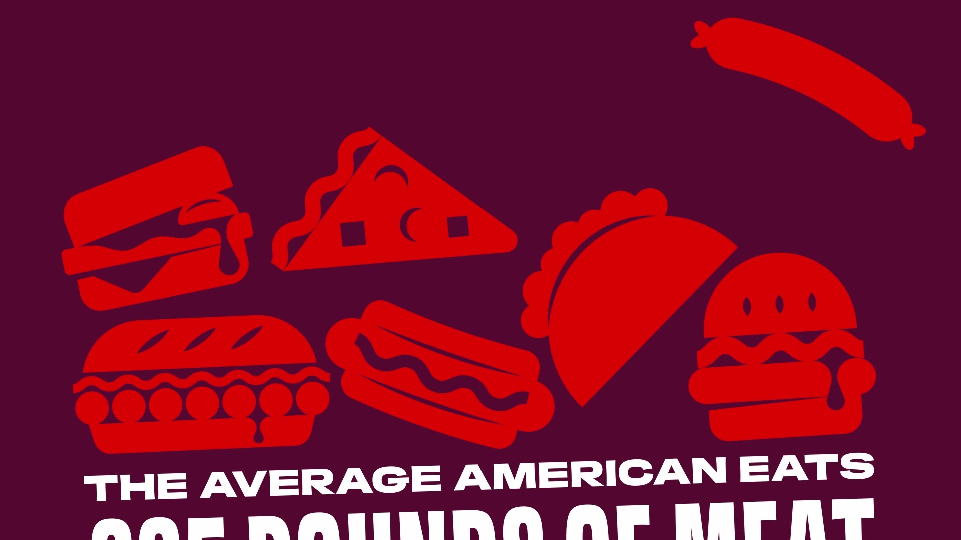
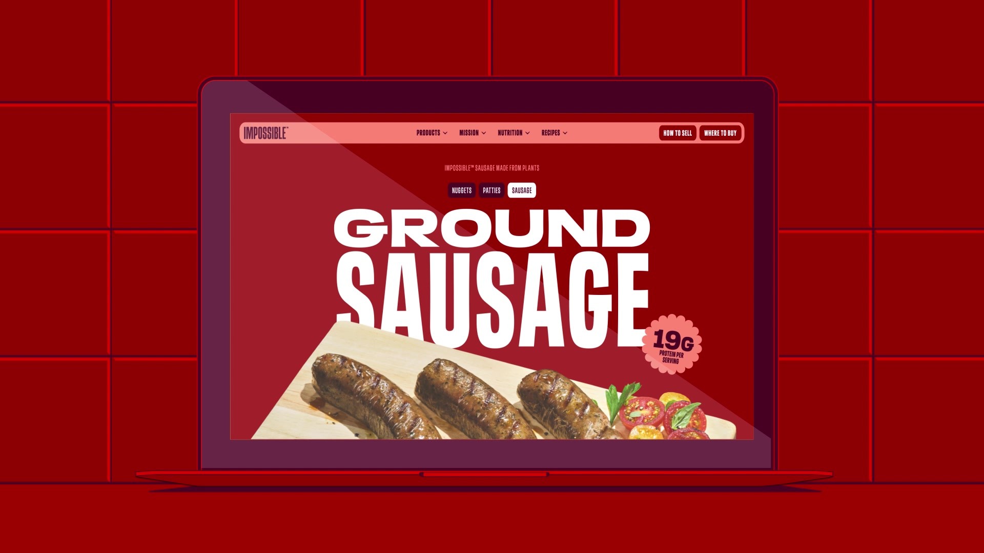
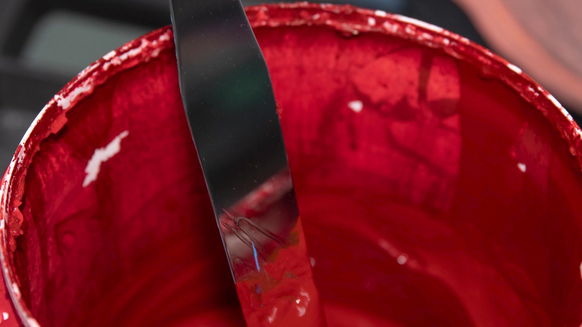
Impossible's new identity breaks free from 'green meats' with a bold, red look that attracts meat lovers and vegetarians alike, with each shade of red referencing meat cooking temperatures—rare, medium, well-done, and charred.
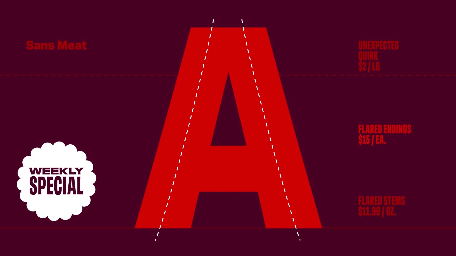
The bespoke typeface, “Sans Meat,” is reminiscent of classic hand-painted meat market signs with flares and weight variations, reimagined for a modern audience.
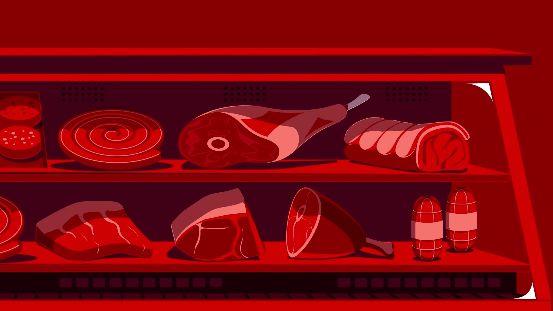
The new iconography is inspired by premium meat certifications and diner menu frames, with illustrations in the style of woodblock prints from old posters displaying cuts of meat. The packaging system grabs attention with its red shelf-block while also clearly displaying key nutritional claims. The system flexes to appeal to consumers at different journey points—it is at its most meaty and spectacular before and at the point of purchase, but able to dial up sustainability messaging and colors for more loyal customers further down the funnel.
Outcome
The world certainly smelled what we were cooking: Impossible’s rebrand scored 1.08B impressions, reached 37,239 journalists, notched a 3,946 total engagement rate, and was featured in 115 articles across Fast Company, CNBC, DesignTAXI, Trend Hunter, Adweek, Brand New, Dieline, Marketing Interactive, Graphic Design USA, Creative Review and many more.
Mark Wilson of Fast Co praised "packages that will no longer be a seafoam green apology to the planet..." and called Impossible, "the meatiest meat on the market.” Bill McCool, of Dieline, proclaimed, "the strategic shift around the perceptions of plant-based meat touches every centimeter of the brand...and leans heavily into what meat lovers relish." Armin Vit, of Brand New declared it, "a fantastic repositioning of the Impossible brand...with a yummy new look that tricks the brain into accepting it as an equally tasty option.”