Cannes Lions
M LOCAL
FITCH, London / MORRISONS / 2012
Overview
Entries
Credits
OVERVIEW
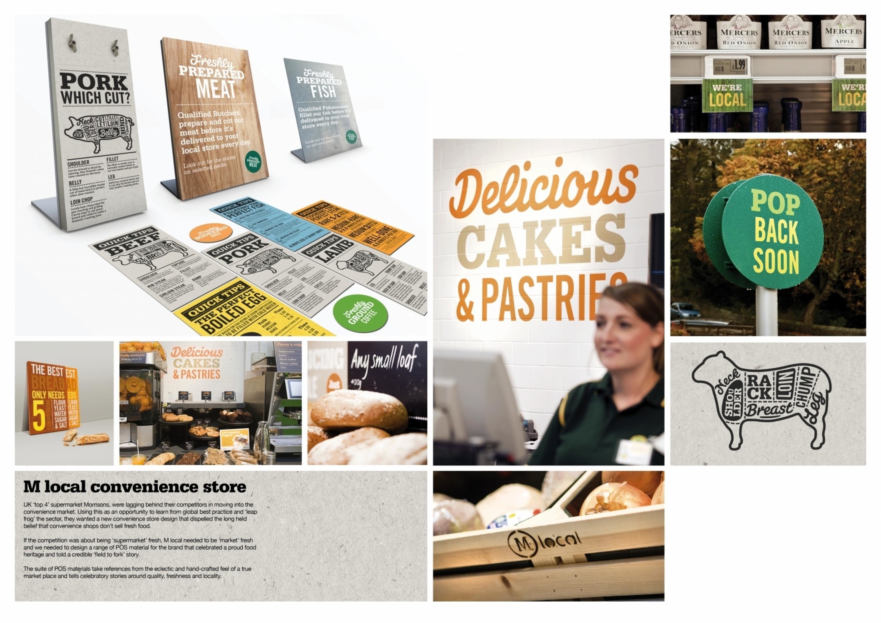
Description
UK ‘top 4’ supermarket Morrisons, were lagging behind their competitors in moving into the convenience market. Using this as an opportunity to learn from global best practice and ‘leap frog’ the sector, they wanted a new convenience store design that dispelled the long held belief that convenience shops don’t sell fresh food.
Execution
Taking cues from the eclectic and hand-crafted feel of a true market place, we developed a new vibrant brand language- introducing fresh green to the colour palette and using a natural typographic style and materials to deliver a more authentic and playfully human face for Morrisons, thus prompting people to better engage with the brand.A new suite of POS material tells celebratory stories around provenance, quality, freshness and locality, as well as making suggestions for meals that can be cooked from scratch.
Outcome
"M local provides the most differentiated and compelling small shop offer the UK has seen in many years. Based on a design that’s rooted in strategic brand knowledge, the new concept isn’t just different for different's sake but provides environments that celebrate the very heart of Morrisons’ brand history and positioning. A genuinely usable design with customers and colleagues in mind, M local allows neighbourhood communities to experience the fresh food that Morrisons is famous for, in an environment that is truly reflective of everything our brand believes in". - Joe Ward, Head of In-Store Marketing, Morrisons
Similar Campaigns
12 items