Cannes Lions
Manischewitz
JONES KNOWLES RITCHIE, London / MANISCHEWITZ / 2024

Overview
Entries
Credits
OVERVIEW
Background
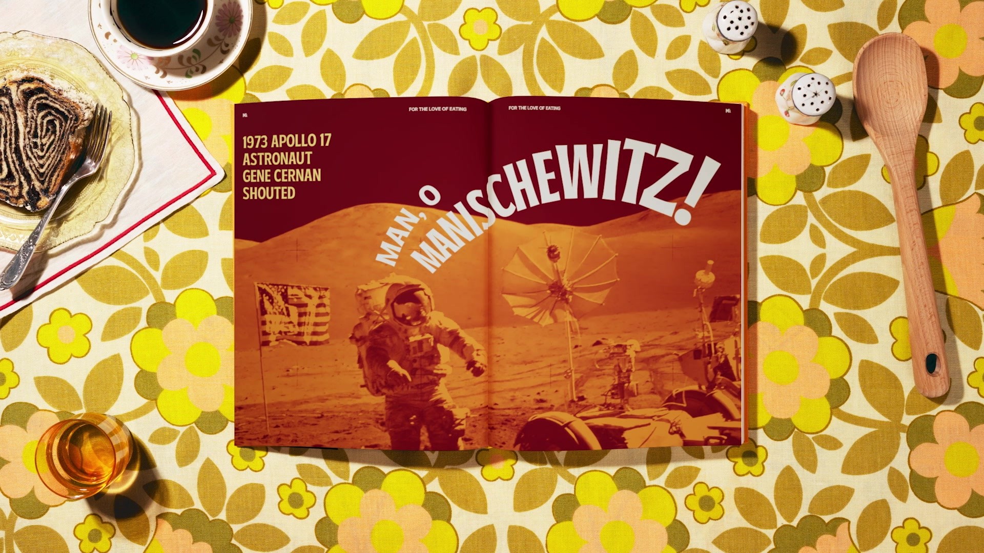
From movie quotes to Halloween costumes, Manischewitz holds a special place not only in Jewish culture, but American culture—they’re part of the zeitgeist. But while people know the Manischewitz name, they don’t necessarily know what it is, and probably can’t name a product. They certainly couldn’t tell you what it looked like or where to find it on shelves—and for a clear reason.
The Manischewitz brand did not look as flavorful, outspoken, or fun as their fame would suggest. We saw an opportunity to create a distinct strategy and brand identity to reassert Manischewitz as THE Jewish food brand for mass market consumers, all while maintaining our existing loyal consumers. In doing so, Manischewitz invites EVERYONE to experience Jewish culture and cuisine.
Idea
Jewish cuisine is more than just food. It’s a feeling. We needed to connect with consumers in a way that transcends any dish.
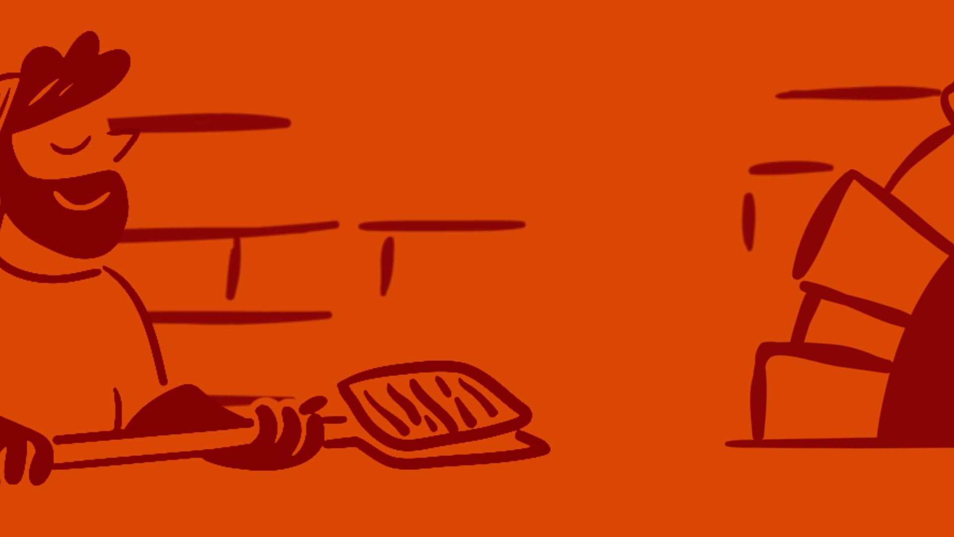
Within Jewish households, the interplay between family and food is also embedded with religious and generational symbolism and traditions. The rebrand brief gave Manischewitz the opportunity to bring the importance of sharing meals and making memories to the forefront. With vibrant, eye-catching colors alongside playful illustrations and type lock ups, we mimic the hustle and bustle of a multi-generational dinner table that every family and culture can relate to. In doing so, we bring Manischewitz (and Jewish food) to a new breadth of audiences that understand the meaning of savoring traditions.
Execution
With a rebrand that honors Manischewitz’s heritage, we started cooking up new elements that appeal to a broader, mainstream audience. We introduced bright, warm colors, fun illustrations that celebrate food moments, and a custom logo and typeface complete with Hebrew-inspired details.
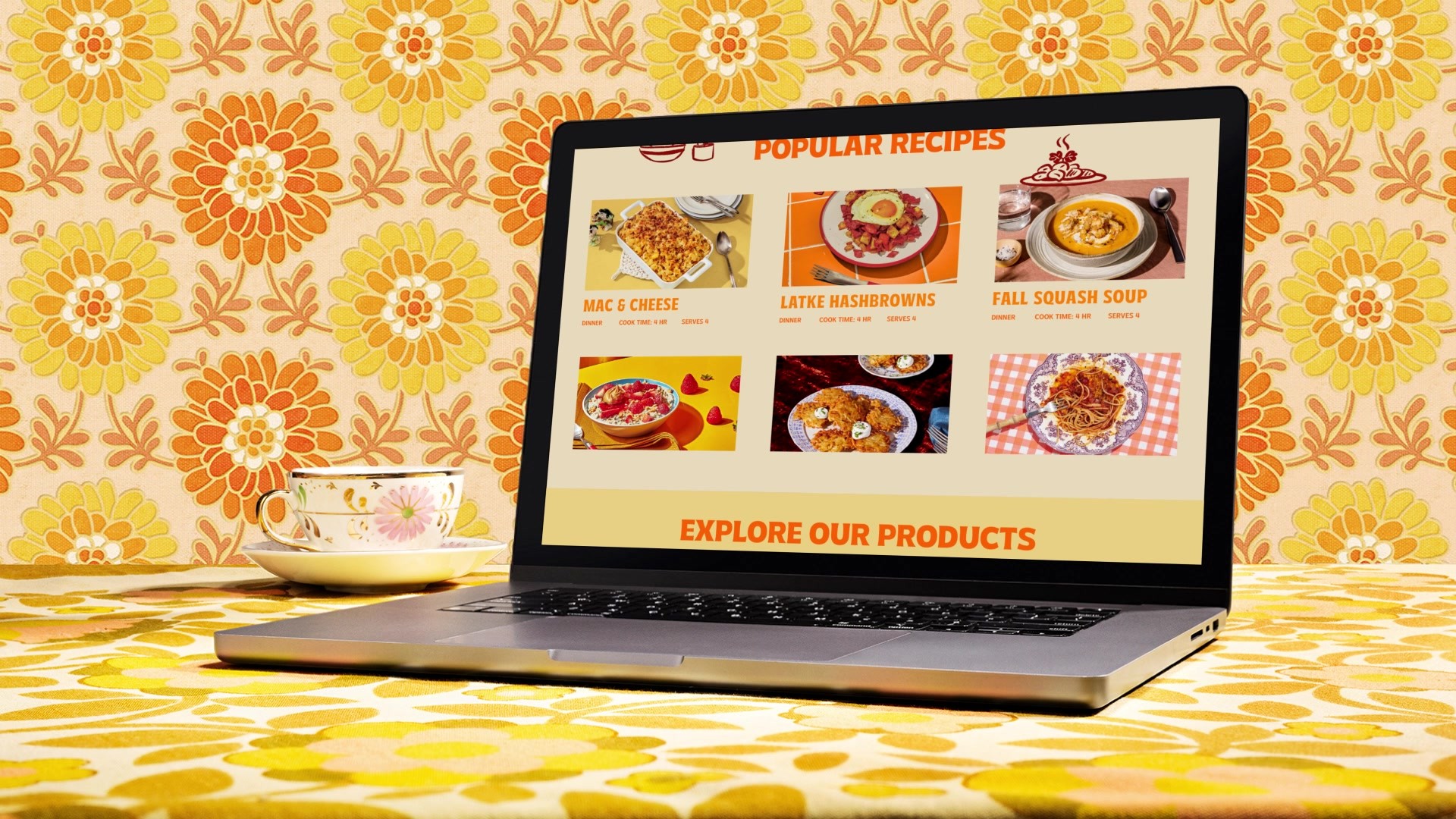
The new logo shows up strong and dynamic, like a snack-size Mani’z for snacking SKUS and M’z for shorter applications like social. These elements flex across SKUs like soup and potato chips, huge store takeovers, a fresh digital ecosystem on website and social, branded swag, and an OOH launch campaign to boot!
Outcome
“With a Fresh Look and Recipes, Manischewitz Courts a New Generation" according to The New York Times. Launched in time for Passover, one of the biggest holidays on the Jewish calendar, the news generated over 1.55B impressions, 136 articles, and 1.51M journalist reach. Consumers love the new identity and are taking note of the brand’s revamped image. This rebrand has not only invigorated sales, but has also revitalized marketing efforts with even greater resonance in the marketplace with new packaging and brand collateral in more than 14K points of distribution.