Cannes Lions

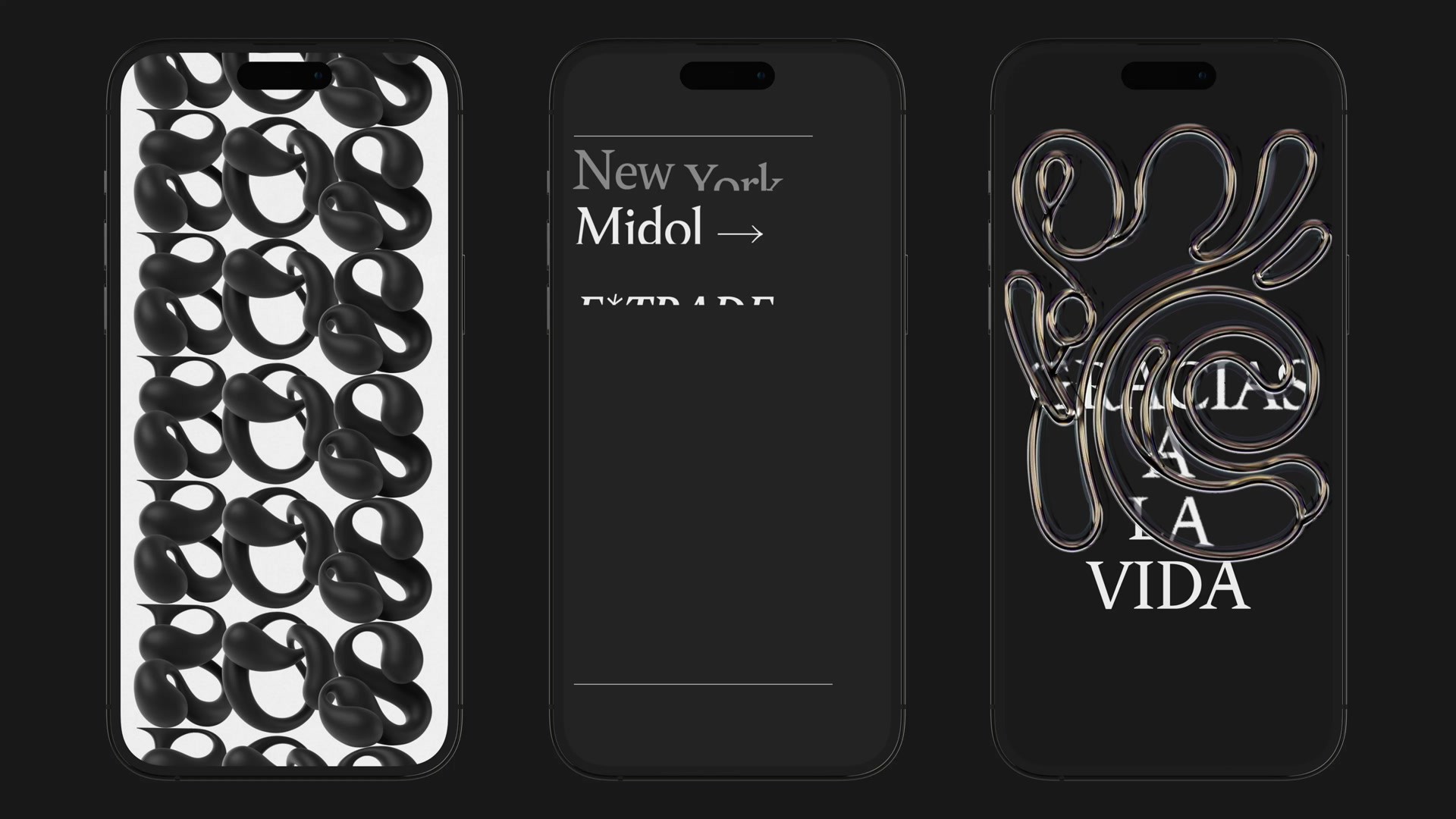
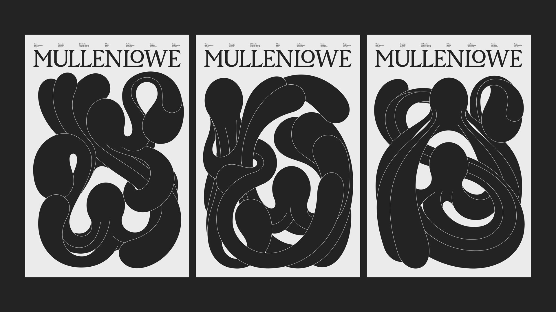
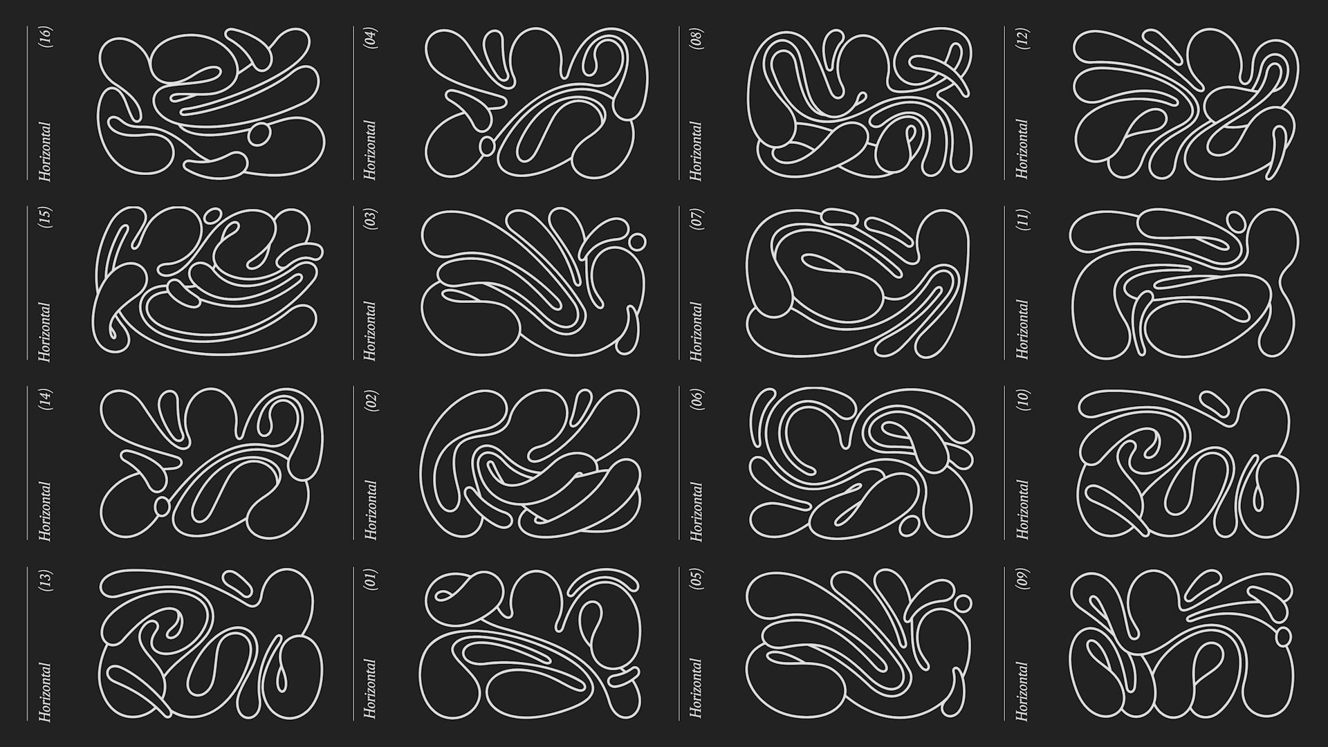
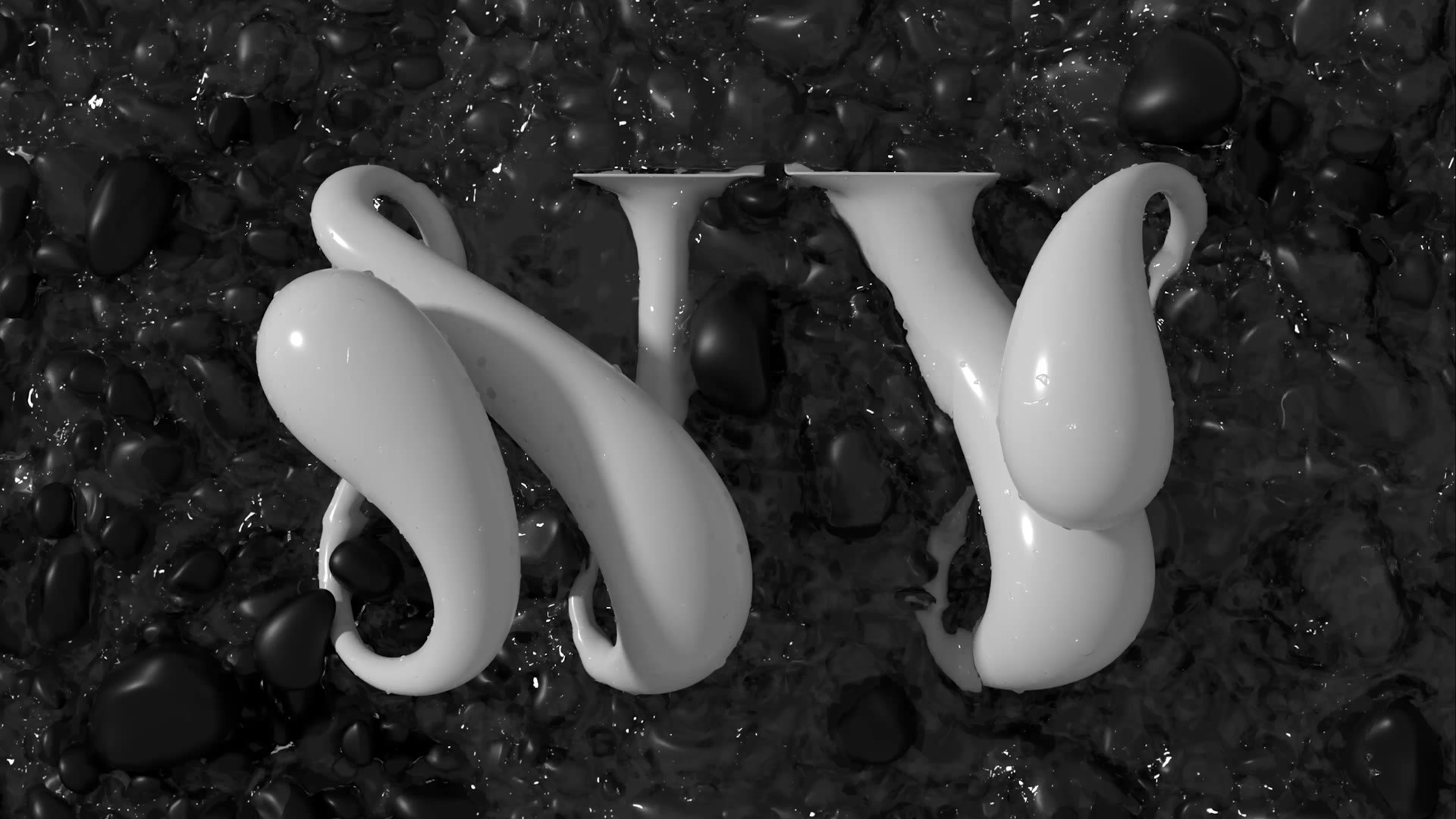
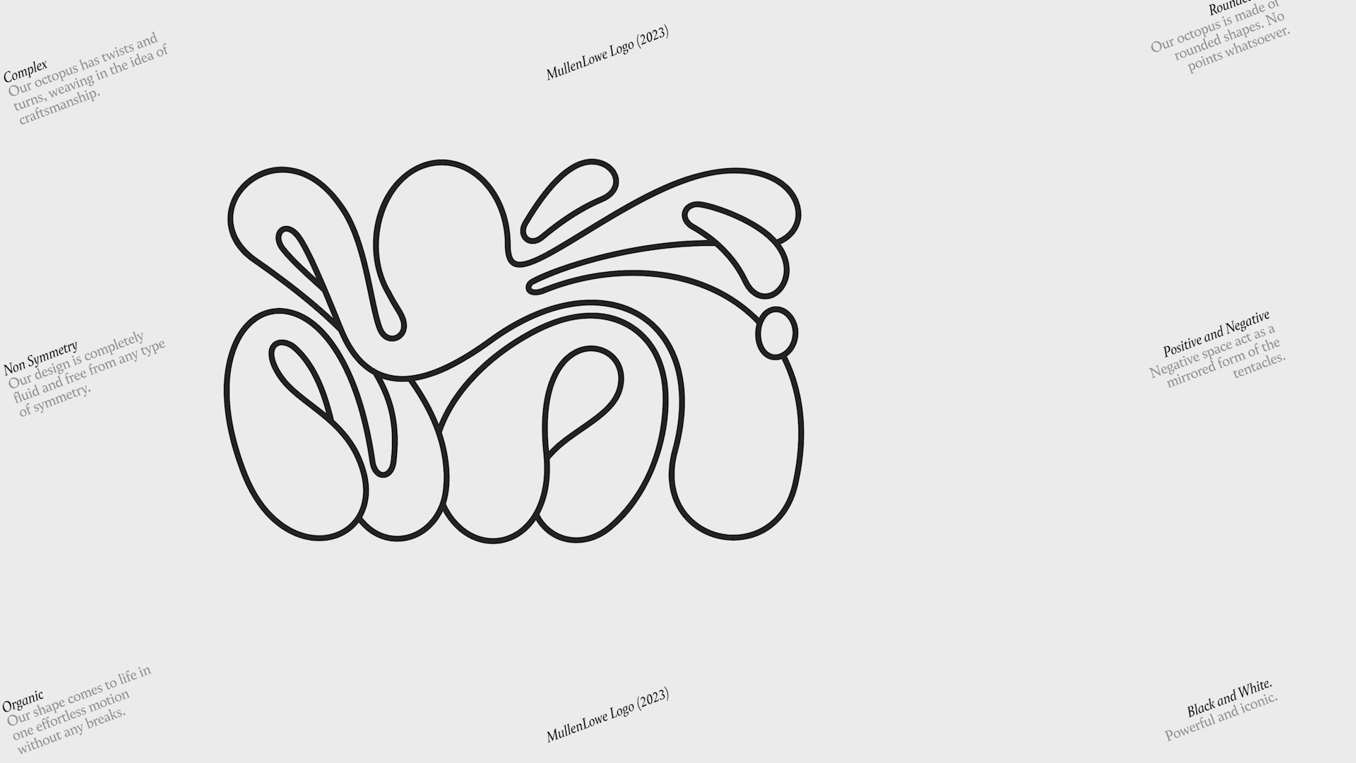
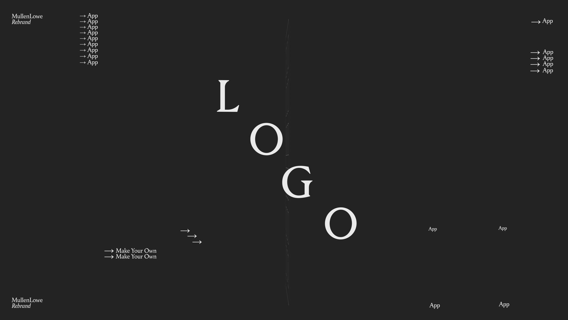
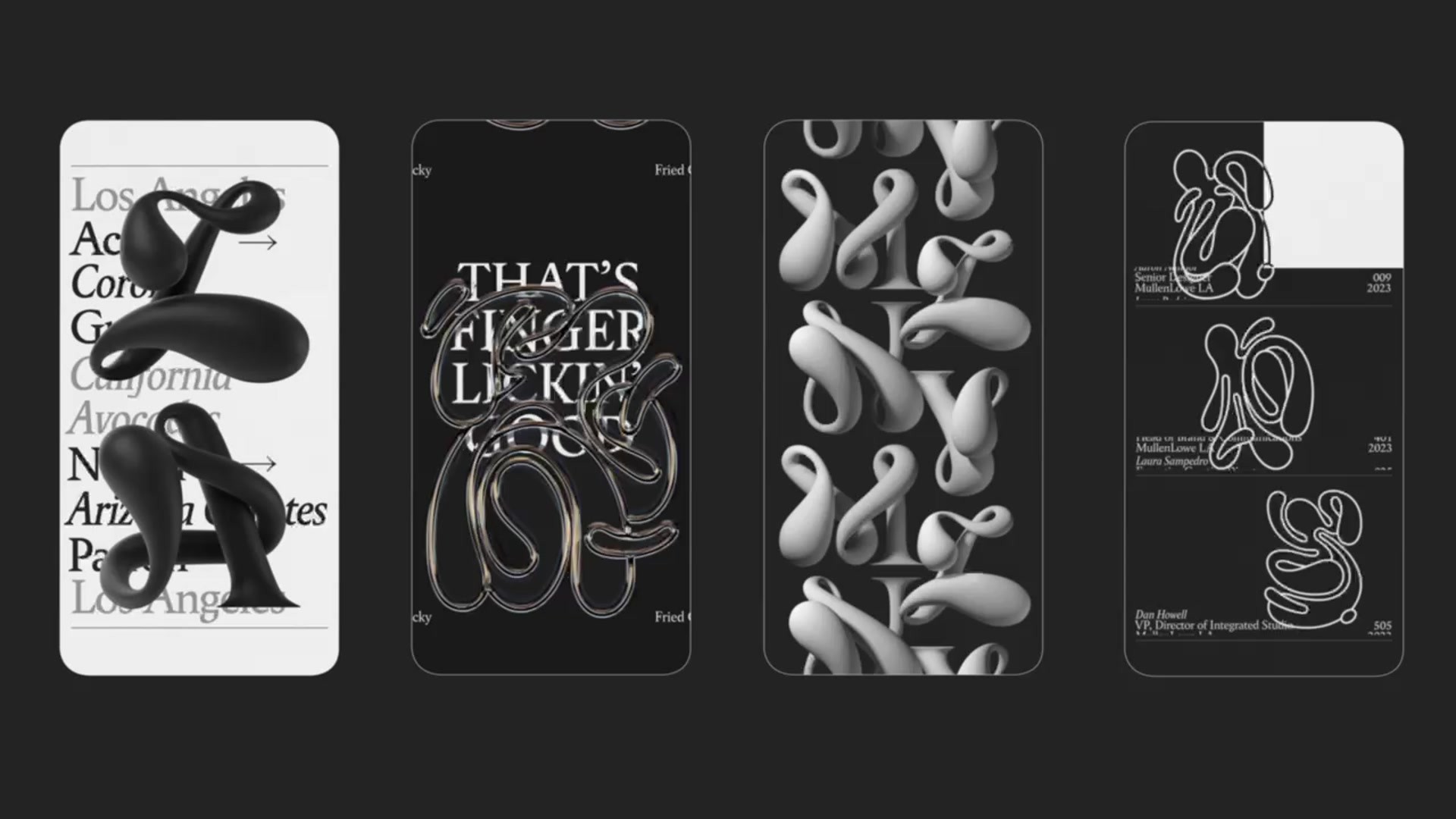
MullenLowe Global Rebrand

MULLENLOWE U.S., New York / MULLENLOWE GLOBAL / 2024

Awards:

1 Gold Cannes Lions
1 Silver Cannes Lions
1 Bronze Cannes Lions
2 Shortlisted Cannes Lions
Presentation Image
Supporting Images
Supporting Images

Overview

Entries

Credits

Overview

Background

MullenLowe grappled with an inconsistent visual identity problem with different network regions using their own logo versions. One thing remained consistent: the octopus was a unifying symbol of the network.

The brief was to distinguish ourselves from other agencies – it was not just a desire, but a necessity. Our new identity had to be simple enough to resonate globally yet nuanced enough for every region.

With this brief, we saw a significant opportunity to showcase our conceptual and executional capabilities. We revamped the visual identity around the octopus icon. It pays homage to the octopus' fluidity and adaptability, focusing on its essence rather than physical form. The logo is designed to evolve without losing its iconic nature and crafted to show personalization at scale. Every campaign element makes a bold statement in terms of both thinking and craftsmanship, all while reinforcing the concept of the octopus' fluidity and adaptability.

Idea

MullenLowe's new visual identity reimagines its octopus by capturing the fluidity and adaptability that make it unique.

This ever-evolving logo has the ability to morph into thousands without sacrificing its pliable, unmistakable iconicity. In fact, each of our employees was encouraged to create and utilize their own personalized logo.

We did not want a traditional, corporate branding system. We were looking for a brand identity that was rich, varied, ever-changing yet instantly recognizable, memorable and undeniable.

There is a very wide range of graphic elements and an unlimited amount of design combinations that make it fun, unexpected and modern. At the same time, the design system makes it all work seamlessly in a surprisingly coherent way.

Strategy

The strategy was to craft a visual identity capable of unifying the network, showcasing the exceptional talent behind our name, and instilling a sense of pride and belonging among our thousands of employees worldwide by allowing them to literally put their mark on our branding.

Execution

We conceptualized the entire idea, designed the logo and its applications, and gained full approval from global leaders. Subsequently, we executed the identity, incorporating an internal system enabling everyone to create their own personalized version of the logo for use as a signature and on stationery. We developed a typeface, website, a shared global presentation deck, guidelines, signage, posters, patterns, apparel, and consistent social media posts and assets that have been utilized uniformly worldwide.

Outcome

It's difficult to quantify the impact of the posters alone. However, people are excited to enter a room, feel their presence and see their name on them. Clients love to feel included and considered as an integral part of the creative process, not just the commissioner.

In general terms, MullenLowe's new visual identity has been the most talked about agency rebrand of the year, with almost 100% positive sentiment (98.3% is the number and that is because concepts like "sick" or "dope" were identified as negative by the algorithm).

Here are some highlights:

- 155 organic earned media impressions

- 300% brand surge on Google

- 98.3% positive sentiment

+2,550 social mentions

+16% inbound calls

+35% new business opportunities directly related to the rebrand.

- Featured in Monotype’s 2024 trends report.

- Featured in main design and creative outlets such as "It's Nice That", "Print Magazine" Communication