Cannes Lions
Nando's Global Packaging
FAMOUS COPY, Johannesburg / NANDO'S / 2016
Overview
Entries
Credits
OVERVIEW
Description
Our design partners seized this opportunity to design packaging like nobody’s ever seen before. Following extensive research into how consumers eat their Nando’s, they developed packaging that thinks smart, looks great and is kinder to the planet. But the packaging could not merely look like Nando’s – it had to sound like Nando’s too. What if we could use the prime real estate provided by the packaging to not only explain the pack functionality to consumers, but also to express our passion for our food and our environmental credentials? We therefore followed a dual approach. Where a specific pack is used for only one SKU (full chicken, for example), we would use the copy to talk about the love of our food. And for packs with multiple SKUs, we would talk about our love for the planet.
Execution
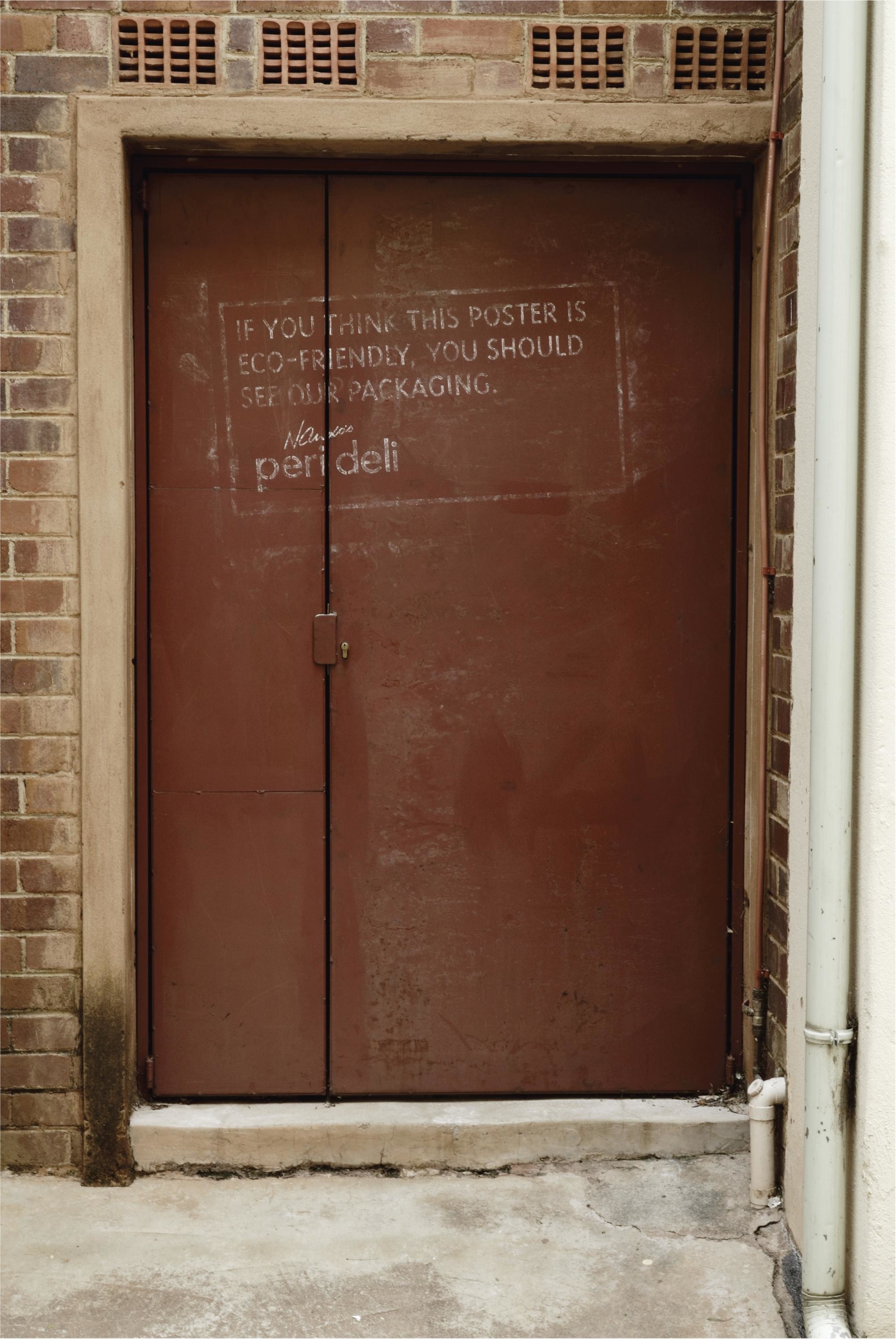
The packs’ graphic design is dominated by an icon, developed to transcend geographical boundaries. It contains three fundamental Nando’s intrinsics – PERi-PERi (represented by the chilli), flame-grilled food (represented by fire) and passion and authenticity (represented by a heart). Some aspects are in the positive, some in the negative. Copy was carefully placed in obvious and non-obvious places (to encourage pack exploration). We were extremely aware that not everyone has the appetite to read long(ish) copy. So to give Nando’s fans enough delightful copy to keep them satisfied, while still expressing our core message to copy-averse consumers, we wrote the copy in a different way. Our core message is expressed in bold lines at the beginning and end of the deck so that those sentences can be read in isolation. But the space between these sentences was filled with meaty Nando’s copy – because the fans would expect nothing less.
Outcome
The new global packaging brought the brief to glorious life. Our premium chicken looks like premium chicken. And our packaging is now as distinctive as the Nando’s brand itself: immutably characterful, constantly innovative, carefully considered and deeply inclusive. But we should acknowledge that this kind of packaging is not intended to stimulate short-term sales. Rather, it is part of the brand’s continued integrated efforts to position itself within its category, build brand equity and cement consumer loyalty. The first phase of the packs’ global rollout has yielded clear consumer value as the pack benefits are readily apparent. Eating a burger is no longer a messy affair. Full chickens are served in their full glory. Because the packs enable the brand to deliver a consistently delightful consumer experience, they strengthen brand perceptions and exceed customer expectations.
Similar Campaigns
12 items