Spikes Asia
NOC Coffee Co
SUPERUNION, Hong kong / NOC COFFEE CO / 2018

Overview
Entries
Credits
OVERVIEW
Background
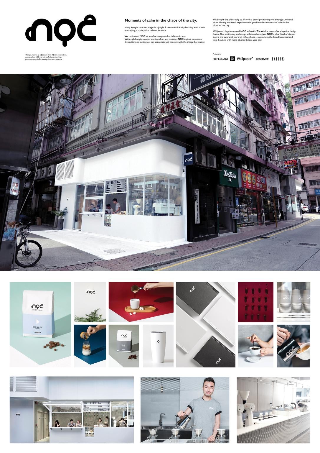
Hong Kong is an urban jungle in a jungle. This densely populated, vertical quagmire, is bursting with content - satiating an era that believes in more.
NOC is a coffee company that believes in less. Less of what you don’t need, or never asked for.
Less confusing menus. Less multiple choice. Less overly interested sales people. Less cutting corners.
With a philosophy rooted in minimalism and curation, NOC aspires to remove distractions, so customers can appreciate and connect with the things that matter.
We bought this philosophy to life with a brand positioning told through a contemporary visual identity and retail experience designed to offer moments of calm in the chaos of the city.
Execution
A brandmark was designed to express three coffee cups form different angles, suggestive of curation – and applied to a variety of collateral with a minimal design aesthetic.
We created a bespoke art direction style, and shot an image library for social media, print and promotional use.
Retail environments were designed to be sanctuaries of calm in the urban jungle. Meticulous attention to detail, use of white space and contemporary fittings come together to remove daily distractions, so customers can connect with the things that matter to them.
A thorough identity guidelines was created to articulate the visual, and verbal personality for future brand growth. Finally, we encapsulated the brand philosophy into a notebook that customers could engage with
Similar Campaigns
1 items