Cannes Lions
Nordstrom Rack
JONES KNOWLES RITCHIE, London / NORDSTROM RACK / 2024


Overview
Entries
Credits
OVERVIEW
Background
Nordstrom is one of North America’s most iconic retailers, known for its deeply personal customer service and highly curated point of view on fashion. Nordstrom Rack is its off-price offering, which gives its customers the opportunity to get the brands they expect at Nordstrom, but at great prices.
The off-price market is inherently democratic, but can feel cheap and overwhelming. Nordstrom Rack, on the other hand, has more to offer—more amazing brands, more access, and better service. The problem was, Rack was looking, speaking, and behaving like everyone else in off-price: cheap, a little corporate, even patronizing; not giving credit to the smart choices their customers were making. We were briefed to develop a new creativity strategy and new brand identity that would transform the Rack brand at every touchpoint, and in the process, elevate and modernize the brand in a sea of sameness.
Idea
Rack recognized it had an opportunity to elevate itself and stand apart from the tropes of off-price retail, and instead celebrate and reflect what is actually true of its customers—that they’re smart, savvy, and pretty badass—and in the process, invite that customer in to express their full, authentic selves in whatever way works for them.
The creative idea was coined as Real Swagger, optimizing the attitude the brand wanted the world to feel. In the words of Helen Mirren, “Swagger means I’m confident in myself, I’m presenting myself to the world, I’m enjoying the world around me.” By applying this idea to every aspect of the brand identity and experience, the brand was able to exude as much personality and dynamism as its shoppers.
Execution
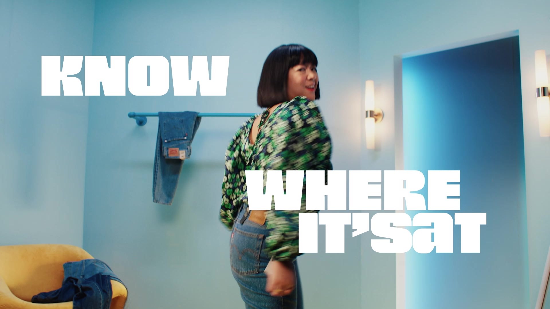
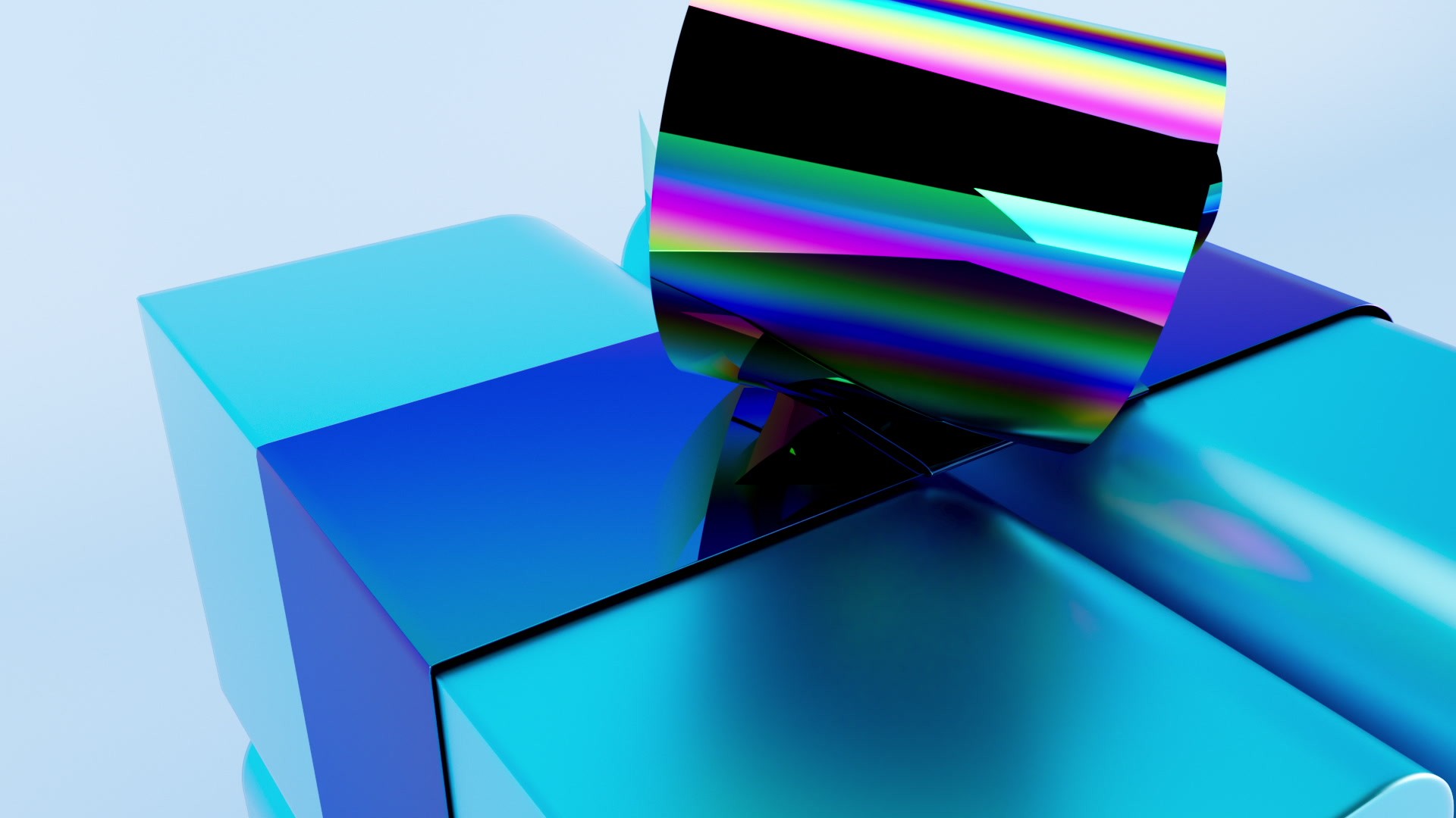
Out with the bland, in with the bold—the new Rack identity system is a fully responsive, dynamic world that brings the brand together across the customer experience, whether in-store or online, in the palm of your hand, or in a product you’re wearing. It includes a bold, new responsive logo, a bespoke, variable typeface, vivid color palettes that work hard to maximize brand iconicity as well as help customers navigate a complex promotional calendar. We also developed a unique and dramatic photography approach that heroes whoever or whatever is in shot, and distinctive, energetic 3D indents that powerfully bring the new logo to life in attention-grabbing ways, season after season.
Outcome
Rack’s new vibe turned heads at launch, with over 1.2 billion impressions. Brand New called it “a tremendous presence with a bold wordmark that is impossible not to notice” and AdAge named it one of the top 5 new logos of 2023. Taylor Cassidy, Marketing Director of Nordstrom Rack, commented on the impact the re-brand has had since: “Across our social platforms, employees and customers have had positive feedback—customers have clearly noticed and engaged with our brand showing up in new ways. Throughout the year, we saw strength in our brand engagement funnel and customer perceptions around our brand. Internally, teams felt energized, excited, and that our new branding enabled increased agility and stickier messaging. The rebrand has been an integral part of the overall Nordstrom Rack strategy, supporting its growth efforts: the business reported a 15% increase in net sales on its recent Q4 earnings call.”