Cannes Lions
Quaker Brand Transformation
R/GA LOS ANGELES / QUAKER / 2019

Overview
Entries
Credits
Overview
Background
If America is so obsessed with health and wellness, why are so many Americans unhealthy? Perhaps it’s because we're so overwhelmed with information we don’t know what to trust. So we turn to food fads rather than proper nourishment.
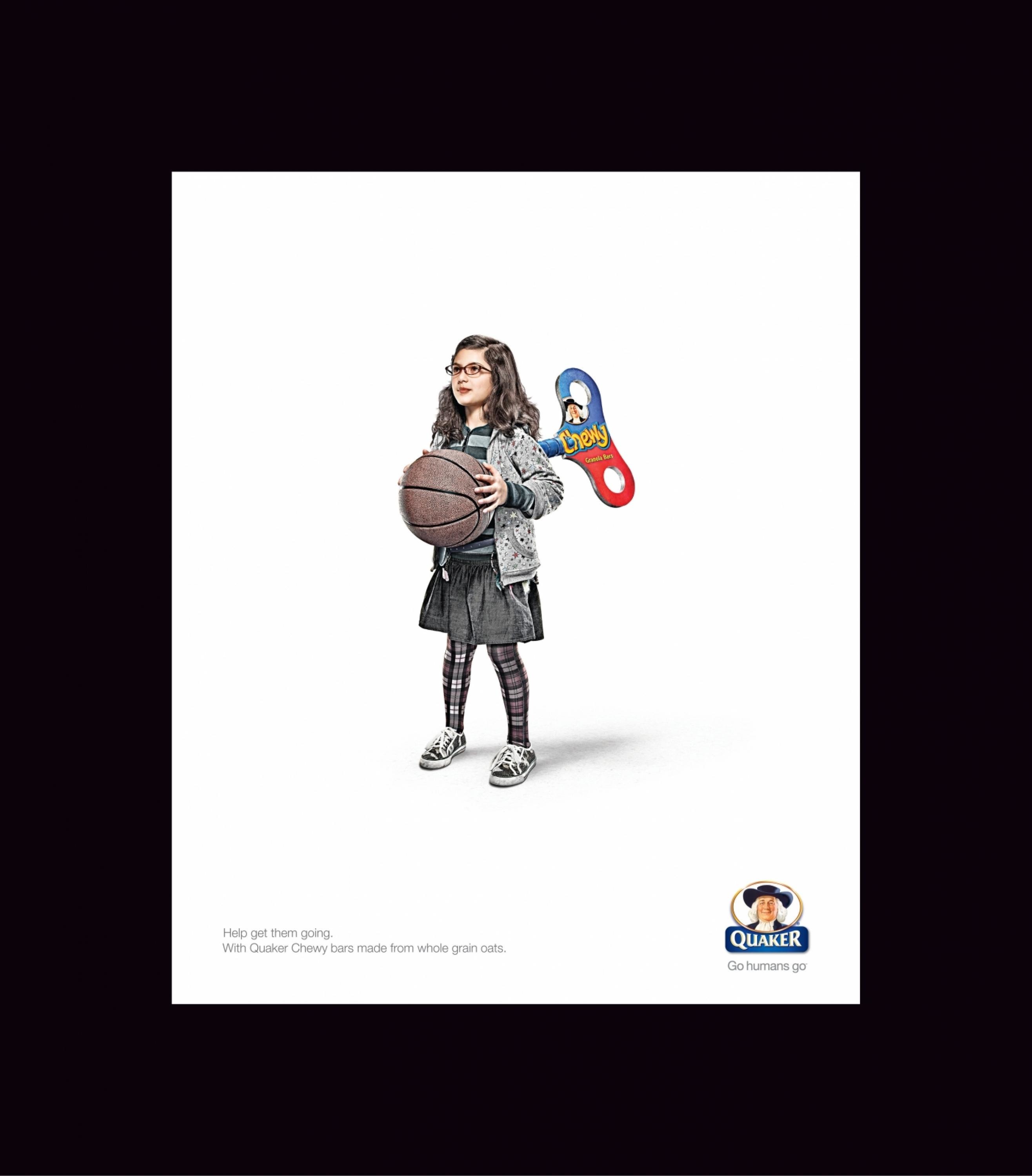
Quaker was the first company to put affordable nutrition in easy reach. 140 years later, it was once again time for Quaker to show the world how to eat well.
We were tasked with strengthening Quaker's strategic foundations that would go on to inform the visual and verbal design system — serving up Quaker in a whole new light across campaigns, products, and platforms. Our starting point was to agree on an inspiring and active purpose for the brand: to strengthen the foundations of a healthier world through simply powerful nutrition for all.
Our work transformed America’s oldest packaged cereal company into a modern health and wellness brand.
Idea
Quaker Oats can be found in more than half of the homes in America, so brand recognition wasn’t the problem. While nutritious oats should have been a natural fit for their lifestyles, Quaker was somehow not connecting with health-conscious people — particularly Baby Boomers — who were leaving the brand for other healthy alternatives.
Our creative idea was simple. We created a new visual and verbal system to shift Quaker from a humble heritage cereal to a heroic modern superfood: easy to understand, simple to engage with and powerful to use.
Execution
Our design system signals Quaker’s timeless brand values, while building credibility in our new nutrition-forward positioning. We used functionality, simplicity, and empathy as filters when developing each element in the system.
An iconography system was developed to help users understand nutritional benefits at a glance. We created a system of pictograms, signifiers, and icons to establish a hierarchy of functional benefit messaging that could flex across products.
Refreshed photography leverages a visual language that is universal, elevated, and relatable. The styling and material system expresses an approachability that resonates across our diverse target audiences. For this reason we choose functional materials like cork over leather, and copper over gold.
A primary color palette leverages Quaker’s historical equity by pulling colors directly from the brand’s iconic packaging. A secondary palette was created to accommodate a wide variety of products and flavors, directly correlated to natural elements.
Outcome
Quaker has become the healthiest and fastest-growing brand in PepsiCo’s North America nutrition portfolio. In the first six months of our Brand Transformation work, we saw significant success for Quaker — both in terms of sales objectives and brand health. The redesigned brand resonated extremely well among all health-conscious consumers, with a total lift in sales of 5.6% YOY, and a total lift in share of 4.8%, but Quaker enjoyed particularly strong sales growth and brand health lift amongst the high value audience of health-conscious Baby Boomers, all while investing less in media compared to the corresponding period.
In a category where it’s hard to move the needle, Quaker’s brand perception improved in the following areas:
+3 “Helps maintain a healthy heart”
+4 “Good for my digestive system”
+6 “Understands the nutritional needs of today’s consumer”
+4 “Helps me achieve my H&W goals”
Similar Campaigns
11 items