Cannes Lions
RSPCA
JONES KNOWLES RITCHIE, London / RSPCA / 2024

Overview
Entries
Credits
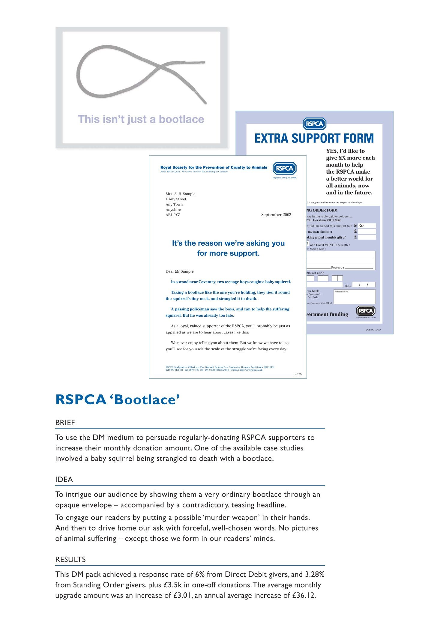
OVERVIEW
Background
The RSPCA is the world’s oldest and largest animal welfare charity (200th anniversary this year). From rescuing to lobbying, changing attitudes to changing laws, they have profoundly impacted the standards of animal welfare for two centuries. But they’ve been underestimated, under-loved and less supported.
Public perceptions no longer reflected the vital work the charity did. They were seen as closed, authoritarian, and focused on the rescue of cats and dogs, rather than existing for every kind of animal.
With the crisis facing animals growing, the RSPCA needed to rebrand to mobilize people into action. Firstly, we redefined their purpose: Inspire everyone to create a better world for every animal. Then we set about creating a brand that would:
-Broaden its appeal to a more diverse pool of supporters
-Broaden awareness of the animals it supports and the problems it solves
-Shift perceptions from cold and authoritarian to open and welcoming
Idea
The “S” in RSPCA stands for “society”.
We put this back at the heart of the brand. After all, it takes everyone – vets, volunteers, supporters, and designers alike - to create a better world for every animal. We needed to inspire them with an identity that was more bold, welcoming and reflective of what the RSPCA did.
To create it, we immersed ourselves in the day-to-day work of the charity. We went on the road with animal rescue officers, visited local charity shops and participated in immersive workshops. Then, we reflected the breadth of the RSPCA’s work across every touchpoint to connect with everyone.
Execution
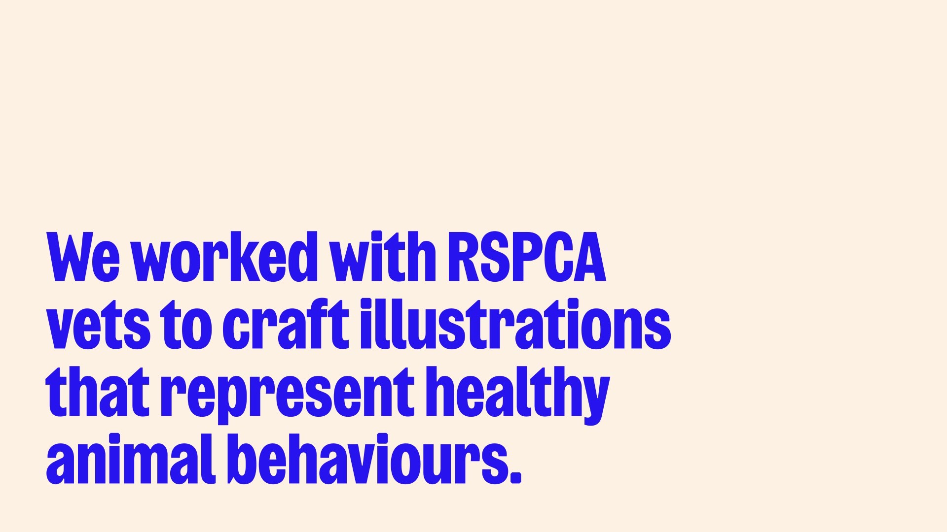
To open the RSPCA up metaphorically, we started by doing so literally, taking the old octagonal logo and created a more adaptable shape, which we coined the “octopunct”. We used this as a dynamic, flexible device to show off the breadth of animals the RSPCA works to protect, as well as give the 140+ branches a chance to feature an animal that best reflects them. This suite of illustrated animals was created in collaboration with vets to ensure they mirror healthy, happy behaviours.
We introduced an eye-catching colour palette fit for digital use and refined every letter of the name to give the wordmark the ability to stand alone. The bespoke font, Wilberforce Sans (named after the co-founder of the RSPCA), takes cues from protest placards.
At every turn, we put society at the heart, preparing the RSPCA to help even more animals by inspiring everyone to join the cause.
Outcome
The RSPCA relaunch captured attention with 2.34B impressions and 116 articles reporting on the organisation including: The Times, Sky News, Good Morning Britain, Campaign, Creative Review and Marketing Week. This led to a 20% increase in website traffic as people headed to the RSPCA to find out more. Publications commented on the anticipated impact of the relaunch with Creative Boom stating “The overhaul isn’t merely for peacocking purposes; it’s about inspiring a new generation of animal advocates.” And Marketing Week stating that the RSPCA’s "completely refreshed assets make the brand stand out against its contemporaries.” All reinforcing how this change was business critical to achieve the organisation’s mission of inspiring everyone to join the fight for animal welfare.
Similar Campaigns
12 items