Spikes Asia
SG50
BLACK, Singapore / MINISTRY OF CULTURE, COMMUNITY AND YOUTH / 2016


Overview
Entries
Credits
OVERVIEW
Background
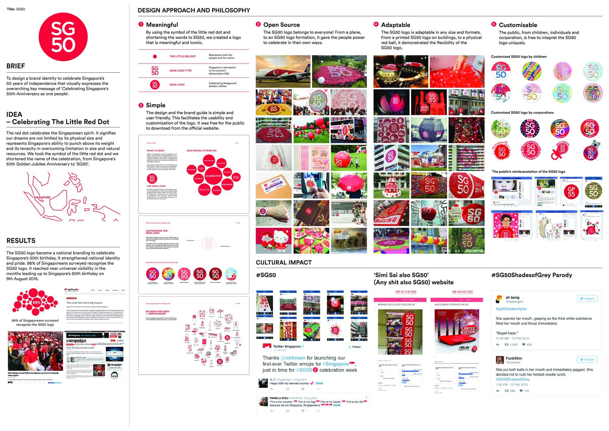
2015 was a significant milestone in Singapore's journey - Singapore's 50th Golden Jubilee Anniversary. The project's objective was to design a brand identity to celebrate Singapore’s 50 years of independence. It had to visually express the overarching key message of 'Celebrating Singapore's 50th Anniversary as one people' and had to allow Singaporeans to establish an immediate connection with the celebrations. The brand had to resonate with all Singapore residents and motivate them to take ownership of the logo and drive participation for all activities related to the celebrations. This is a nationwide branding excercise to celebrate Singapore's 50th Golden Jubilee Anniversary.
Execution
1) Meaningful By using the symbol of the little red dot and storterning the words to SG50, we created a logo that is meaningful and iconic. 2) Simple By keeping the design and the brand guide simple and user friendly, it facilitates the usability and customization of the logo by everyone. The SG50 logo is easy to identify, remember and redraw. 3) Open Source Everyone can use it to celebrate SG50. From corporations to individuals, it gave the people power to celebrate in their own ways. 4) Adaptable The SG50 logo is adaptable in any size and formats. From a printed SG50 logo on buildings, to a physical red ball, it demonstrated the flexibility of the SG50 logo. 5) Customisable The public is free to intepret the SG50 logo uniquely. Children drew the SG50 logo. Corporations customised their own SG50 logo to celebrate SG50. The public has also reintepreted the
Similar Campaigns
7 items


