Cannes Lions
The Equity Bars
SIRITI, Mumbai / DASRA / 2024


Overview
Entries
Credits
OVERVIEW
Background
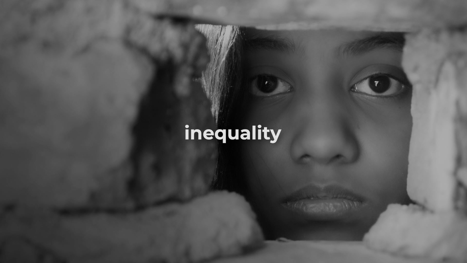
Even as India actively fights inequality, the economic, gender, geographical, caste and class disparities persist stubbornly. A lot is being done but more has to be done at a more strategic and transformational level.
Dasra, is concerned about the wide divide that still exists in a country that is needs to do lot more to meet SDG goals. They wanted the agency to come up with a rallying cry to help spur further urgency in addressing this.
Objectives: Bring various stake holders to though a common equity mission
1. Challenging embedded power imbalances in policy and funding .
2. Ensuring gender equity at an opportunity and representation at all levels
3. Representation of minorities and targeted action for disadvantaged groups.
4. Empowering community leadership (proximate) and social protection.
5. Redistribution and downstream changes to create sustainable equity.
Launched at Dasra Philanthropy Week, India's largest philanthropy event. Reached over 1500 stakeholders.
Idea
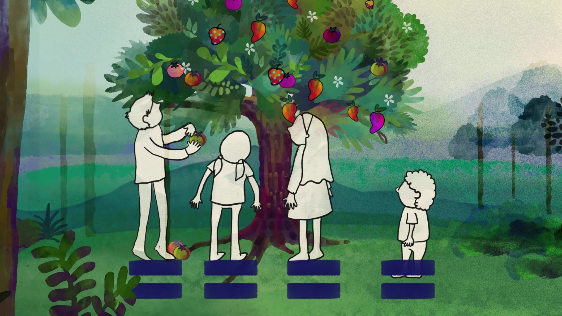
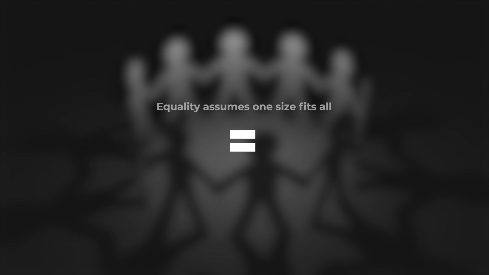
Dasra's mission going forward is focused on equity. Through all the different social sector areas they work in, equity is the overarching goal. We had to give equity a disruptive appeal rather than letting it remain a word that is casually interchanged with equality. So we decided to reference the universally accepted 'equal to' sign and evolve it to represent 'equity'.
We extended the lower bar of the 'equal to' sign to represent that equity goes further.
Giving a concept as rich as equity a symbol gives everyone a compelling and unifying north star; embedding clear call to actions within this symbol makes it's further impactul.
The target audience for this idea, is the funding community which needs to give more strategically to equity aligned initiative, and also social sector organisation that have to embrace the deep and diverse challenges on ground and address them differently.
Execution
Historically, symbols that have had a transformational impact have been simple yet rich with meaning. So, when we had to design a symbol to champion equity, we built on the universally known ‘equal to’ sign to pull people in with its familiarity and create an impact with its disruption. We extended the lower bar proportional to its height and created a symbol for Equity - concept that is more powerful than equality.
To make the symbol more human, we added soft corners and organic edges. The symbol in its purest form as an outline, is open to being adapted and adopted by the sector.
For Dasra, we added a gradient and grain inspired by the dynamic and nuanced nature of equity.
This simple yet powerful symbol was adapted across Dasra's programs and brought alive through touchpoints like website, social media, sector reports, t-shirts, badges, and even art.
Outcome
'Towards a transformed India, where a billion thrive with dignity and equity'. Dasra has been committed to this vision but is concerned that not enough is changing fast enough. This symbol is helping them focus on equity as their singular cause and has also energised the social and funding network to apply itself more efficiently and effectively. It's a visual anchor and appeal for 'equity'.
With this renewed focus on equity and calls to action, the marginalised across SDG's will benefit from greater and faster impact. For example, a NGO working towards childhood education is taking into consideration the internet penetration across different regions before making it's online training plan, so that different content formats can be deployed. This avoids loss of substantial money (if a uniform outreach had been deployed) and enables better impact. The launch of the symbol has also attracted new partners to support the mission.