Eurobest
The Newspaper Design Edition
JUNG VON MATT/LIMMAT, Zurich / SAMSUNG / 2018
Awards:










Overview
Entries
Credits
OVERVIEW
Background
The new Samsung Galaxy S8 should be perceived as a new iconic design on the iPhone-dominated Swiss market. But how can you communicate to the entire population at once that Samsung is revolutionising the market with innovative design?
For that, the design of something that all Swiss people hold in their hands every day was radically changed: their beloved “20min” newspaper.
Idea
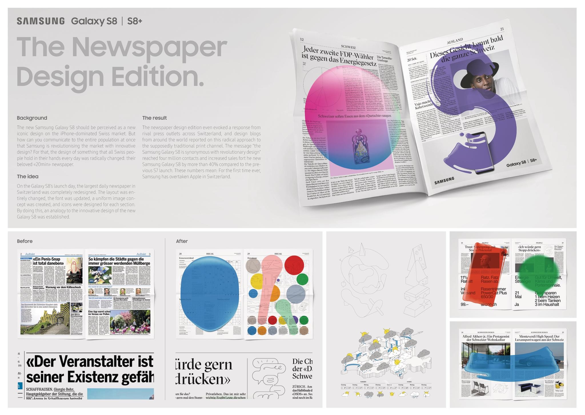
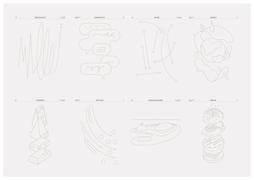
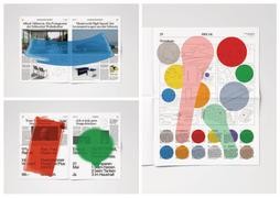
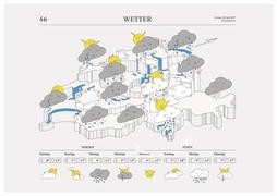
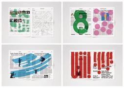
On the Galaxy S8’s launch day, the largest daily newspaper in Switzerland was completely redesigned. The layout was entirely changed, the font was updated, a uniform image concept was created, and icons were designed for each section. By doing this, an analogy to the innovative design of the new Galaxy S8 was established
Strategy
The strategy was to change the brand perception of Samsung. In Switzerland, the iPhone and the Apple brand are primarily associated with design and innovation, while Samsung is perceived to be a more mundane brand. Radically changing a traditional newspaper layout can be seen as an analogy to the innovative design of the new Galaxy S8.
Execution
A new and uniform image concept was created for the newspaper. Nothing was left untouched, creating a totally new experience with Switzerland`s most popular newspaper. The layout was changed, the font was updated, a new image concept was developed and fresh icons were designed for each section.
Outcome
The newspaper design edition even evoked a response from rival press outlets across Switzerland, and design blogs from around the world reported on this radical approach to the supposedly traditional print channel. The message “the Samsung Galaxy S8 is synonymous with revolutionary design” reached four million contacts and increased sales fort he new Samsung Galaxy S8 by more than 40% compared to the previous S7 launch. These numbers mean: For the first time ever, Samsung has overtaken Apple in Switzerland.
Similar Campaigns
12 items
