Eurobest
There's Nothing Comic About Dyslexia
INNOCEAN BERLIN, Berlin / DYSLEXIA SCOTLAND / 2023
Awards:


Overview
Entries
Credits
OVERVIEW
Background
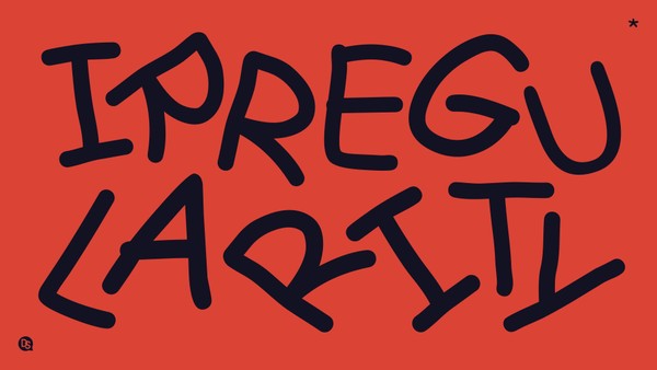
Comic Sans is the most polarising font to date, due to its highly asymmetrical nature. While this irregularity makes it popular amongst the dyslexic community, it is also what makes designers despise it so much.
So, we decided to launch a campaign that faces designers with their arch-nemesis, wherever they looked, there was Comic Sans wittingly calling on them to adopt a more inclusive mindset. Not by overlooking their hatred of it and using it, but by designing new fonts that are both dyslexia-friendly and worthy of their designs at the same time.
Idea
By using Comic Sans as the hero of our direct campaign, we were guaranteed to grab the attention of the people who can influence change when it comes to design inclusivity. The campaign uses the most hated font by the design world, which also happens to be the most favoured font by dyslexic people, to challenge designers to bridge the gap between aesthetics and function. And that is by creating fonts that are both dyslexia-friendly and beautiful at the same time.
Strategy
Designers are responsible for how information is presented, so a direct campaign targeting them was the strategic way to go.
“There’s Nothing Comic About Dyslexia” challenged the way designers approach inclusivity in various formats. The campaign included a range of mediums, such as long-copy ads, posters, postcards, a campaign website, and personalised social media messages.
All assets called for designers to create fonts that are dyslexia-friendly and good for design at the same time. So more people can use them and information can be made more accessible to everyone alike.
Execution
The campaign ran during Dyslexia Awareness Month (October 2022). First, we targeted the world’s top designers with personalised messages on their Instagram. Then we challenged them everywhere they looked, on street posters, postcards in design bookstores, and with ads in industry magazines such as Form, Slanted, and Daddy.
Finally, we launched a new dyslexia-friendly typeface created by a renowned typography designer. The font named “Inconstant Regular” proves that function and beauty do not have to be mutually exclusive.
The campaign as well as the new font were featured on WeTransfer, leading to an international creative community of 87 million users every month to see our campaign.
In turn, driving an army of designers to our website, where they learned more about dyslexia and how to create dyslexia-friendly fonts.
Outcome
The campaign caught the eye of the design and creative industries, sparking reactions and conversations on social media.
Miami Ad School Europe launched an inclusive design class.
WeTransfer stamped our call on their digital walls.
35 million Global Impressions.
5 million Earned Media.
+15k downloads of Inconstant Regular, which inspired work that helps 780 million people feel more included in society.