Cannes Lions

Toledo Museum of Art

LAFAYETTE AMERICAN, Detroit / TOLEDO MUSEUM OF ART / 2024

Awards:

1 Bronze Cannes Lions
Presentation Image
Case Film
Supporting Images

Overview

Entries

Credits

Overview

Background

TMA has one of the richest art collections in the world, but was ailing from all of the baggage of an “Art Museum” —seen as academic, dated, and elite— implicitly creating a divide between the museum and their community.

The museum's brand and visual identity hadn’t been touched for decades. As the Museum’s strategy to become the “Model Museum of the 21st Century” crystalized, it became clear that they needed the brand to be more welcoming, dynamic, and ambitious. It was time to evolve this powerful 120-year-old institution into a more inviting, lively, and future-facing brand.

What unfolded was a deep, wide ranging, 13-month brand refresh that began with a strategic deep dive, and concluded with an overhaul of the entire brand into a holistic new system. It was activated across their campus, sub-brands, promotional materials, digital properties (including a full website redesign), and an integrated launch campaign.

Idea

TMA’s collection is a great source of pride for Toledoans. It’s the one place where the city’s past glory and emerging future are equally alive. We drew inspiration from that pride to create a brand as welcoming as it is ambitious.

Through research from the museum’s diverse audience, we found a tension between the desire to define the “model museum of the 21st century” and the need to honor their legacy as a cornerstone of the community.

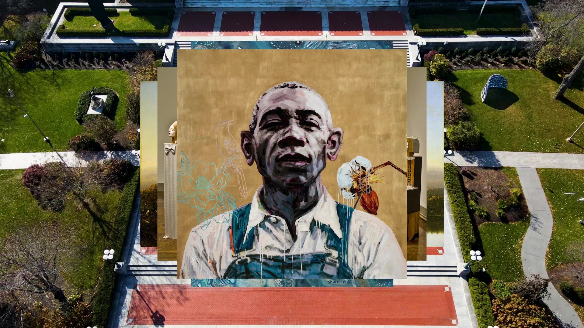
Art is never static—it’s always dynamic. Art connects, enlightens, and emboldens. Just as a viewer’s perspective on a piece of art shifts as they cross the room, we wanted our work to continually drive a change in perspective – sparking new ideas about what art is, who artists are, and who art is for. We wanted to show that this transformative power of art lives at TMA for all of Toledo to enjoy.

Execution

Grounded in the campus’ “T-shaped” footprint, and set in motion to reflect the continual reframing of art history and its emerging future, the new TMA logomark is a dynamic, multifaceted icon built for the digital age.

In addition, key strategic design moments in the system tap into TMA’s DNA. A couple of examples include:

Typography: The typography draws inspiration from historical styles employed by the museum over the years. The combination of a refined sans-serif typeface with a supporting serif typeface has been evolved to give flexibility to the new identity.

Glass: Paying homage to Toledo’s history as the City of Glass, the alchemy, translucency, and symbolism of glass is infused within the identity and applications.

Color: The identity is expressed through an adaptive color palette – reflecting the artwork within view. Two color fields are sampled, each expanding into three color saturation options.

Outcome

Since launching the new brand identity, TMA has seen increases in year-over-year museum visitation of 20% and year-over-year exhibitions ticket sales have grown 140%.

In this same period, social media campaigns have seen a strong year-over-year growth in impressions (+116%) and engagement (+105%).

Don’t just take our word for it – in the short time that the work has been live, it’s received mass acclaim from the global design community. UnderConsideration called it “one of the best museum identities [they’ve] seen in a while.”