Cannes Lions
Uber | Where To?
UBER HQ, San Francisco / UBER / 2017

Overview
Entries
Credits
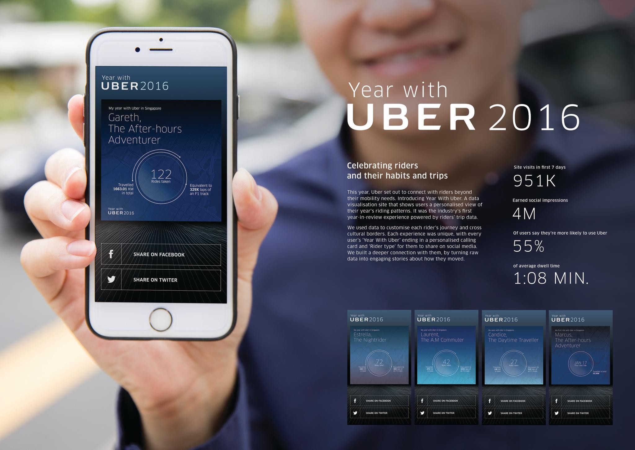
OVERVIEW
Description
Working in tandem with the product team, we created a campaign rooted in the one question that would greet riders in the new app: “Where to?”. At the center of it all was an immersive and responsive website with full-screen video. Translated in over 50 languages, it let riders explore all the new features and request early access. The site opened with an anthem video that gave riders an imaginative look at how the new app fits into their daily lives. As riders scrolled, animations unfolded to show key features in action. They could also watch a sizzle video that put the new UI on full display or How To videos to help them get the most from the new app.
Execution
The timeline for the microsite and related videos was 8 weeks, which was especially tight given the fact that the app was far from a finished when we kicked off creative. So this was one of those “fix it while it’s flying” efforts, with numerous product features and design elements being added mid production. Two weeks before the launch, an announcement email was sent to over 100 million people around the world to prime them about the new app and drive them to the campaign microsite. There were also paid social ads, in-app messages, and a press push that led to over 63 million total impressions. Once the new app had fully rolled out, the campaign strategy shifted towards education with feature deep dives and How-To videos.
Outcome
In the first two weeks, the website had over 19 million page views with an average time on site of 1:12. The total number of media impressions for the campaign topped 63 million. And riders exposed to the marketing had a 20% jump in number of trips per week in the new app.
Similar Campaigns
12 items