Cannes Lions
WATER
THE COCA-COLA COMPANY, Mexico City / COCA-COLA / 2010
Overview
Entries
Credits
OVERVIEW
Description
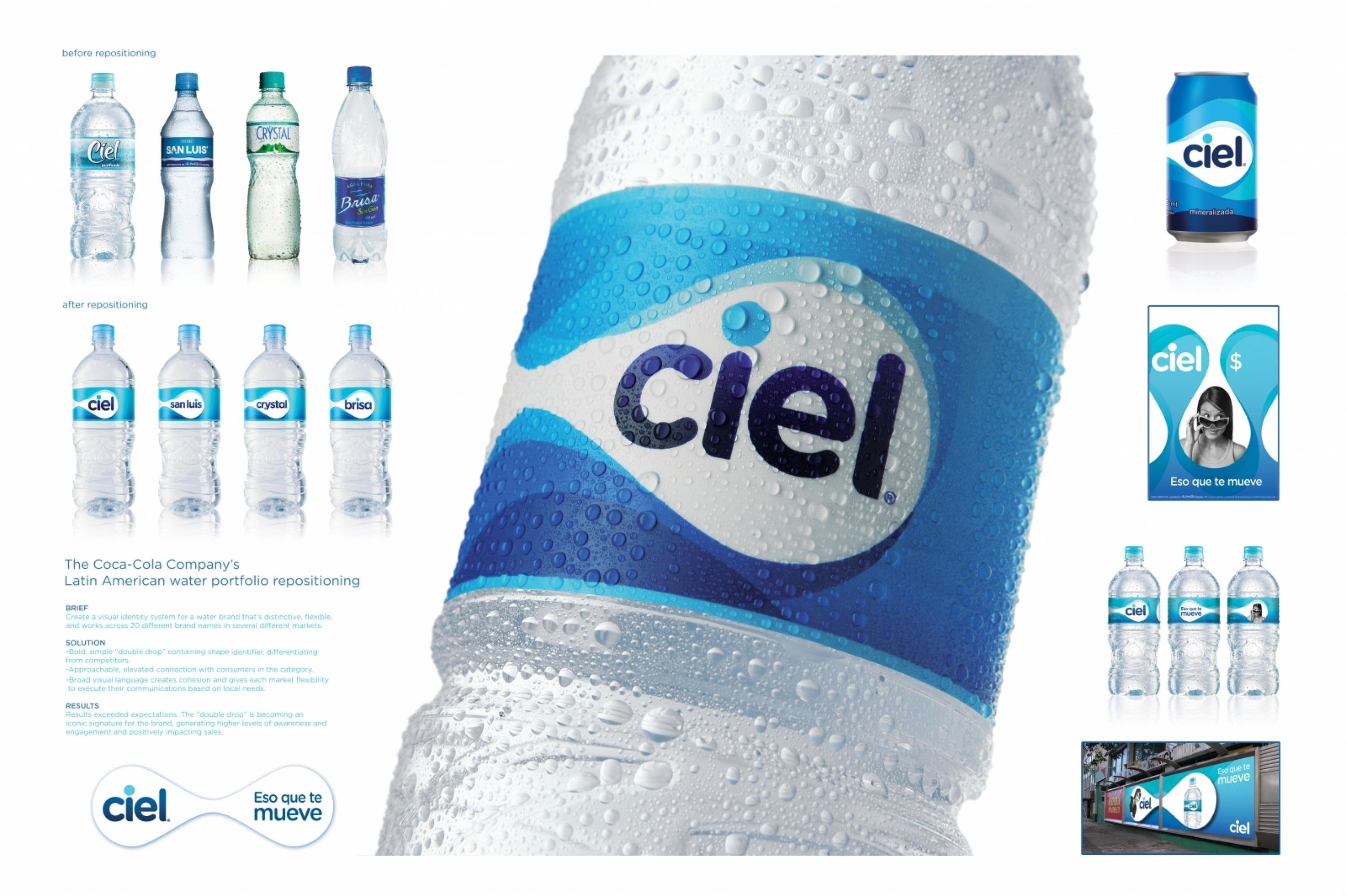
The Coca-Cola Company has more than 20 water brands across Latin America, from source waters in the Brazilian forest to purified water in Colombia. Their target consumers are young adults who are active and optimistic. Consumption occasions are mostly on the go.The task was to create a single, proprietary visual identity system that would work across all Latin American water brand names. The system needed to stand out from the competition and needed to be flexible enough to work in different formats, from packaging to point-of-sale marketing, to outdoor advertising.
Execution
1) Reflect the brand's active, uplifting positioning:The identity system is based on three design principles:-Dynamic-Bold & simple-Modern, yet timeless2) Build an emotional connection with consumers:Approachable, emotional, "fashion" black & white lifestyle photography is relevant to young adults and completely unexpected in the water category.3) Create a strong shelf presence:A bold, simple, unique "double drop" shape contains all communications and has become the core brand identifier.4) Allow freedom within a framework:A broad visual language is cohesive and gives each market flexibility to execute their communications based on local needs.
Outcome
The new visual identity system first launched in Mexico in 2009, under the Ciel brand name. Results exceeded expectations and product sales increased following the launch. To date, four brands have been reintroduced with the new system. The double drop identity is becoming an iconic signature for the brand, generating higher levels of brand awareness. The client's local markets are finding the system easy to apply to their needs. Based on the success of the roll-out to date, 5 additional brands will convert to the new identity over the next six months, with more to follow.
Similar Campaigns
12 items
