Design > Graphic Design & Design Crafts
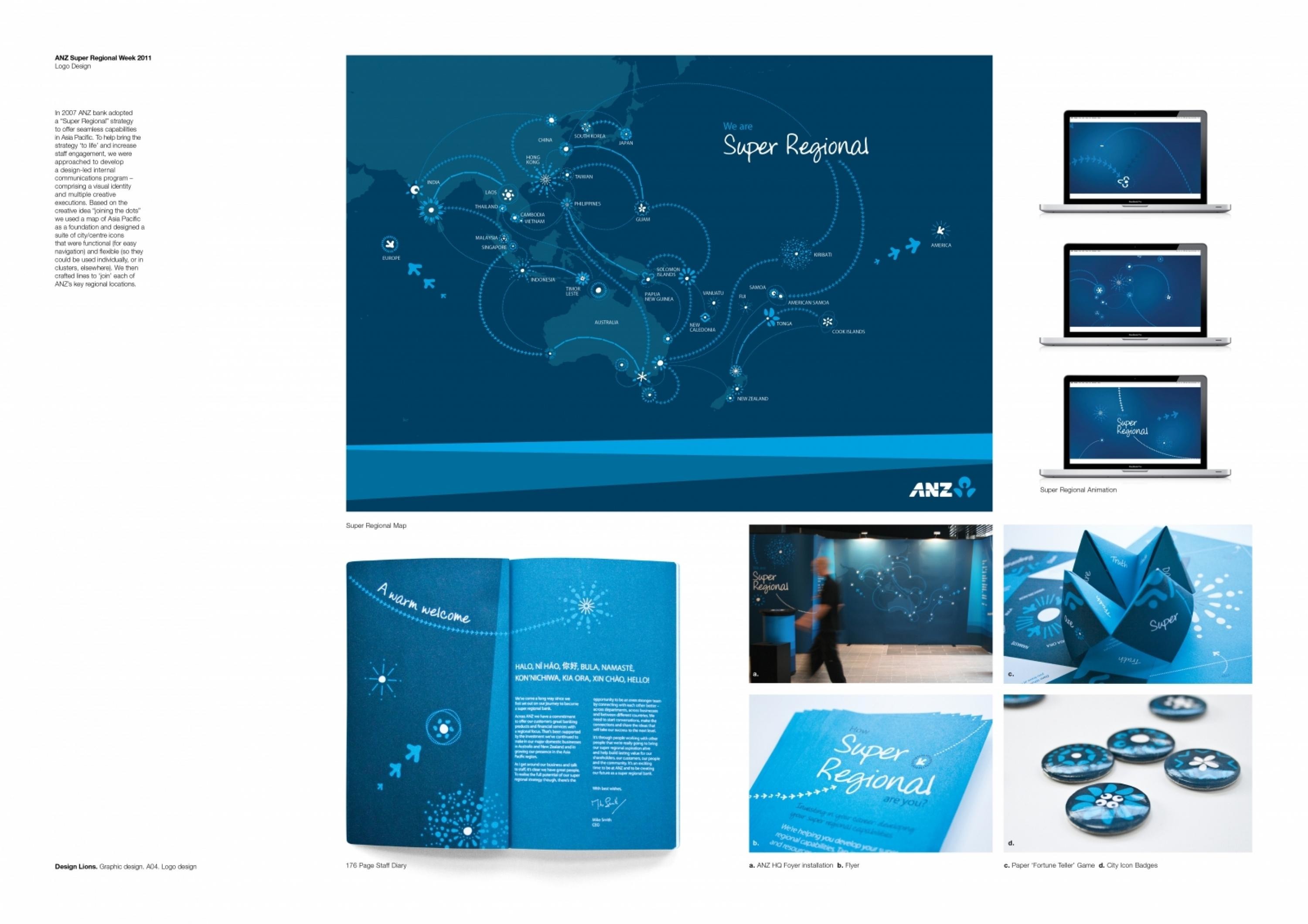
ELMWOOD MELBOURNE / ANZ BANK / 2012
Overview
Credits
BriefExplanation
In 2007, ANZ bank adopted a ‘Super Regional’ strategy and widened its presence in the Asia Pacific region to offer seamless financial services and capabilities. To help bring the strategy to life and give it more oomph via increased staff engagement they approached us in 2011 to develop a comprehensive design-led internal communications program, comprising a visual identity, look and feel and an array of creative concepts for collateral to support an inaugural ‘Super Regional Week’ of strategy-relevant activities.
ClientBriefOrObjective
Our key aim was to contextualise the complex Super Regional strategy to give ANZ staff a better idea of what being ‘super regional’ meant via a simple yet compelling visual identity, graphic language and a series of fun, effective and informative staff engagement pieces. The key challenge was to achieve cut-through with, and to win the hearts and minds of, staff whilst working within robust pre-established ANZ brand identity guidelines i.e. our design(s) had to look and feel distinctly ANZ (e.g. colours, fonts) but also new, fresh and totally unique.
Effectiveness
The Super Regional identity and visual language we created was extremely successful in both supporting ANZ’s inaugural Super Regional Week and helping to drive effective staff engagement with the strategy, business wide. In testament to the quality of our design and creative communications thinking on this project, to this day ANZ continues to regularly use the identity, look and feel we created to represent its thriving Super Regional strategy more broadly, making it the first, and only, internal ‘sub-identity’ in the recent history of the brand’s visual architecture.
Execution
To give the Super Regional strategy a distinctive visual language, we started by developing an overarching identity, look, and feel based on the creative idea of ‘joining the dots. Using a map of the Asia Pacific region as a focal point, we then designed a suite of city centre icons that were both functional (for easy navigation) and dynamic and could be used individually, or in smaller groups beyond the map. To give the identity a suitable sense of movement and connectivity, we crafted a lively series of fluid lines that energetically joined each of the bank’s key regional city centres.
More Entries from Logo Design in Design
24 items