Cannes Lions
AIRLINE
EURO RSCG C&O, Paris / AIR MAURITIUS / 2009
Overview
Entries
Credits
Overview
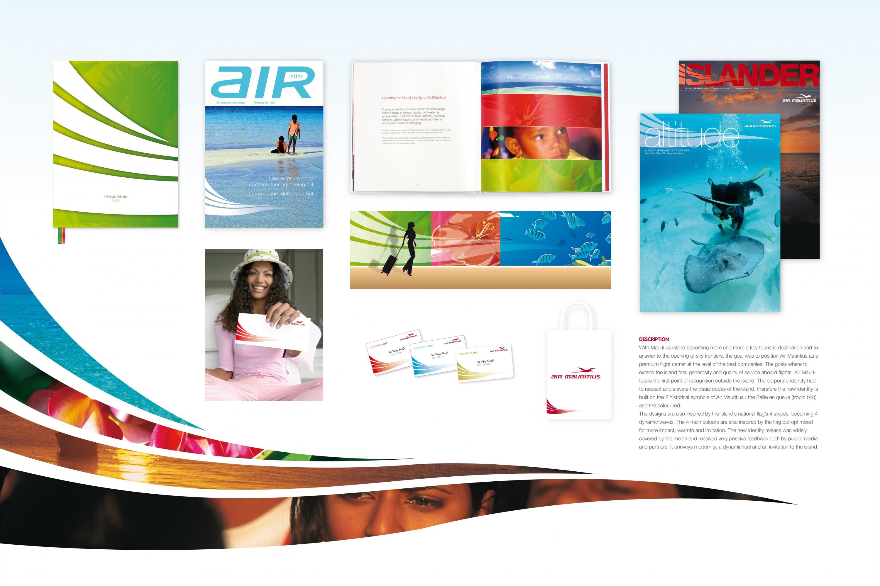
Description
To contribute with Mauritius Island's attractivity as a key destination for tourists, and to face the opening of the sky, Air Mauritius has engaged profound changes to its flight offerings: More flights, destinations, cabin redesign, partnerships with Airfrance etc...
The client therefore wished to accompany this change with a redesigned corporate and brand identity.
Execution
The identity had to respect and build upon strong visual codes of the island. The logo is constituted by two historical strong symbols to Air Mauritius: The tropic bird (Paille en Queue) and the colour Red. The brand identity is also strongly inspired by the Island's national flag which is made of four stripes. These stripes were stylized to represent the flag in motion and dynamic. The four colours were retained to define the new expression.
Outcome
The new identity release was widely covered by the media and received very positive feedback from the public, media and partners. It conveys modernity, a dynamic feel and an invitation to the island.
Similar Campaigns
6 items