Cannes Lions
APPLIED ARTS MAGAZINE
COSSETTE , Montreal / APPLIED ARTS / 2012


Overview
Entries
Credits
Overview
Description
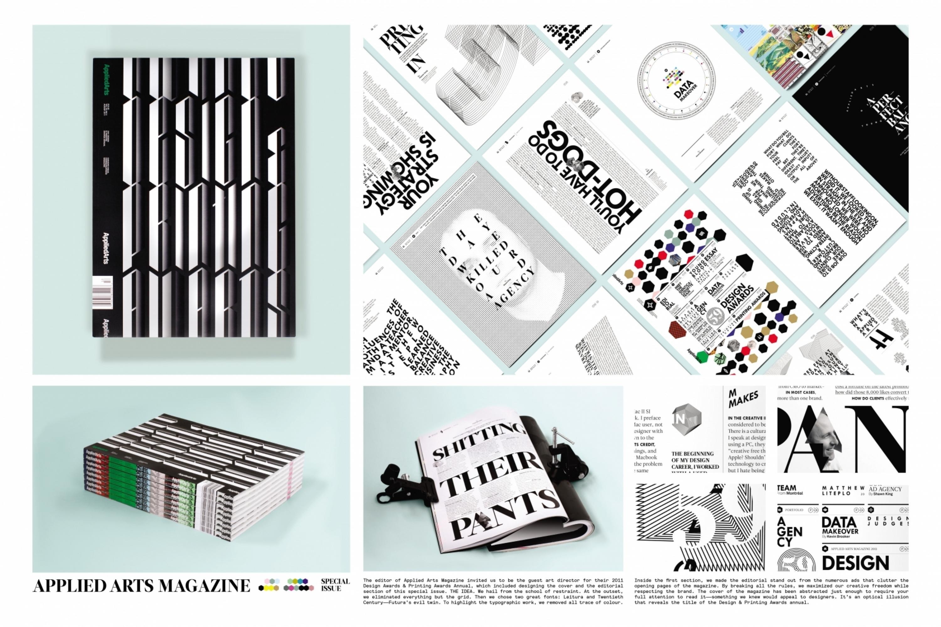
The editor of Applied Arts Magazine invited us to be the guest art director for their 2011 Design Awards & Printing Awards Annual, which included designing the cover and the editorial section of this special issue.
Execution
We hail from the school of restraint. At the outset, we eliminated everything but the layout grid. Then we chose 2 great fonts: Leitura and Twentieth Century - Futura’s evil twin. To highlight the typographic work, we removed all trace of colour. By breaking all the rules, we maximised our creative freedom while respecting the brand.The cover of the magazine has been abstracted just enough to require your full attention to read it - something we knew would appeal to designers. It's an optical illusion that reveals the title of the Design & Printing Awards annual.
Outcome
The redesign of the editorial section and cover of Applied Arts Magazine’s 2011 Design Awards & Printing Awards certainly got a lot of people talking in the industry - especially about the innovative type treatments. The majority of the feedback was enthusiastic and quite favourable, clearly reflected in above-average sales at the news stand.
Similar Campaigns
7 items