Cannes Lions
BANK
SEENK, Paris / BNP PARIBAS / 2010
Overview
Entries
Credits
OVERVIEW
Description
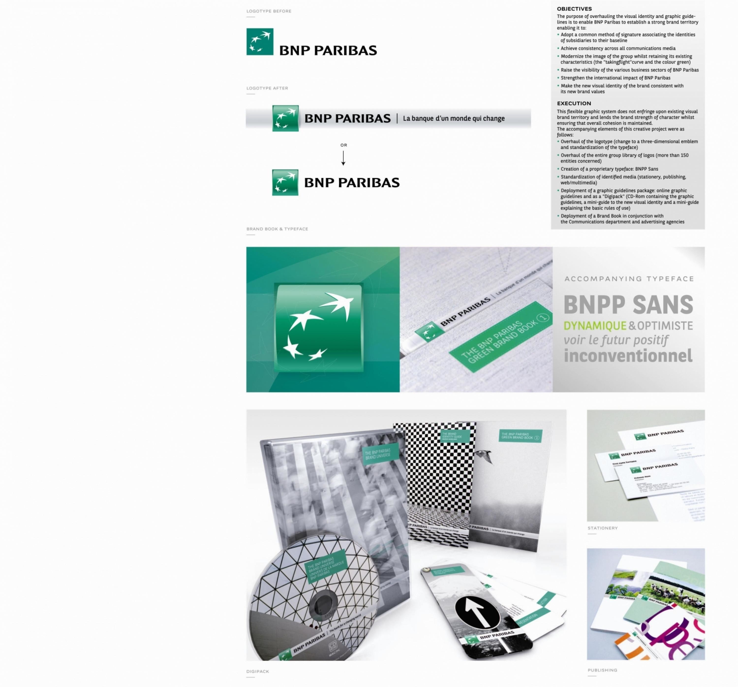
BNP Paribas, a European leader in banking and financial services, has now become a powerful, innovative and cohesive brand.To strengthen its brand image, the group wanted to deploy a common method of signature across all each of its three divisions and their subsidiaries to afford the brand a high degree of visibility throughoutthe world.
Execution
This overhaul of the brand's identity resulted in the creation of a common system of signature:the Brand Block witch takes its inspiration from the facades of the bank's branches. In graphic terms, the Brand takes the form of a strip incorporating:• The logotype of the issuing entity within the group• The associated baseline• Website address (sometimes)The accompanying elements of this creative project were as follows: • Overhaul of the logotype (change to a three-dimensional emblem and standardisation of the typeface) • Deployment of a graphic guidelines package: online graphic guidelines and a Digipack (CD-Rom containing the graphic guidelines, a mini-guide to the new visual identity and basic rules of use)
Outcome
The new BNP Paribas visual identity has been deployed since December 2008 and is used by both the group and its subsidiaries.This new visual identity has been met with a really enthusiastic response on the part of BNP Paribas employees, who have readily adopted the graphic guidelines and apply them on a day-to-day basis.
Similar Campaigns
12 items

