Cannes Lions
CHILEAN RED CROSS
JWT CHILE, Santiago / RED CROSS / 2010

Overview
Entries
Credits
Overview
Description
Background: The Red Cross in Chile is a very well positioned, but mainly in the segments of adults and seniors.Therefore we sought to communicate to a younger target products and services of the organisation.
Execution
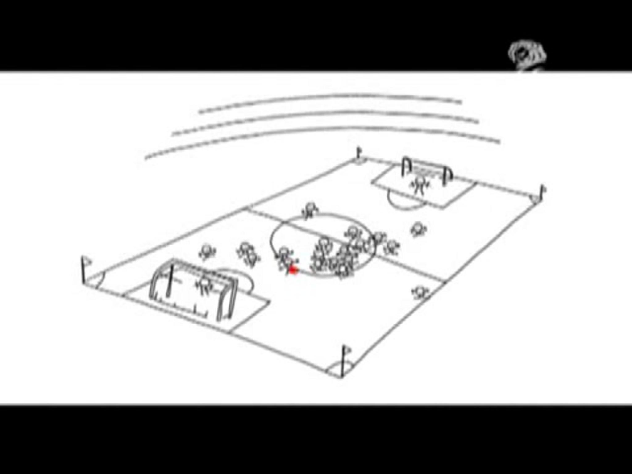
The piece responds to the need to interact with a young, increasingly sensitive to the design and aesthetics. It was decided for a comic that from the viewpoint that the lines and colors are simple. This for two reasons: first so that decoding is simple and is just as much attention to the message and design. And then, for the color red, typical of the brand, could highlight in generating drawings recall in each vignette.
Outcome
There was a greater recognition of young people into the brand.Increased visits to the website.Volunteering increased by 30%,Media and public spaces joined this activity, offering free dissemination of the campaign, for Radio Cooperativa and the Santiago Airport.
Similar Campaigns
12 items


