Eurobest
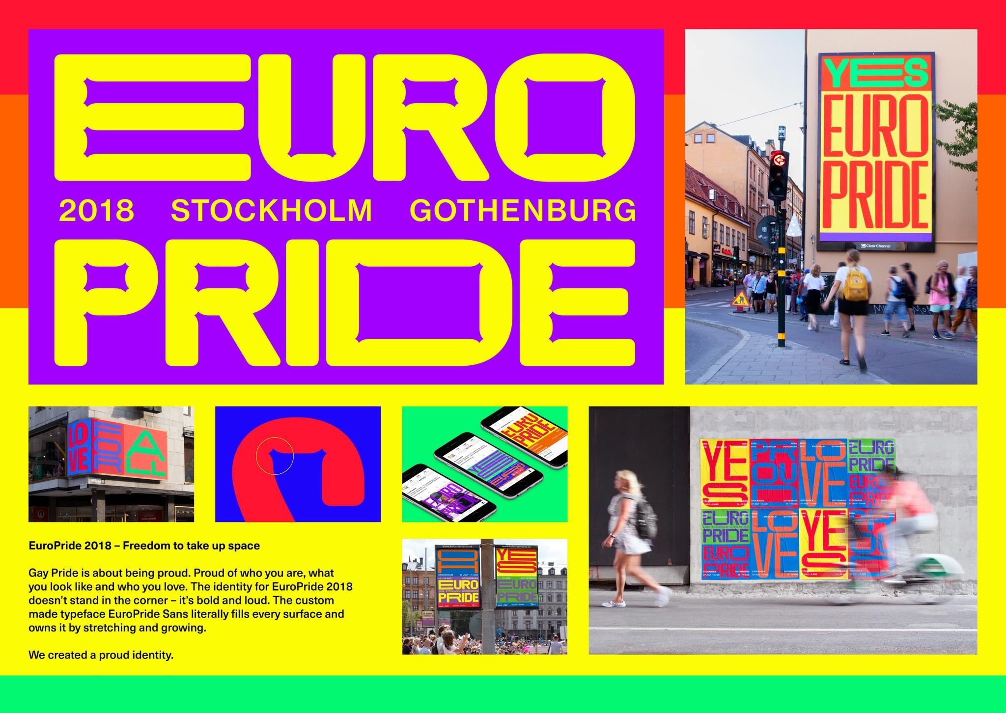
Europride 2018 - Freedom To Take Up Space
BOLD, Stockholm / EUROPRIDE / 2018
Overview
Entries
Credits
Overview
Execution
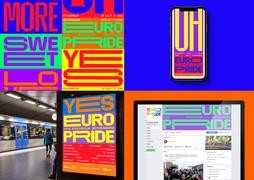
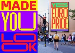
The core element of the identity is the custom made typeface EP Sans. The idea behind the typeface was that it should adapt and react to its environment, stretching from ultra extended to ultra condensed, always filling the available space. It is a variable font that changes depending on format, interaction and viewport width. A typeface that isn’t afraid to be expressive. It is made to be both unconventional and ugly-cute. Friendly and round with its folds and flabs but at the same time strong and in-your-face, refusing to be silent.
We used the rainbow flag as our layout system, the colors expanding and compressing to hold the typographic messages. The identity appeared all over Stockholm before and during Pride week, for example on static and moving billboards, guerrilla poster campaigns, magazine ads and in social media.
Similar Campaigns
10 items