Spikes Asia
Grab Community
GRABADS, Singapore / GRAB / 2023

Overview
Entries
Credits
OVERVIEW
Background
In 2019, Grab was already a superapp. Yet, people still saw us as a ride-hailing company. One of the barriers to this perception change was that our existing visual identity had a supergraphic element we called the 'double lines', which were inspired by road marks, and was originally intended to represent the ride-hailing business.
Idea
We knew we had to refresh our visual identity, yet we had to find a way to preserve certain elements that have become synonymous with Grab. One of these elements was the 'double lines'. So we decided to reflect this element in our typeface instead. We then began our journey to create our own font and called it Grab Community--in reference to the various communities of drivers, merchants, and consumers we serve.
Execution
With 'double lines' as our design origin, it was only natural for us to develop an inline typeface. But inline typefaces are notoriously difficult to pull off, and our company's various needs added to the complexity.
From a usage standpoint, the typeface would be most frequently used in marketing collateral, most of which consisted multiple elements like pricetags, promo blurbs, logos, and images. Legibility was key.
We also had to develop the typeface for various scripts in Southeast Asia. For example, catering for a complex script like Thai meant we had to also consider accents. We also had to ensure we maintained the distinctive geometrical form of the Grab Community typeface. It took us a couple of years to complete 5 different scripts (Latin, Thai, Vietnamese, Burmese, Khmer) for 8 countries.
Once ready, we applied it across all of Grab's touchpoints, from digital branding to physical driver jackets and signages.
Outcome
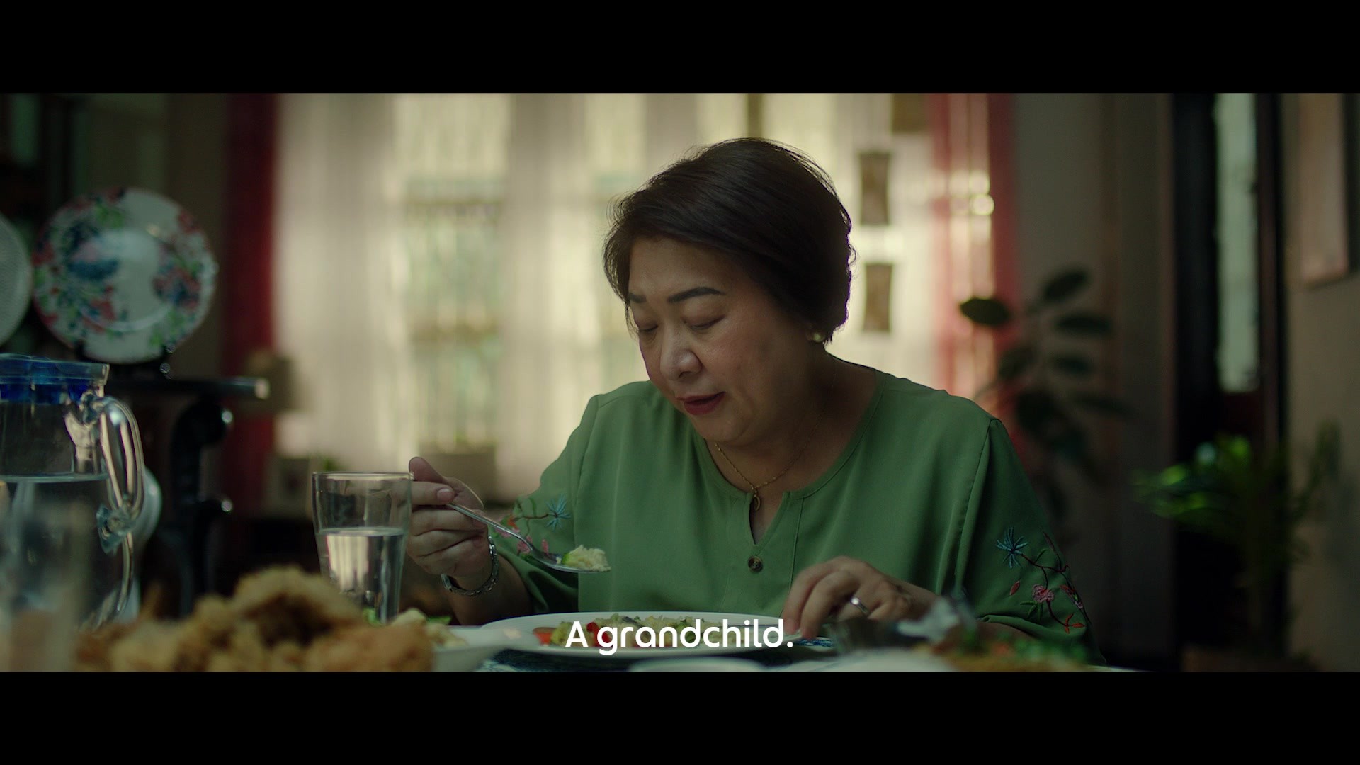
Even when communicating different services, in different languages, our visual identity remained consistent through it all. Within a month of launching the new visual identity, our superapp perception went up by 5 pts. Today, the Grab Community typeface continues to grow with Solid, Dot, and Serif joining the family. Each creating a different feeling, designed for the diversity of Grab.
Similar Campaigns
6 items