Cannes Lions
GREEN ENERGY
ANA COUTO BRANDING & DESIGN, Rio De Janeiro / RAIZEN / 2011
Overview
Entries
Credits
OVERVIEW
Description
Shell and Cosan have formed a joint venture, the goal of which is to offer the world a new source of clean energy: ethanol. The brief was to create the name and the brand for this new company, which would become one of the major companies in Brazil.
Execution
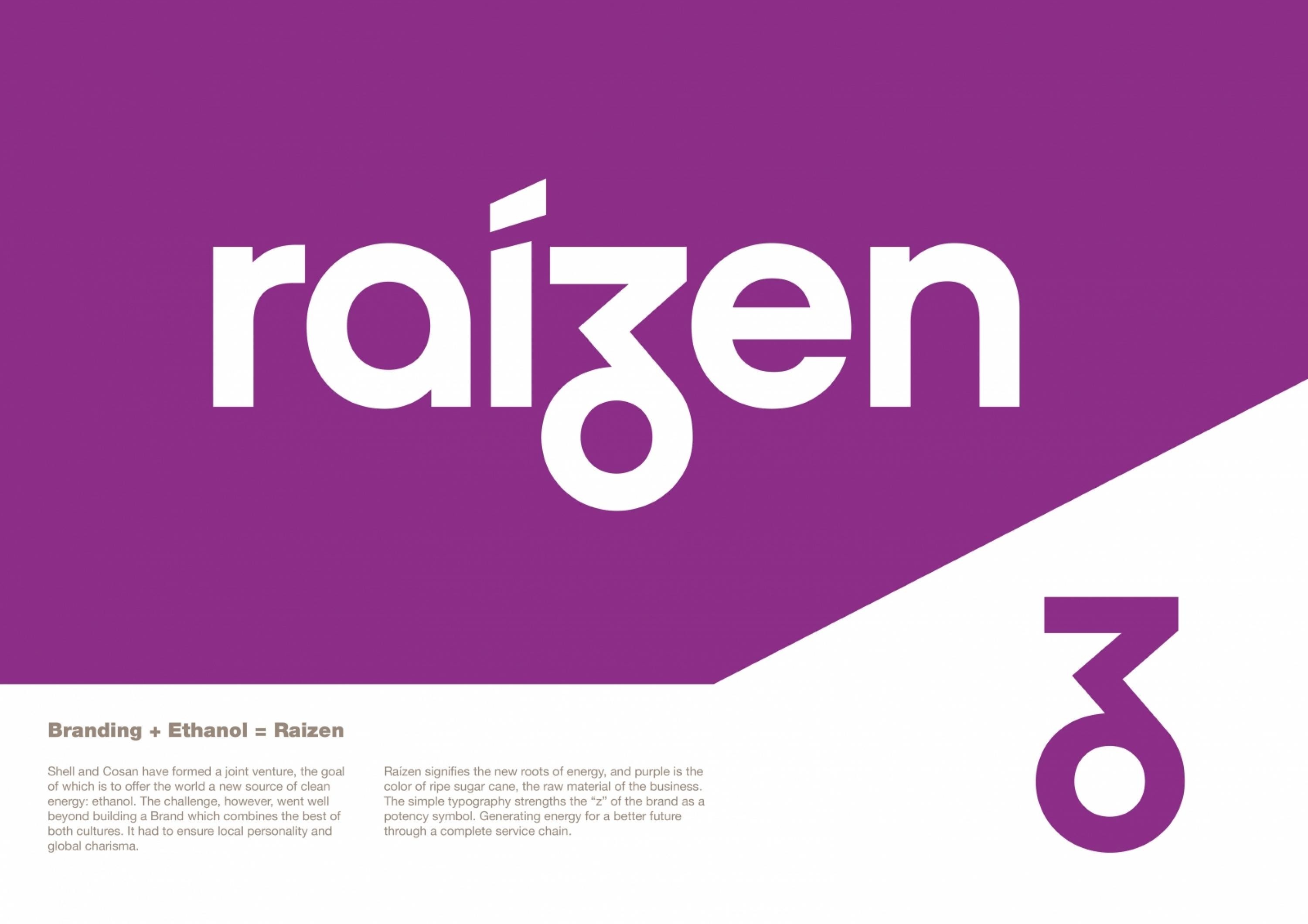
The brand Raizen was created to express differentiation and distinction, synonymous with a new production and distribution era of global energy. Raizen means the new roots of energy. Purple is the colour of ripe sugar cane, the raw material of the business, and its simple typography stresses the “z” of the brand as a symbol of power. It represents highest performance, even if not applicable to the logo brand. This is energy raised to the power of Raízen. Energy raised to its maximum power.
Outcome
Launched in February of 2011, the new company is betting on the growth of international sales of ethanol. In the words of its president, Vasco Dias, “The plan is to consolidate sugar cane ethanol as an international commodity”. And Raízen is an exact reflection of this objective. It is green energy. From Brazil to the world.
Similar Campaigns
10 items
