Eurobest
If
BOLD, Stockholm / IF / 2020

Overview
Entries
Credits
OVERVIEW
Background
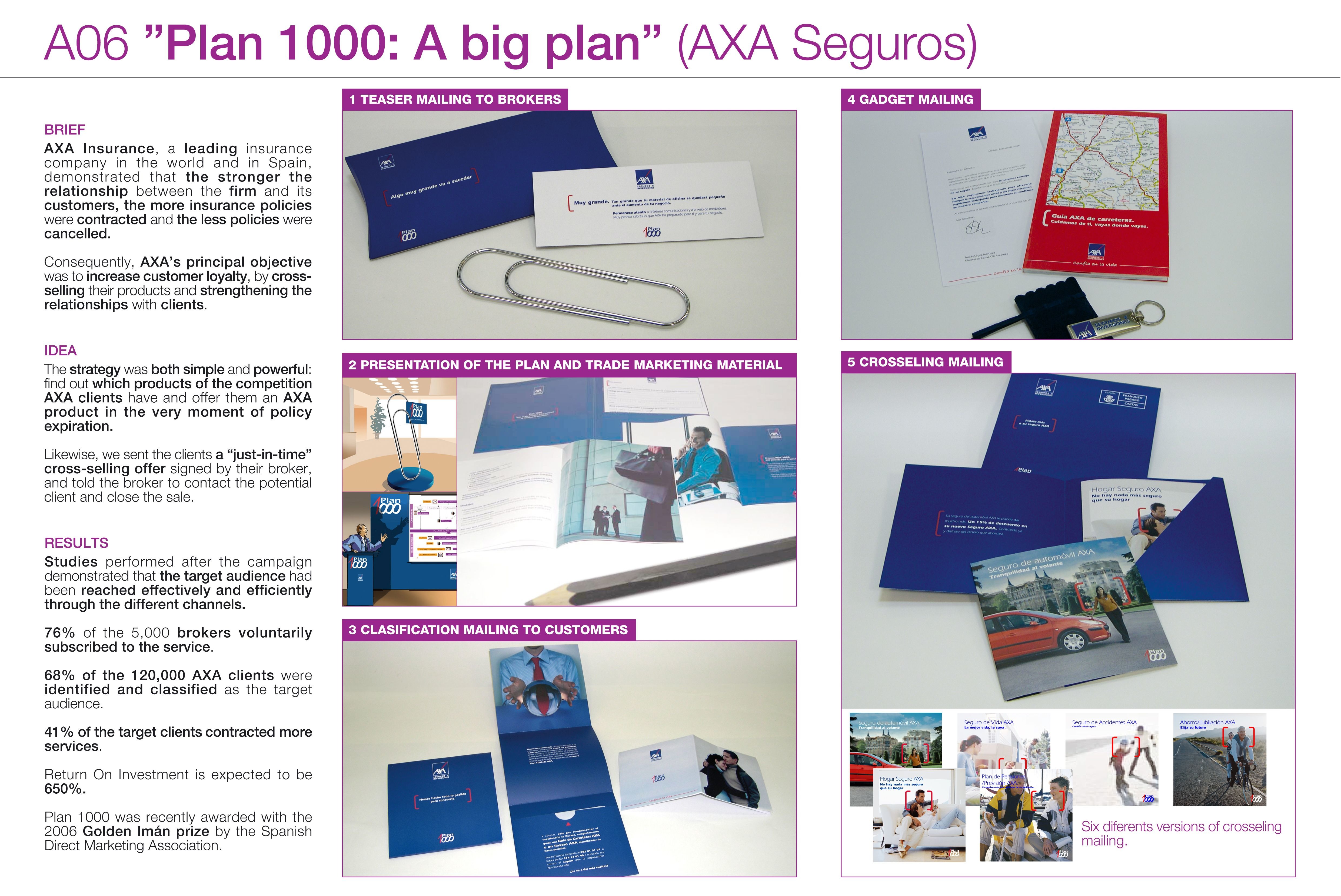
With their over 20 years of service and 3.7 million customers, If is the largest insurance company in the Nordic region. Coinciding with their 20th anniversary a new position was developed – The most caring insurance company.
Idea
The aim of the new brand identity is to reflect the company’s new position. We therefore scaled away the unnecessary and reduced the complexity many associate with insurance. And to truly be there for the customers we focus on what really matters the most.
Execution
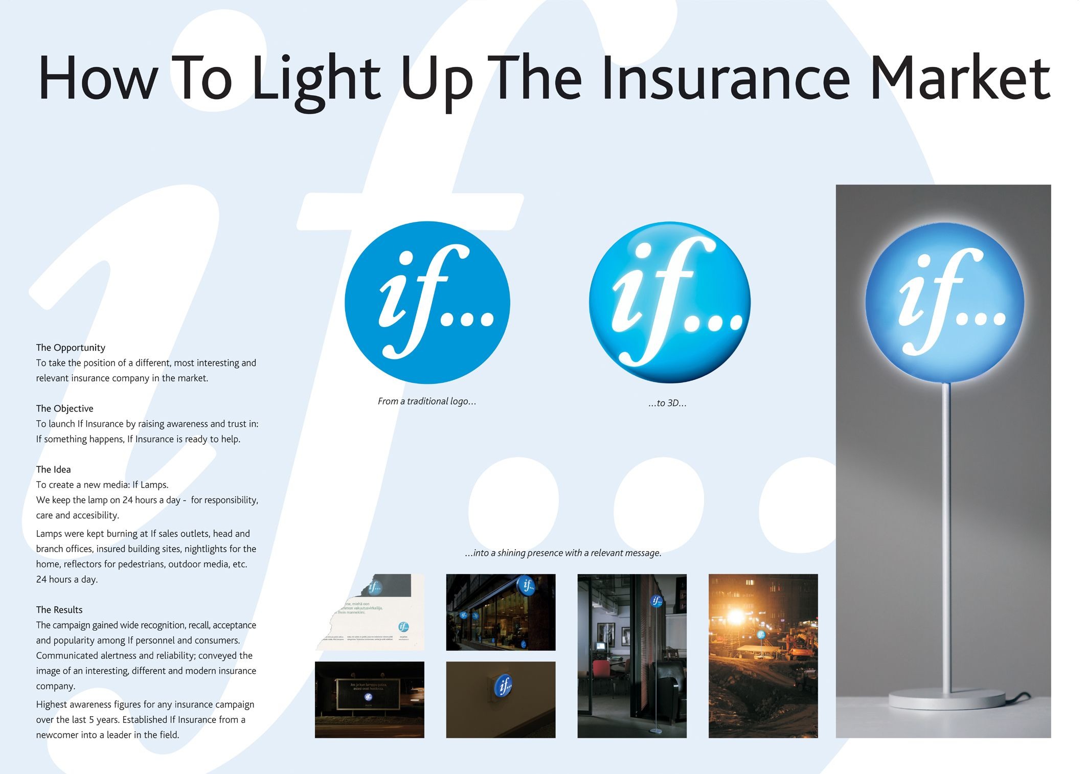
The visual expression has been refined through all channels to create coherency and user friendliness, for example by using significantly fewer components. The updated primary blue color acts as a guide on all platforms and is complemented by a new warm color palette. A new custom font – If Sans – ensures instant recognition. New image styles add emotion and removes the unnecessary to create clarity. We made insurance easy to understand by drawing attention to what matters the most. Simply personal.
Outcome
Similar Campaigns
12 items


