Cannes Lions
ITALIAN FOOD BRAND
PACKAGING BRANDS, Rio De Janeiro / SPOLETO / 2010
Overview
Entries
Credits
Overview
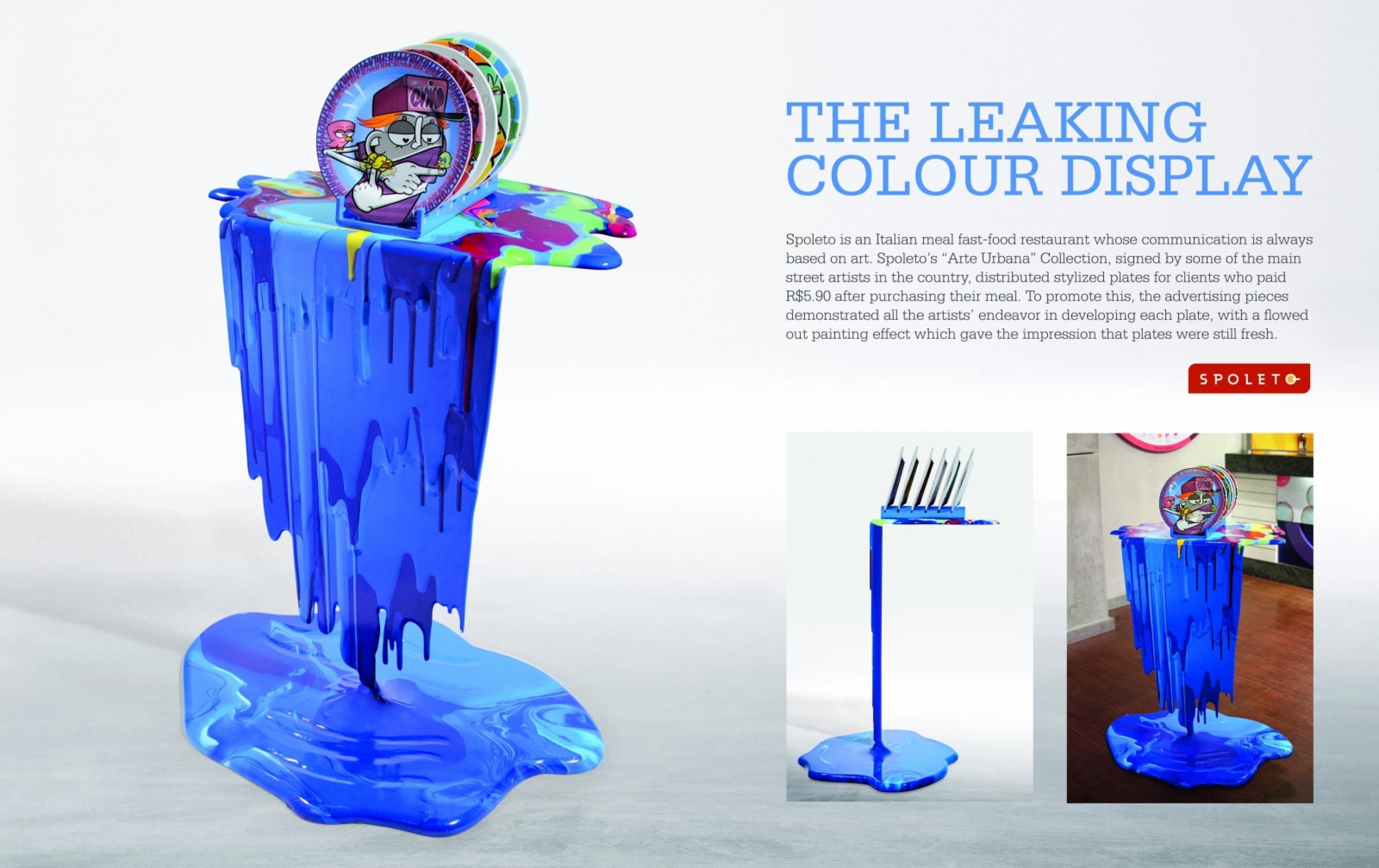
Description
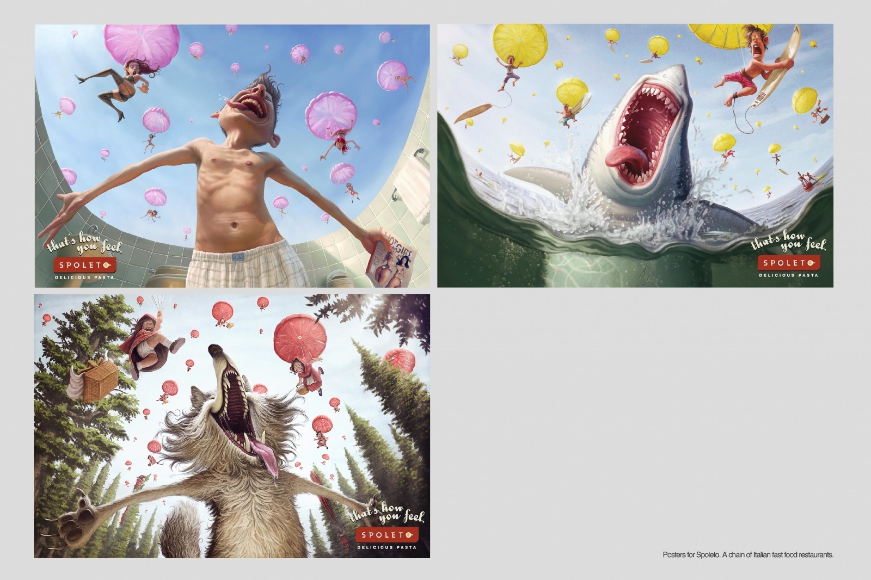
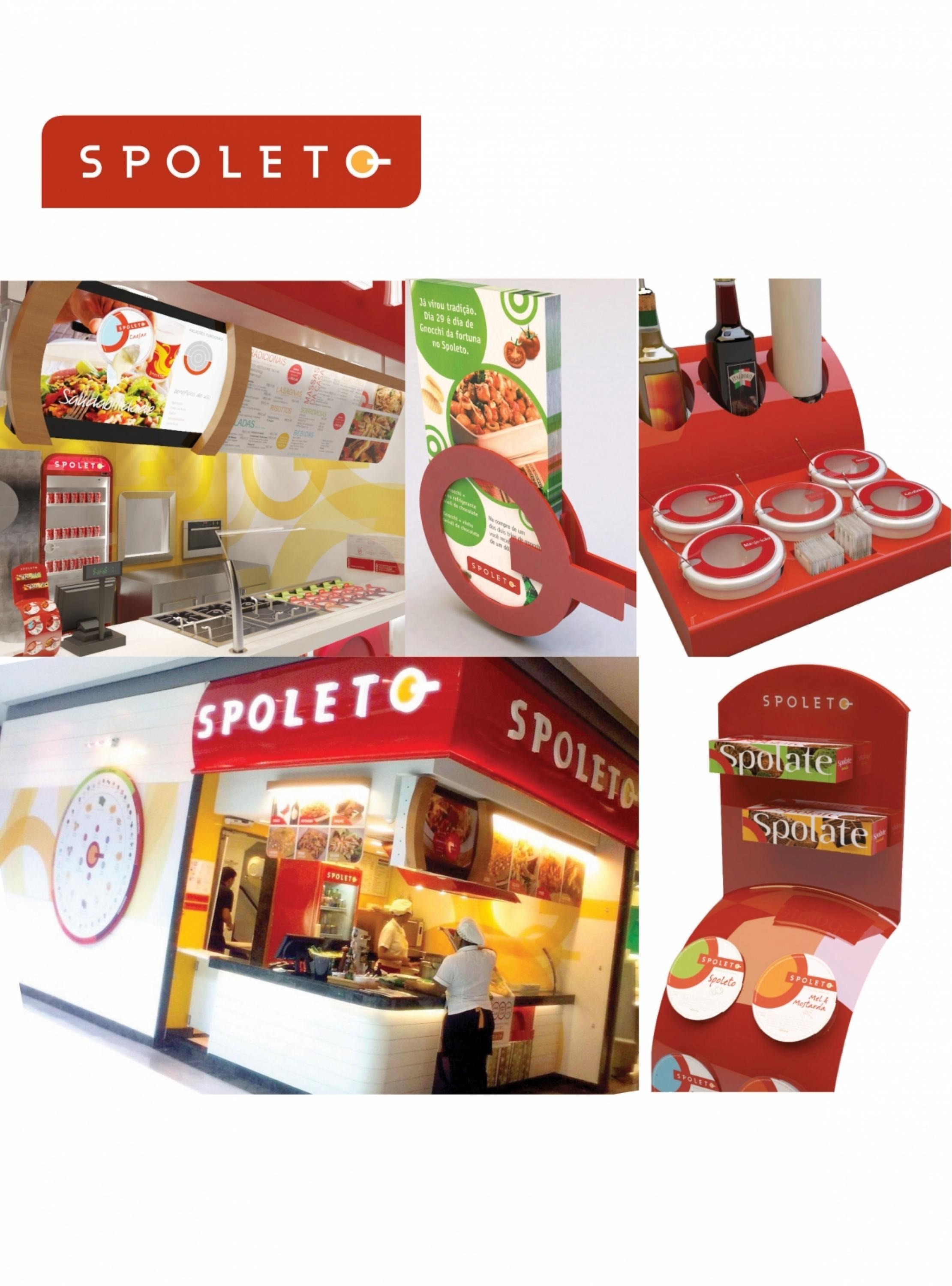
Build a multi-target brand for Spoleto, a very well known brand of Italian fast food in Brazil, targeting a more updated and modern logo that should reflect a new brand essence positioning:A creative, young and joyful life style with strong design-oriented personality in a European modern way,This brand should involve every store in a unique experience.After the project development, the concept should be replayed in every store in Brazil, total 250 stores.
Execution
We made several studies to find an icon that explain the brand by itself : A FRYER PAN; where the customer creates its own recipe by mixing ingredients with the pasta. This is done in a very joyful way, interacting with the cook.This icon is the main focus of the brand ad is used in all the environmental design: wall decoration, packaging, displays to support communication, etc
Outcome
We are able to use the icons –frying pan- in many different ways. First in the brand itself – SPOLETO- the last “O” is the frying pan icon. This icon covers the store walls in a modern patterns; some have many overlapping icons and others have dishes in the middle of it. Icons are also parts of displays, objects and clothing,We achieve to make a direct identification with the brand even when the name is not written. Brand essence is spreading far beyond shop environment to be recognised even outside the context.
Similar Campaigns
11 items