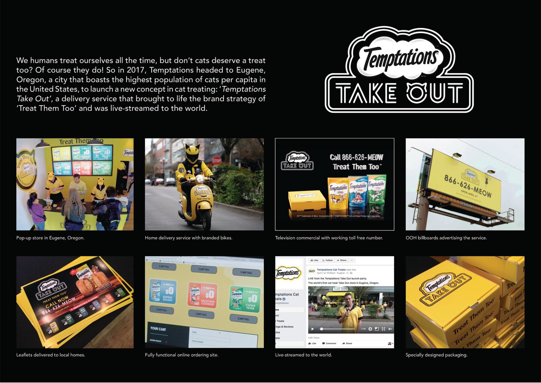
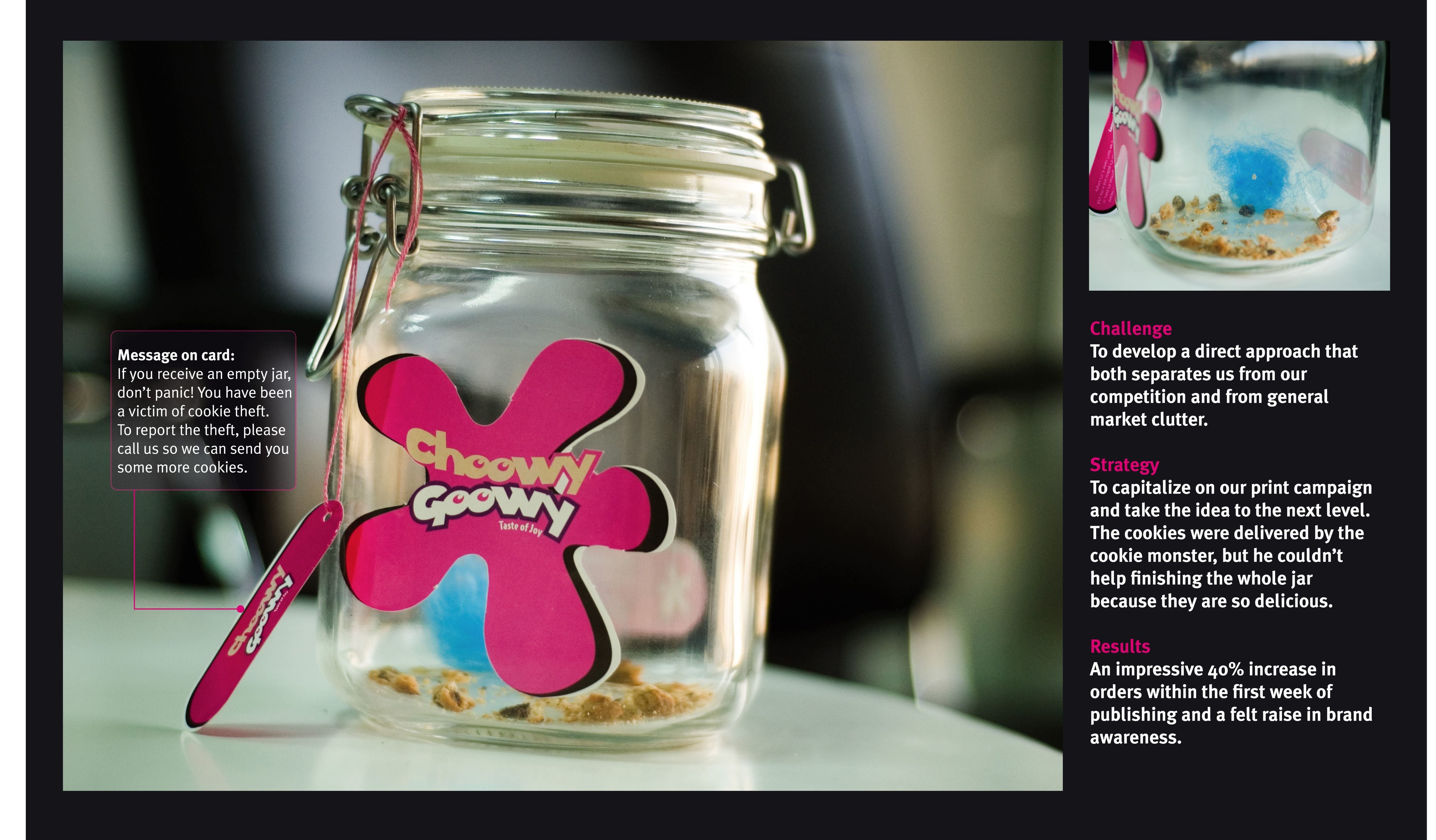
Eurobest
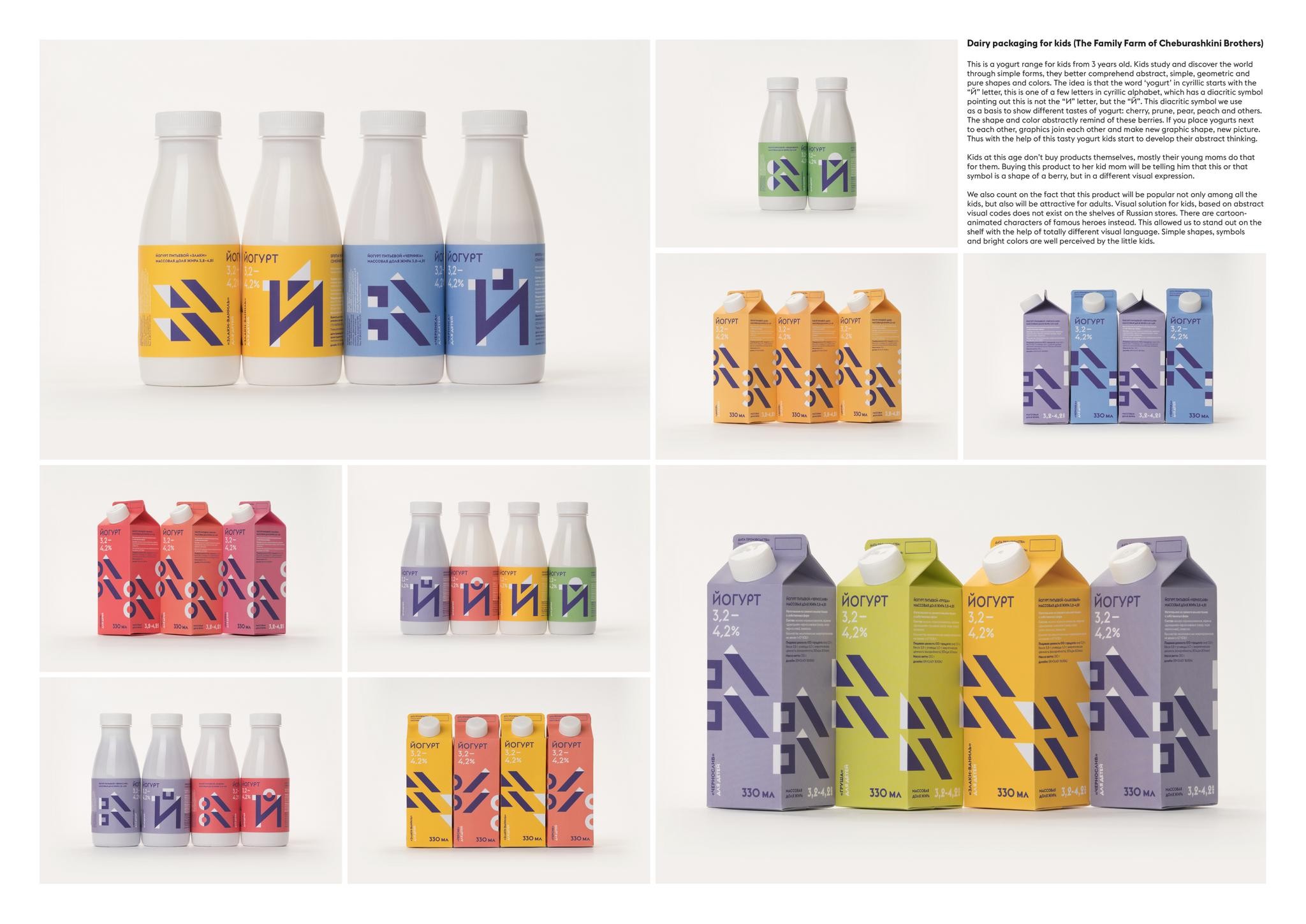
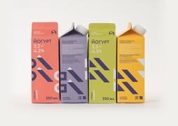
Kids yougurts Cheburashkini Brothers
ERMOLAEV BUREAU, Moscow / CHEBURASHKINI BROTHERS / 2017
Overview
Entries
Credits
Overview
Background
The brief was about the range of natural dairy products made specially for kids. And we understand that parents will be our target audience as well, because it is them who's buying products in the store. Kids will be attracted and fascinated by the package design, but parents already know Cheburashkini products. Which means they will be sure choosing yogurts by Cheburashkini Brothers that their kids will be getting tasty, natural and healthy product.
Execution
This is a yogurt range for kids from 3 years old. Kids study and discover the world through simple forms, they better comprehend abstract, simple, geometric and pure shapes and colors. The idea is that the word ‘yogurt’ in cyrillic starts with the ? letter, this is one of a few letters in cyrillic alphabet, which has a diacritic symbol pointing out this is not the ? letter, but the ?. This diacritic symbol we use as a basis to show different tastes of yogurt: cherry, prune, pear, peach and others. The shape and color abstractly remind of this berries. If you place yogurts next to each other, graphics join each other and make new graphic shape, new picture.
Packaging for yogurts for kids is made in purepacks and bottles.
Similar Campaigns
7 items