Cannes Lions
MAKING MAGIC WITH CLASSICAL MUSIC
INTERBRAND, New York / LUCERNE FESTIVAL / 2013

Overview
Entries
Credits
Overview
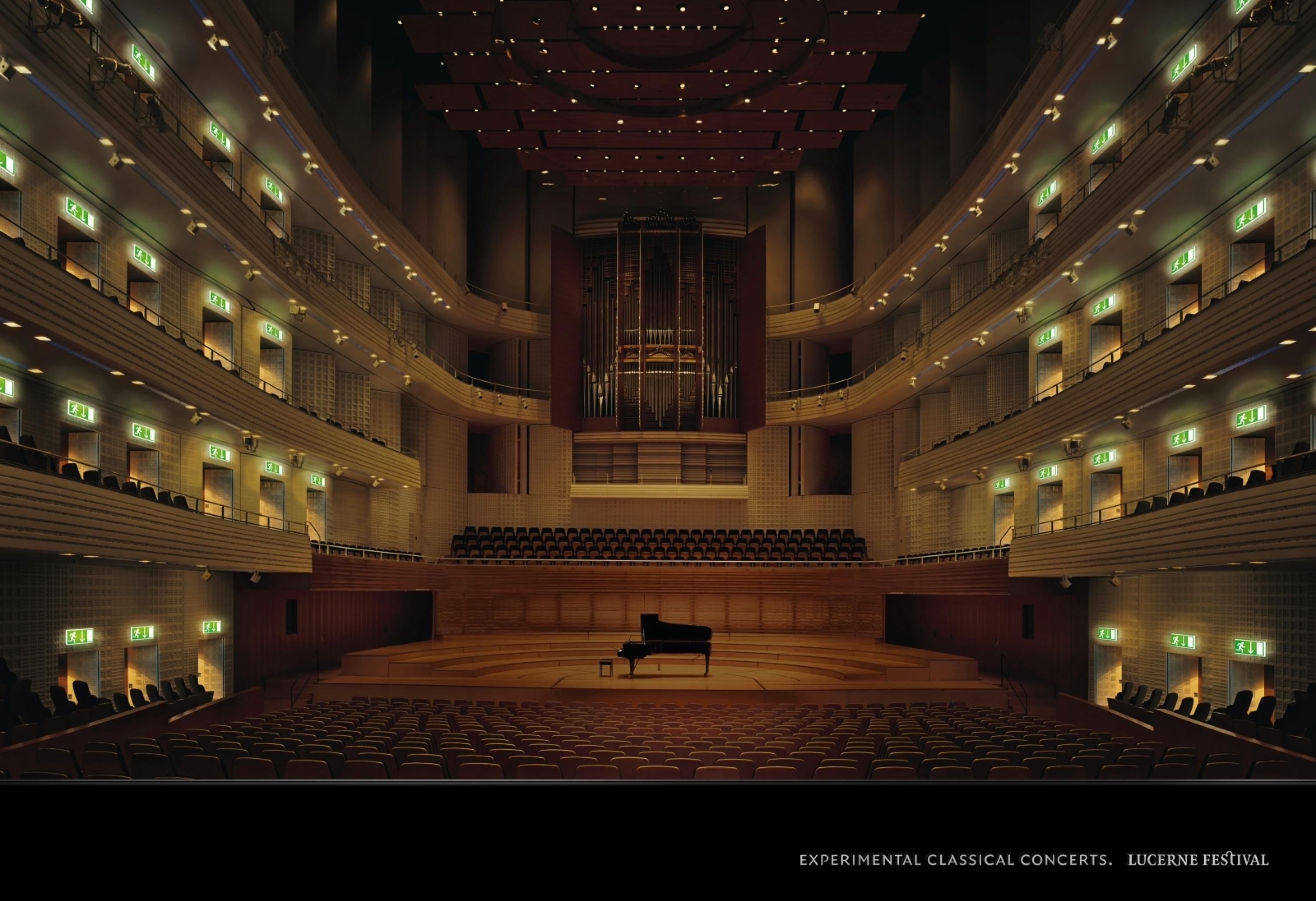
Description
The visual identity of the Lucerne Festival lacked a crucial level of clarity and cohesion, as the brand, its offers and sub-brands were not well structured.
In order to meet the challenges of positioning the LUCERNE FESTIVAL as one of the best known classical music festivals in the world, the following needed to be defined:
• brand platform: vision, mission, brand values and communication themes,
• brand structure
• new corporate design to visualise the musical experience.
Execution
LUCERNE FESTIVAL is colourful, easy and clear to identify. The most important element is the circle, representing music and the gathering of world-class artists. The supporting arrows show the connectivity between artists and audiences wherever the LUCERNE FESTIVAL takes place around the world.
Outcome
The visual identity is unique within the music festival context and was truly embraced by audiences. During the LUCERNE FESTIVAL, the vibrant new brand identity brought the sounds of the world to the city of Lucerne.
Similar Campaigns
8 items