Cannes Lions
NATIONAL GALLERY OF AUSTRALIA
NAKED COMMUNICATIONS, Sydney / NATIONAL GALLERY OF AUSTRALIA / 2011
Overview
Entries
Credits
Overview
Description
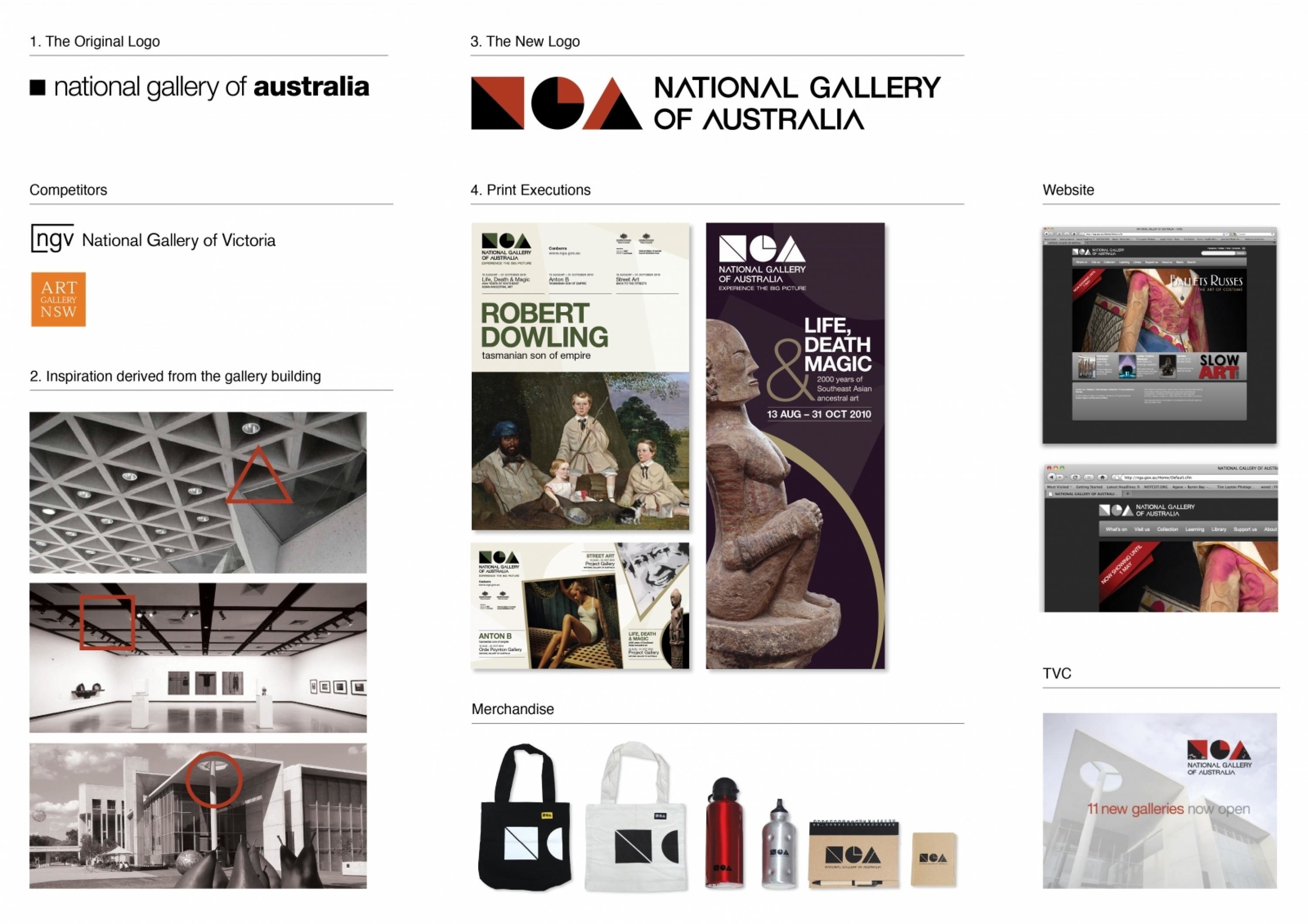
The National Gallery of Australia (NGA) was founded in 1967. In 2011 the NGA opened a new wing, effectively doubling its size. The gallery wanted a new brand positioning, logo and visual identity to coincide with this opening. The identity was to reflect the NGA’s relatively modern focus (19th century onwards), it’s monumental stature in Australia, and the gallery’s fundamental reason for being – to engage all people with significant art on a grand scale. Finally, the identity had to reflect the gallery’s desire for art to be accessible and feel open to all.
Execution
We decided to use primary shapes in the logo, to both connect the gallery’s identity to its past (a black square) yet also reflect the coming together of the old (triangles) and new (curves) wings. The use of the three primary shapes is also elemental, stripping back art to its simplest form this reflects art that is both significant and accessible. Finally, the use of the square, circle and triangle is a literal, translation of the gallery’s three primary initials N, G and A. This fortunate piece of design serendipity makes the logo playful and accessible for all.
Outcome
The new identity reflects an exciting time for the gallery. With double the gallery space the gallery has been entertaining larger crowds at more events, and has a rejuvenated sense of life. The new logo reflects the new enthusiasm people have for their new gallery. Sales of logo branded merchandise have increased significantly, as people are proud to wear the new logo on bags, clothes, and other personal items. The gallery is extremely pleased with the results.
Similar Campaigns
8 items