Cannes Lions
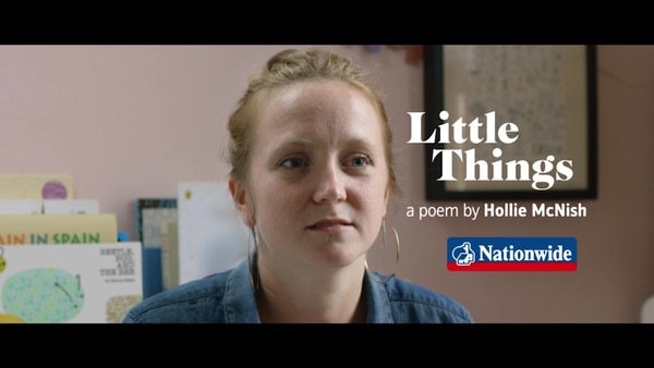
Nationwide embarks on its biggest rebrand in 36 years
NEW COMMERCIAL ARTS, London / NATIONWIDE BUILDING SOCIETY / 2024
Overview
Entries
Credits
Overview
Background
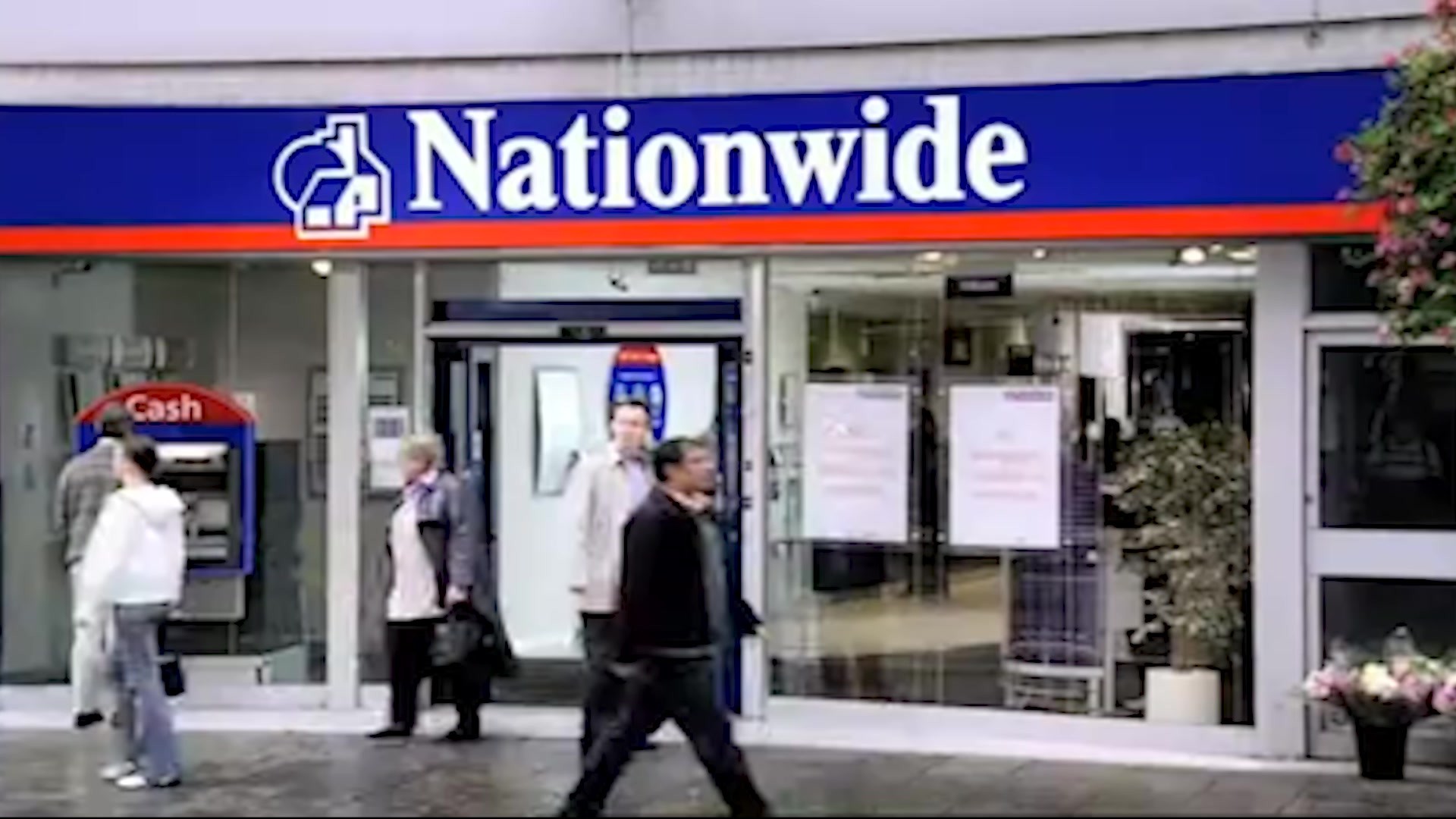
With fresh leadership in the society in the form of Chief Marketing and Corporate Affairs Officer Catherine Kehoe, Nationwide approached the agency to update their brand to better reflect their status as a viable, modern and future facing alternative way to bank. The brief was to change the entire look and feel of the society and have it done yesterday. There was no time to waste and this was to be a marquee statement as a business. There were no direct objectives, no abstract metrics, or any form of structured brief. Internally we faced the challenges of justifying the disruption and what to some could be seen as prioritising cosmetic changes over real experience improvements. We had to set a vision for the society that was so good, the board couldn’t not do it.
Idea
The creative challenge and ultimately the creative solution for this brief lay in the fact that Nationwide was caught between two financial forces.On one hand, the market dominating high street banks, with tarnished reputations and dated brands and experiences. On the other, disruptive neobanks, loudly boasting digital only experiences in bright neon.
So Nationwide was looking like the banks it was founded to be an alternative to, but less appealing than the new kids on the block. We’d lost our reputation for doing things differently and were losing ground to our latest competitors.
But that conflict, between our history and our future, became the energy that fuelled the creative idea. When you’ve been an alternative for over 150 years, your history is your future. You can be true to both. The tension of a modern classic. A dependable disruptor.
Execution
The logo was 36 years old, and customers weren’t sure exactly what it was. The evolution simplified and modernised while still being recognised. Now with an obvious sun and home.
There was a wealth of typography in the archives. Real character was found in an award winning font from the 80s, especially when paired with a custom-cut grotesque sans to keep that creative tension.
There are many blue banks, but ours was looking old and wasn’t accessible. So we deepened the blue, representing our deep traditions. Primarily, this is then contrasted with a modern, lighter red. Progressively, the secondary palette replaces this on core products to make the range easier to navigate.
This palette features across the freshened illustration style, moving the brand away from stock imagery towards more editorial and grown up visualisations. Each, with its corresponding shadow always lining up with the sun in the logo.
Outcome
We got talked about:
• People hearing positive things about the brand also doubled, to 34% vs. 17% in Jan.
We sparked more positive feeling towards the brand:
• Positive Impression of the brand increased +24%, from 25.4% in Jan to 31.4% in Nov.
• This score increased even more, +35% for previous rejectors of the brand.
We drove more people to want to choose us:
• Purchase Intent – brand you are most likely to take out a financial product with increased +37% .
• This means we influenced 2 million more people to say they would choose Nationwide as first choice, over any of our competitors.
Source: Wavemaker analysis of YouGov Brand Index data for Nationwide.
Similar Campaigns
11 items