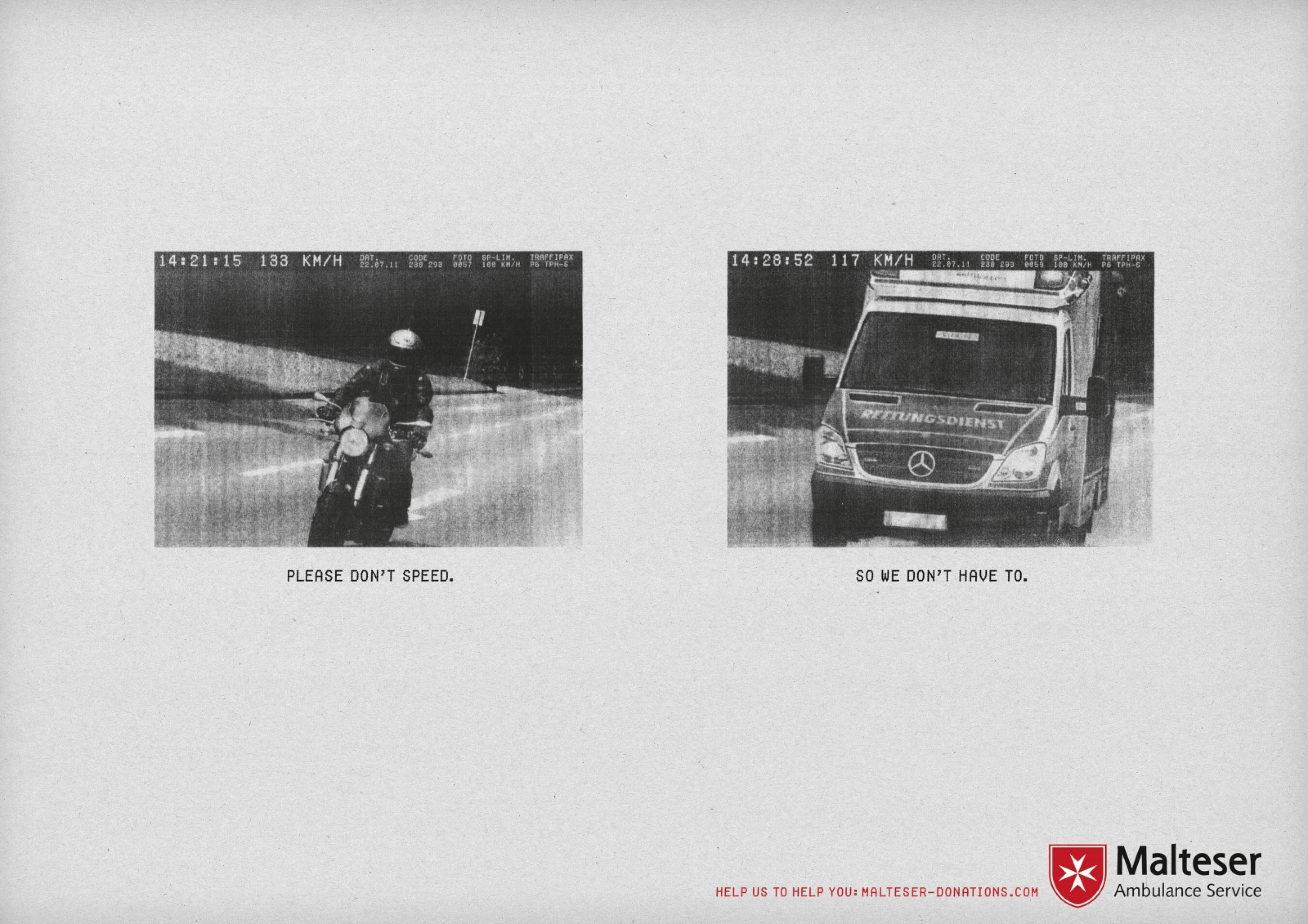
Cannes Lions
PROSIEBEN REDESIGN
PROSIEBENSAT.1 TV DEUTCHLAND, Unterfoehring / PROSIEBEN / 2015
Overview
Entries
Credits
Overview
Execution
We initially started to rethink the whole strategy of the entertainment brand with all its various parts. But then we decided to focus on the corporate design instead.
To develop a future-ready design, which could work on all platforms, we assessed many interactive and mobile interfaces. And our system also had to be suitable for TV. Overall we wanted to offer viewers/users a brand-new, contemporary design combined with the usability they’ve come to expect.
The logo and slogan stayed untouched, as they are among the best known in the German market. We also kept the main branding color, red, but extended the system by adding two further colors (royal blue and crystal white). A new font (Campton) and typography are also a very important branding tool in the whole system. We also brought an icon system to the TV screen in order to present additional information. Parallax animation supports the floating transitions in the system and gives a three-dimensional feeling alongside the flat elements.
Outcome
With its new corporate design, ProSieben is once again the top mover in the German TV/media market. Being visionary and state of the art are core brand values. This is not just important in terms of content, but for overall communication as well. The response regarding all publications was extremely positive, as were viewers’ reactions on social media. Sales customers are also very proactive in booking the new sponsoring and advertising platforms.
Similar Campaigns
8 items