Spikes Asia
Qantas Brand Identity Refresh
HOUSTON, Sydney / QANTAS / 2017
Overview
Entries
Credits
Overview
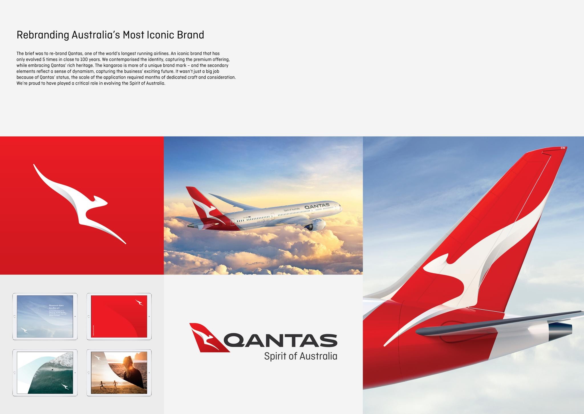
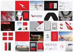
Background
There are rare opportunities when it makes complete business sense for a brand to evolve its identity. It demands good reason. This was one of those moments. The launch of the new 787-9 Dreamliners was the pinnacle behind years of capital investment in the Qantas experience. Everything from the on-board menus to the lounges to the customer service had been improved to deliver on Qantas’ promise of being the world’s leading premium airline. It had been 10 years since the last re-brand - Qantas had earned their stripes. It was time to symbolise an exciting new chapter. Time to embrace the optimistic energy of the staff. Time to capture the feeling of re-instated pride that people felt towards Australia’s most iconic brand.
Execution
For the commercial need of maintaining market confidentiality, the re-design was entrusted to a small team. Within this, a handful of designers dedicated more than a year to ensuring the identity could work in over 200 applications - from the side of a plane, to a digital application to airport signage and everything in between. The variance in scale and application demanded upmost care and consideration. 1,000’s of sketches in the concept phase, perfecting the iconic kangaroo silhouette - degrees of change. And just as long handcrafting the Qantas logotype. We focused on making it more streamlined, as if air is pushing across the top. The secondary colour language focused on deepening and brightening the distinctive Qantas reds, and reflecting the landscape of Australia. It was the level of care that a brand like Qantas simply deserves - this is a brand that will outlive us all.
Similar Campaigns
12 items