Cannes Lions
SADIA FROZEN FOOD
TEAM CRÉATIF DESIGN, Sao Paulo / BRASIL FOODS / 2011
Overview
Entries
Credits
Overview
Description
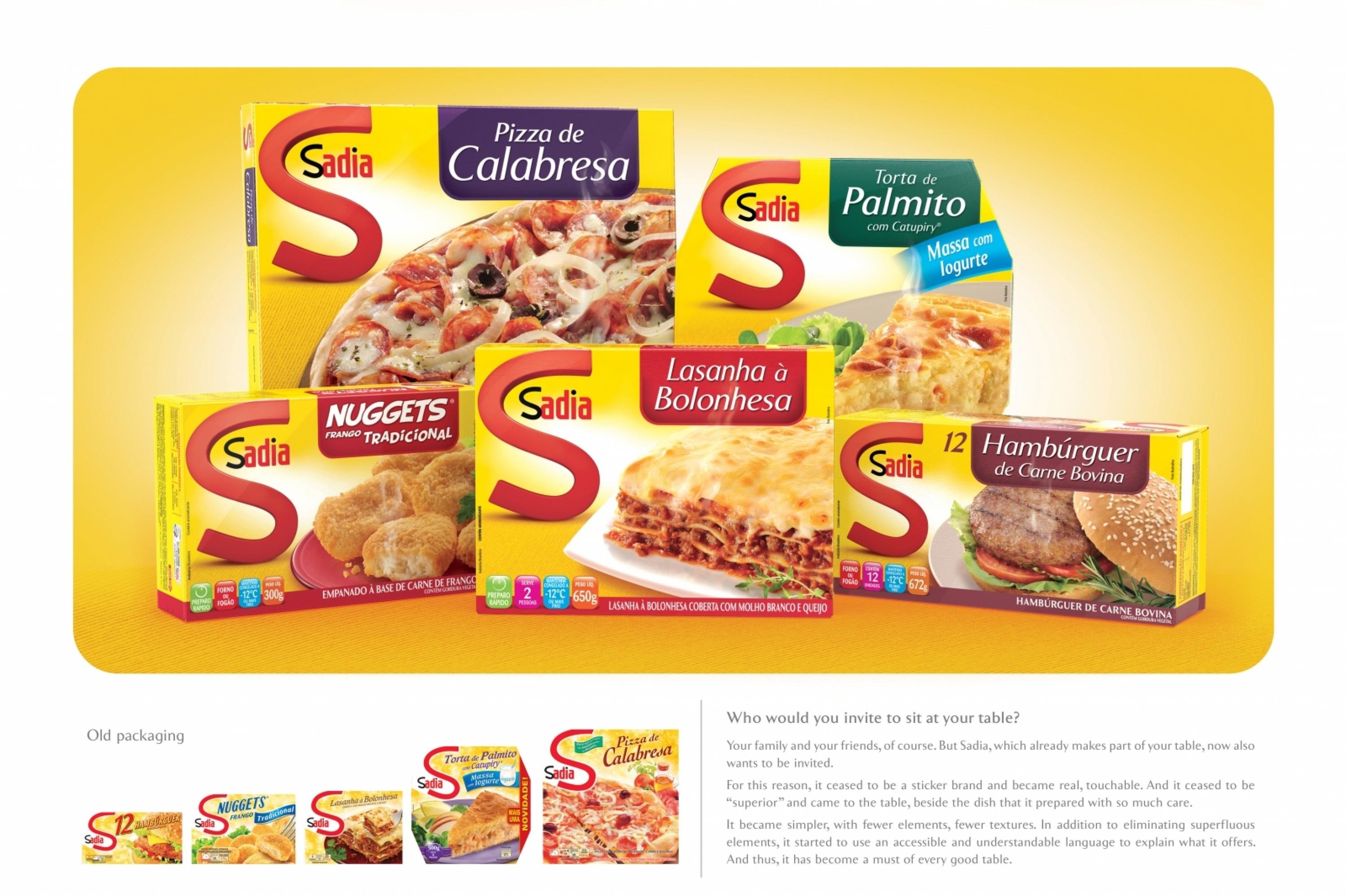
Sadia packaging was introduced to the market in 2001, and since then all competitors have been relaunched a few times. Although impactful and appetizing, Sadia packaging has aged and lost the ability to generate differentiation and proximity to a consumer that has evolved a lot during this period.Therefore, the brief was to evolve the graphic image of the packaging in order to modernize it, facilitate navigation between different categories and flavours, and bring it closer to the concept of “real food”, generating a more intimate and reliable relationship between brand and consumers.
Execution
The final design is the translation of the graphic concept: Sadia goes to the table with you.
Sadia sits at the table and is the protagonist of that special moment. This was possible through:- Real brand: icon “S” of Sadia has gained volume and texture, ceasing to be just a sticker brand and becoming something concrete (beneficial brand).- This icon is on the table, in the same context as the food: this is the real brand, which offers real food.- Simplified elements: fewer elements, textures and pieces of information, focus on what really matters: the brand and the food.
Outcome
The relaunch is too recent (March 2011) to allow us to evaluate the impact on results.
Similar Campaigns
8 items