Cannes Lions
SPORTS BRANDING
KT, Seoul / KT - KOREA TELECOM / 2014
Overview
Entries
Credits
Overview
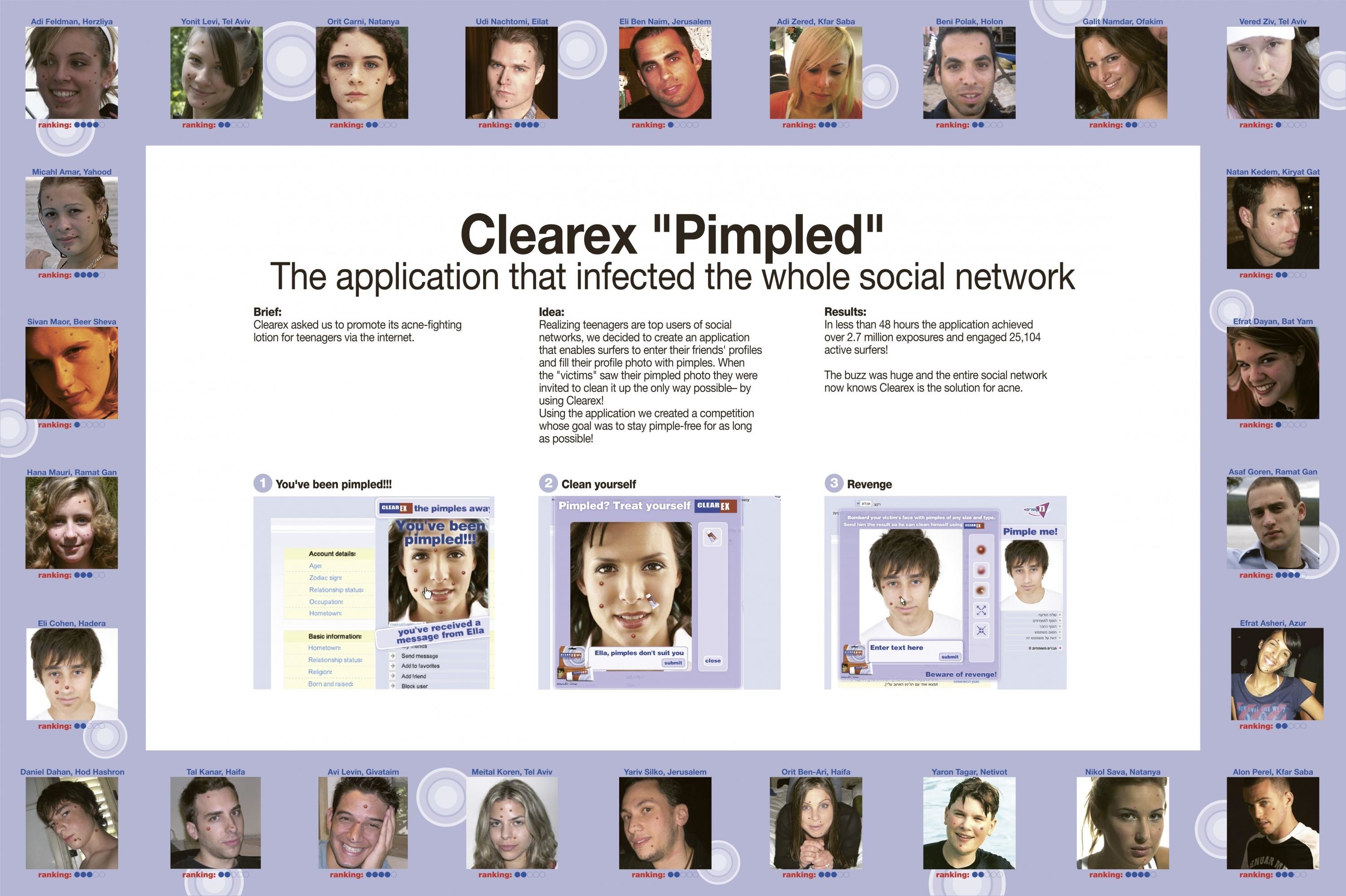
Description
Most Korean major league baseball team’s designs do not meet fans' expectation or lack originality. So we made a different approach. Hinted by the name wizards, we created logos and emblems reflecting our main design concept ‘burst of magic’ to build a unique brand identity. The core visual language was inspired by iconic symbols of its own Suwon City, which helped derive emotional attachment.
Execution
Each mascot was born with its distinctive character; vic the pitcher represents power whereas ddory the catcher symbolizes speed. Blending the traditional to modern, we chose magical monsters over a typical wizard, inspired by the traditional fairy tale character of Suwon City, the hometown of the brand. Gaining insights after listening to the fans, we came up with a list of functional items that are able to show kt wiz's spirit and engagement throughout the fan’s daily life.
Outcome
Since its launch ceremony, kt wiz branding has consistently received positive feedbacks and attention from the fans as well as the sports media. Within a week we reached around 58,000 reactions on SNS, over 2 million views on YouTube and the numbers only continue to grow. People contacted us to ask where they can purchase the products. There is no doubt that the brand will be even famous after the official debut game in March 2014. Products will be officially available in our new store, opening on April 28th 2014.
Similar Campaigns
12 items