Cannes Lions
TANGO SOFT DRINK
BLUE MARLIN BRAND DESIGN, London / BRITVIC / 2010
Overview
Entries
Credits
Overview
Description
The brief set by Britvic Soft Drinks was to recapture Tango’s irreverent sense of fun and full on taste in a new brand identity, packaging, tone of voice and off pack communications.
Execution
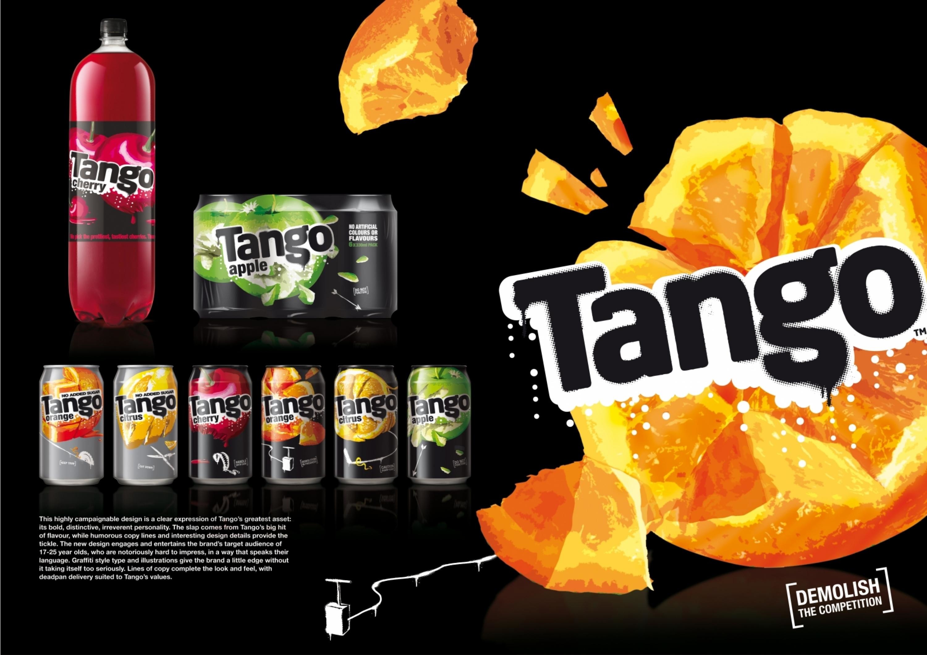
We created an identity that is a clear expression of Tango’s nature, based around the idea of slap and tickle. The slap comes from Tango’s big flavour with the tickle provided by humorous copy lines and design details. Where many brands used imagery in a cute, innocent way, Tango’s packaging shows fruit getting crushed, punctured, mangled, mauled and mashed up. Graffiti style type and illustrations give the brand a little edge without it taking itself too seriously. Lines of copy complete the look and feel with deadpan delivery suited to Tango’s values. The design is highly campaignable.
Outcome
Since the new look made its debut, sales have soared and the brand has taken on a new relevance and aura of coolness for its target consumers. When Tango is in the hands of its target audience its brand values of impact and entertainment come across loud and clear.
Similar Campaigns
12 items