Eurobest
The Domino Effect
JONES KNOWLES RITCHIE, London / DOMINO'S PIZZA / 2016


Overview
Entries
Credits
OVERVIEW
Background
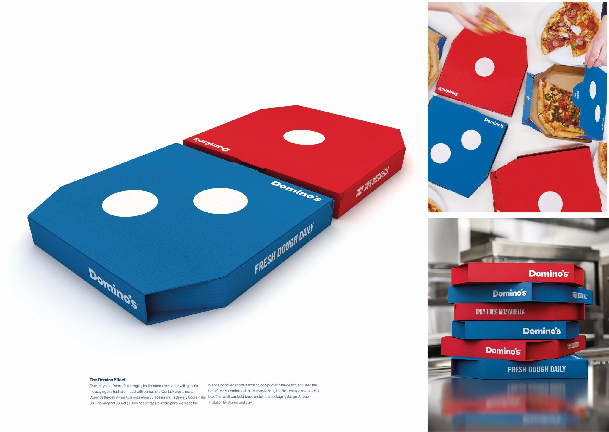
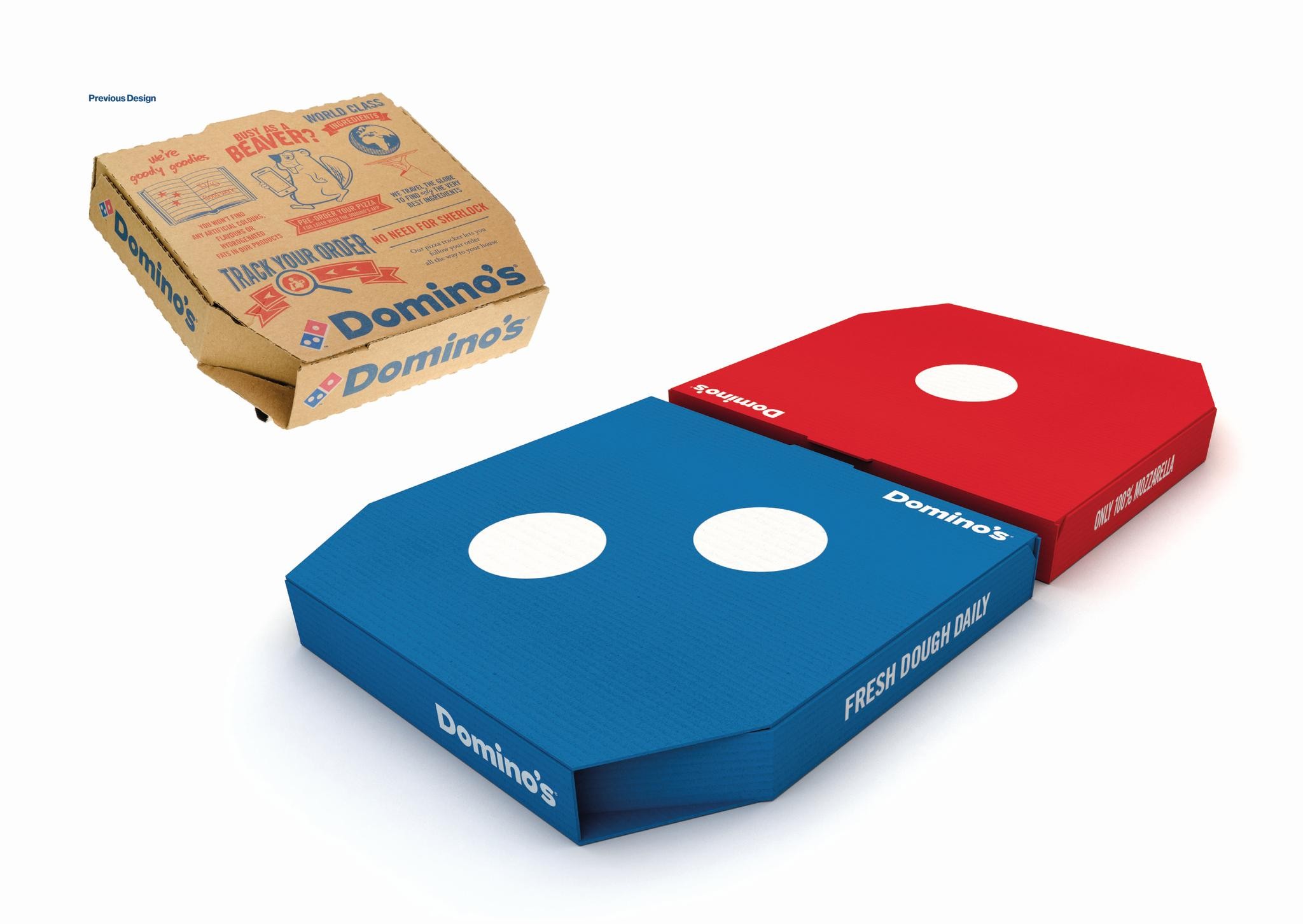
Domino’s Pizza began delivering to homes across America back in 1960. Today, it’s the biggest pizza chain in the world, with franchises in 73 countries. With a distinctive blue and red logo and catchy name, Domino’s authored the home delivery pizza market. Yet, after decades of local market interpretations of their pack design, increasing competition and promotion-driven activations, Domino’s had lost its confidence. The delivery boxes had become cluttered with generic messaging and the once iconic Domino’s brand mark had become relegated to a small endorsement on promotional and themed packs. The brand was becoming recessive in a sea of brown boxes. At its arrival on the doorstep, it no longer commanded a sense of authority or impact. Our brief was to unearth and bring to life Domino’s charisma in a bold and iconic manner, to make it stand out, engage and excite consumers again, beyond just the product offer.
Execution
To stand out, be chosen and remembered, Domino’s needed to celebrate what made it unique, not what made it the same. We started by removing all the generic category communication, focusing only on what Domino’s owned: its once iconic red and blue domino logo. With pizza being a catalyst to sharing occasions, we took inspiration from Domino’s pizza combo deal and used it as a canvas for the visual expression of the domino – one red box, one blue box. Thus, the iconic Domino’s logo became the pack itself and a tangible expression of people coming together over pizza. Design that is bold, simple and an invitation to play and share.
With its visual essence distilled into its essential, distinctive components, the brand was able to make an impact on the doorstep and demonstrate that it's the only choice when it comes to pizza.
Don’t order a pizza. Order Domino’s.
Similar Campaigns
12 items
