Cannes Lions

This American Life

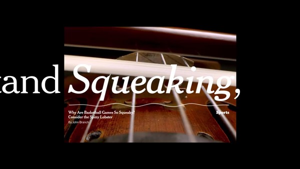
STINK STUDIOS, Brooklyn / NEW YORK TIMES / 2021

Digital Proof JPG
Digital Proof JPG
Supporting Images

Overview

Entries

Credits

Overview

Execution

The typography reflects the feeling of listening to the show, and visualizes the way that individual stories have woven together in their own unique shapes over 25 years to show us, quite literally, what This American Life is. The typography, Mercury, is the show's brand typeface, and it appropriately reflects the prestige and seriousness with which the radio show's team has approached their work. The nonlinear format of the ragged quotes attempts to embody both the unpredictability of the listening experience and the experimental spirit of the show that has challenged the format of radio for the last quarter-century. The underlines, playhead icons, and annotation-level text attempt to create a feeling of linked clickability as the piece drives the viewer to a digital archive of audio pieces to explore.

Similar Campaigns

12 items

Independent Journalism for an Independent Life

DROGA5, PART OF ACCENTURE SONG, New york

Independent Journalism for an Independent Life

2023, NEW YORK TIMES

(opens in a new tab)