Cannes Lions
Uber
JONES KNOWLES RITCHIE, London / UBER / 2024
Overview
Entries
Credits
Overview
Background
Uber wanted to elevate what they mean to people, but the brand wasn’t ready for it. Their black, white, and green palette and logo were recognizable assets, but weren’t enough to fully represent the brand’s capabilities. To address this, we created three goals for the Uber brand:
1. Double down on what makes Uber distinctive
2. Tell the story of Uber’s new mission: “reimagine the way the world moves for the better”, and
3. Align Uber’s disparate services under one identity.
We needed to reflect how people experienced the brand across its services—from ride sharing to delivery—with a flexible, expansive, and united design system. The system we built brought the story of Uber's new mission to life, using assets already core to the brand: the circle, line, and square.
Idea
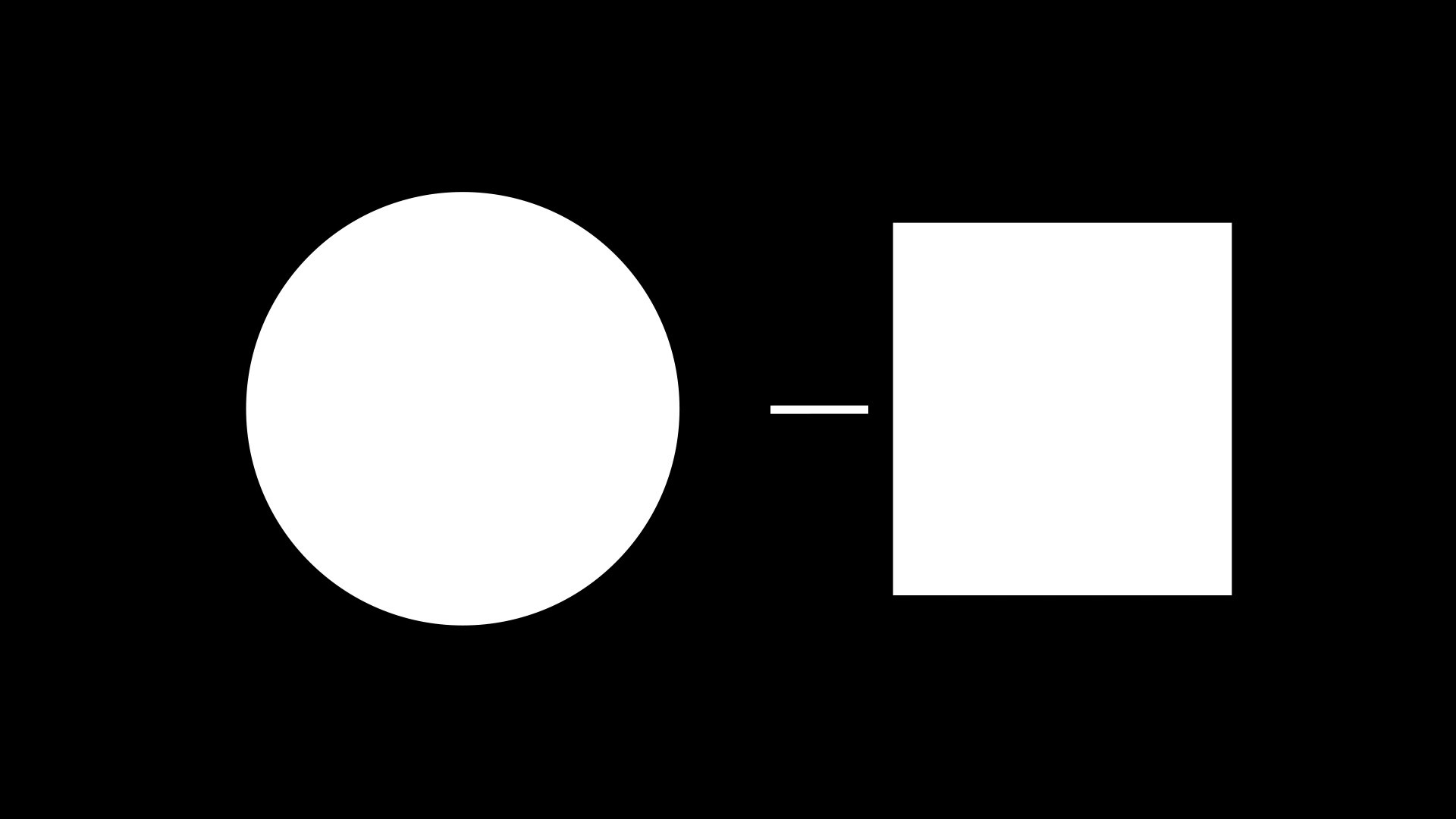
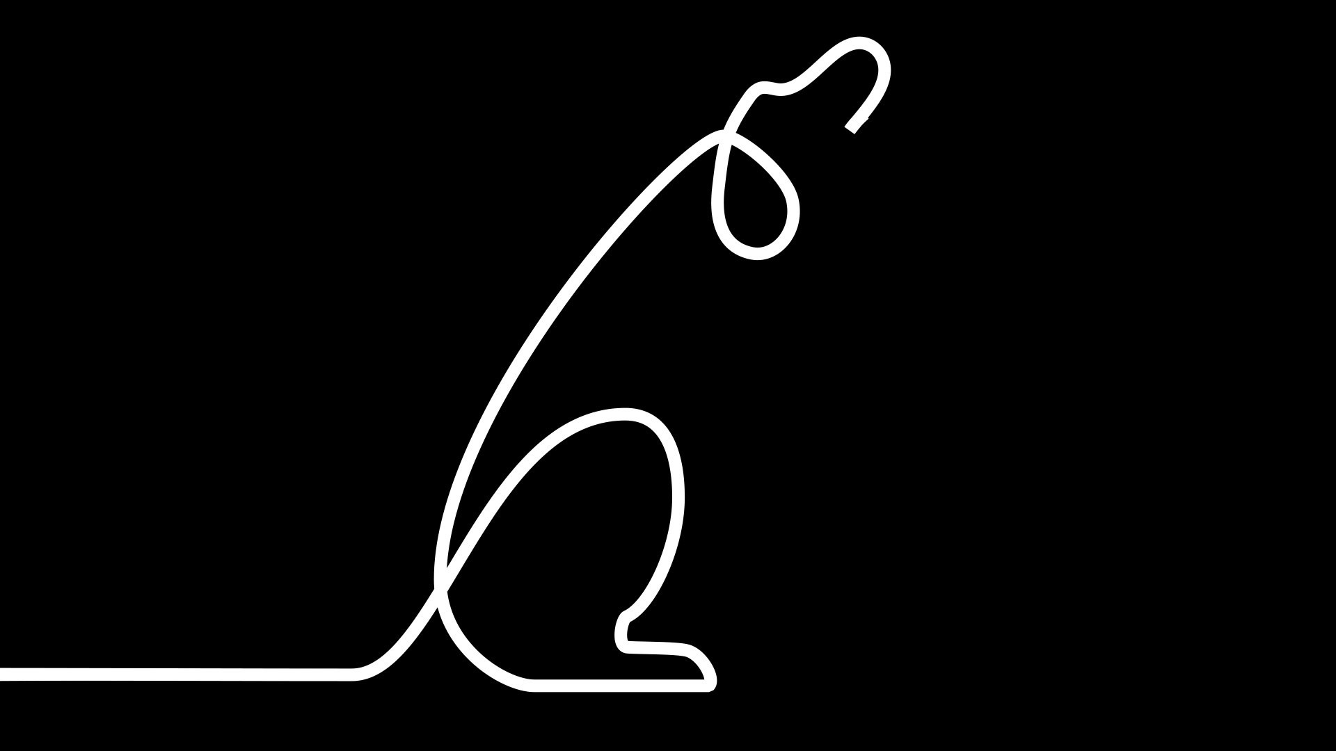
Uber’s map is one of the most recognizable assets in the customer experience. It has three main elements: the circle as the starting location, the line as the route, and the square as the end destination. We saw an opportunity to transform these functional icons into design elements rich with symbolic meaning, telling the stories of what happens when you simply connect here to there.
We used these three simple icons to build the language of the Uber brand, revolving the kit of parts and essential design assets around the map’s story. The result takes us on emotional journeys, delicious transformations, and personal experiences that only Uber can share by simply connecting two sides, two people, or two moments together.
Execution
The circle, line, and square became the foundation for Uber’s design system and kit of parts, uniting all internal and external communications. They influenced the graphics and motion languages and became the basis for bringing to life photography, illustration, and type.
We used color to create a navigable system. The classic Uber black and white unifies every element under a master brand, while color helps distinguish between mobility and delivery. The delivery and ride services got unique treatments and balances of color, bringing them to life in their own unique ways.
Every element tells the story of connection. From connecting first dates and family members, to bridging the gap between your hungry stomach and a roll of sushi, the new Uber brand feels personal and meaningful to our everyday experiences, coming to life across brand collateral from billboards to drivers manuals and key chains, delivery boxes and the app itself.
Outcome
The updated brand system provided Uber with the fuel it needed to grow. At launch, Creative Boom noted, “The brief wasn’t to come in and start fresh. The simple black and white logo continues to stand out, but rather it was to help Uber elevate its brand to match its growth goals, bringing together its various products and services under a unified strategic approach, reflecting an expanding range, including grocery, pharmacy, and convenience delivery options.”
The adaptable system is now the cornerstone of the Uber brand. Fully adopted by internal teams and partner agencies alike, it ensures all new content and campaigns are distinctive and built on the brand’s full scale mobility ambitions.
Similar Campaigns
12 items